Hey people,
I'm student on modern high school, and the school is using really bad-looking learning and testing portal. As I am Graphic designer, I decided to redesign the whole thing and while I was at it, I did prototype too. I went for minimalistic design and very premium feel. I wanted the user to be able to navigate it easily and to enjoy the experience (even though it's learning portal).
Here is the prototype and you can find some screenshots below.
https://xd.adobe.com/view/8194d7cb-1bb0-4ae1-bc3c-c498f3dbfd6e/
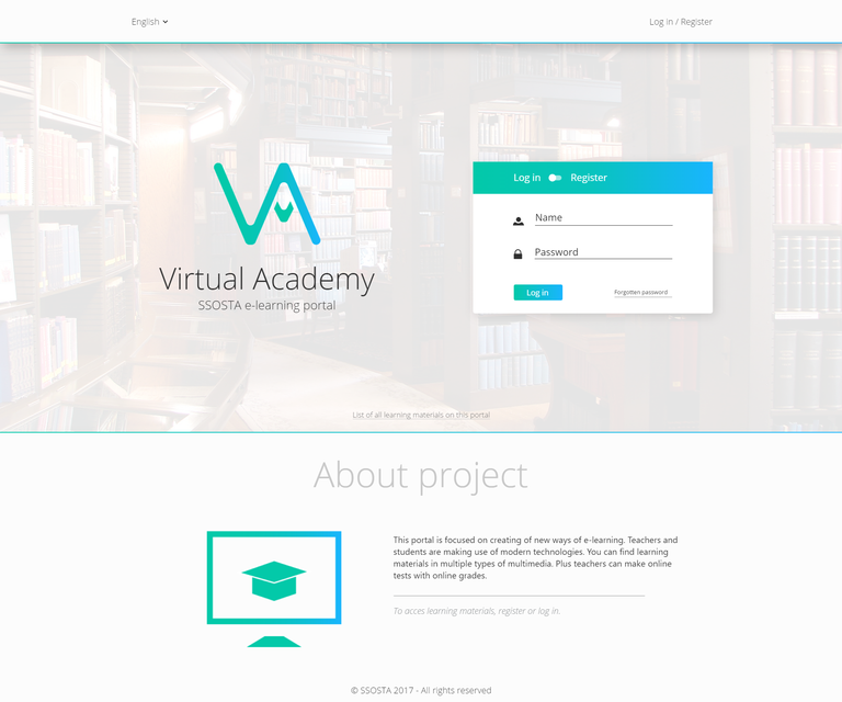
Well, first we have the landing page here. You can log-in or register. All the content is open just for the students of my school.

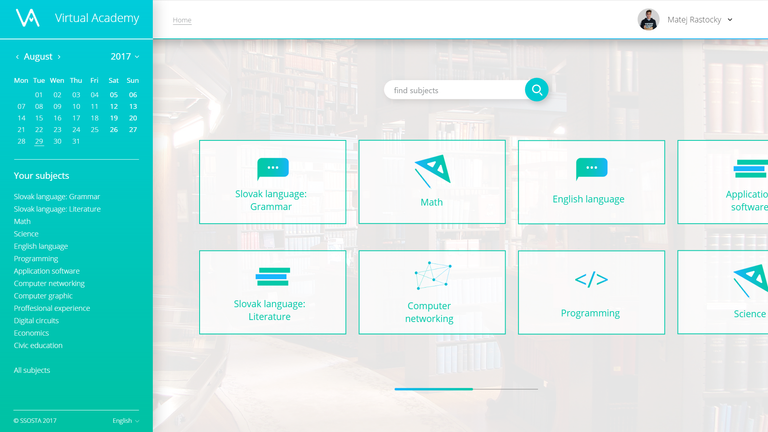
In this screenshot you can see page that will welcome you right after login. You can search for your subjects or check the exams plan in calendar on the left.

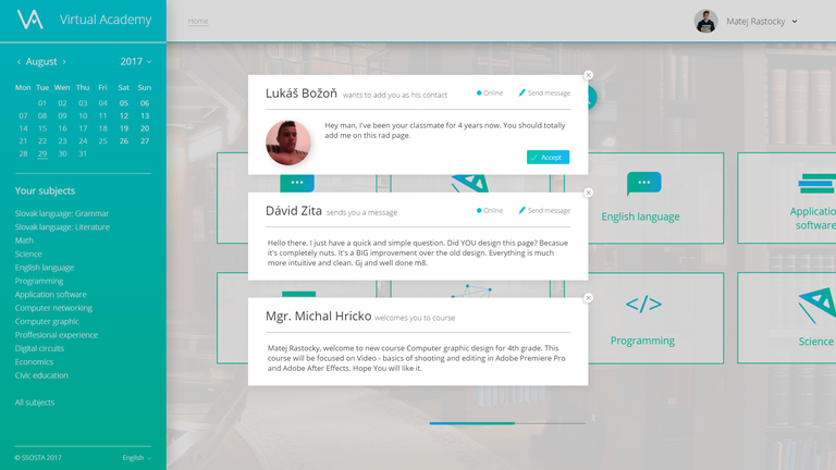
All the notifications are in the form of modals and you can view them by clicking the dropdown arrow next to your profile name, then click "Notifications".

You can explore my design further in the prototype (link on top of this page).
Any feedback will be appreciated.