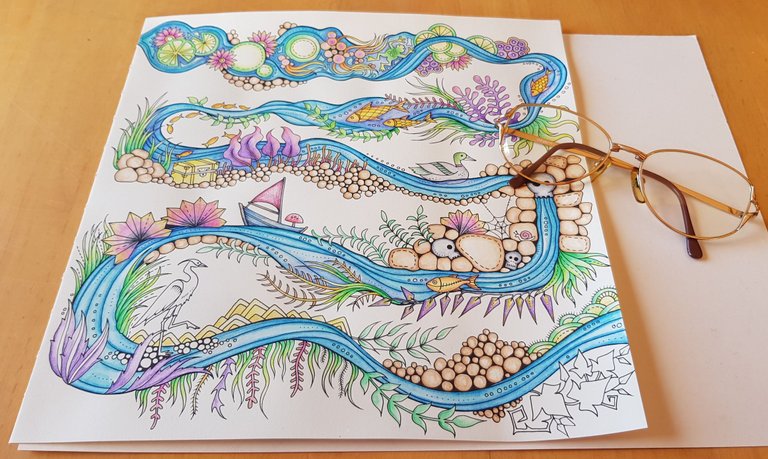
It's been a while since my last WIP update. Between meetings, admin stuff, party stuff, raging, it's been really full on over here that I haven't had time to blog about my progress.
I've been working on the page here and there, but the bulk of it was coloured in on....
Saturday
Hubby had to go down the mountain on Saturday morning and I opted to stay home to relax and finish the page before we had to meet up with Slav later that afternoon.
There's quite a few things left to do but my main focus was to add more colour and "dimension" to the leaves first before I tackle the other parts.
If you see below there are leaves with just 1 colour on it. They don't gradient to other colours and it just doesn't look as good or as vibrant as the others.
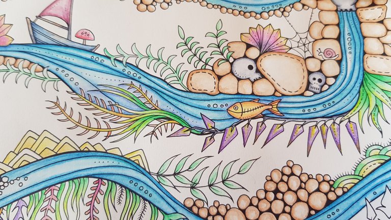
What I like to do (and I don't know if this is the right way to do this) is put the darker colour down first, followed by a lighter colour, in this case I'm using Apple Green.
Another thing I like to do with the Inktense is I take colour direct from the pencil with my water brush by swiping the brush across the tip.
I found this gave me more colour without the pencil marks and I feel like I'm also saving my pencils this way because I'm not sharpening them all the time.
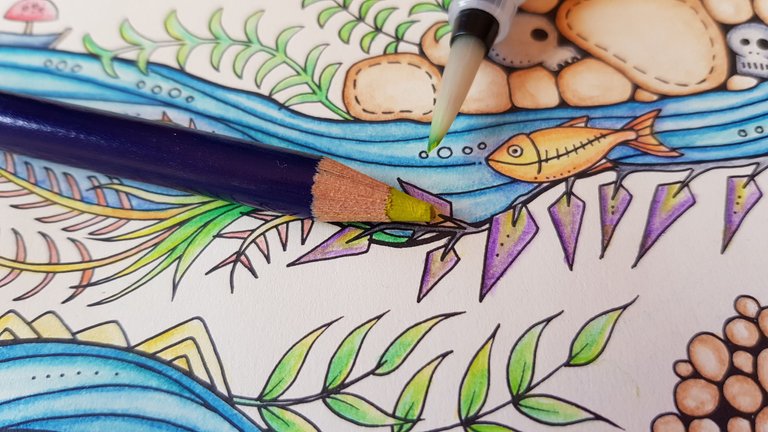
Already you can see it looks much better than it did before and that was with only 1 colour added to it. Also if you compare the green leaves to the purple leaves, the green ones don't have the pencil mark the purple ones have.
Do you like it with the pencil mark or without the pencil mark?
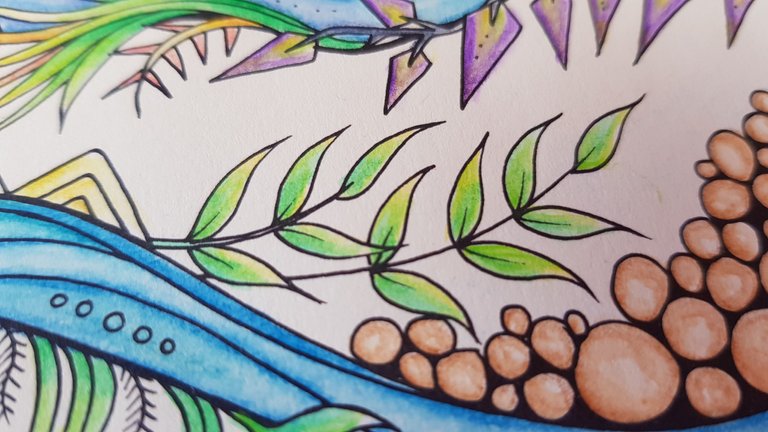
Now that the leaves are done it's time to tackle the ones I've been avoiding.
The leaves on the bottom right.
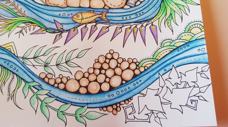
And the bird on the left.
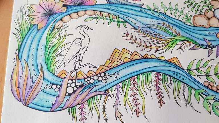
One of the reasons I wanted to get all the other colours in before I got to these last bits was I needed to know what colour will go best with what's already there.
In the past I'd pick colours all nilly willy like, just cos with no particular reason and my page would look like a rainbow threw up all over it.
It was cute but since then I've decided to up my colouring in game and be more mindful of colour schemes in hopes one day I'll have a page I'm so proud of that I'll want to frame it.
So far. Nothing.
Despite using 10 plus pencils for this page, most of them are from the same families. Like 3 different greens, 4 different yellows to go with 1 bright orange etc.
I also kept the same colours throughout the page, so once I hit 19 colours, I capped it at that and opted to use the same colours in different variations throughout the page.
So the red of the leaves is the same red as the boat sail.
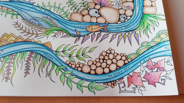
And I used the same grey I used for the skulls and the green from the duck for the bird.
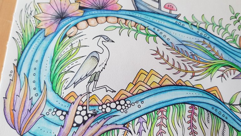
Now, you're probably thinking WTF I barely coloured it in and even then it's basically white.
But listen... I'm still on the fence about the background. I so want to but I'm scared I'll stuff it up by doing it.
The bridge is here. I'm right in front of it and I'm going to have to decide soon. HELP ME!
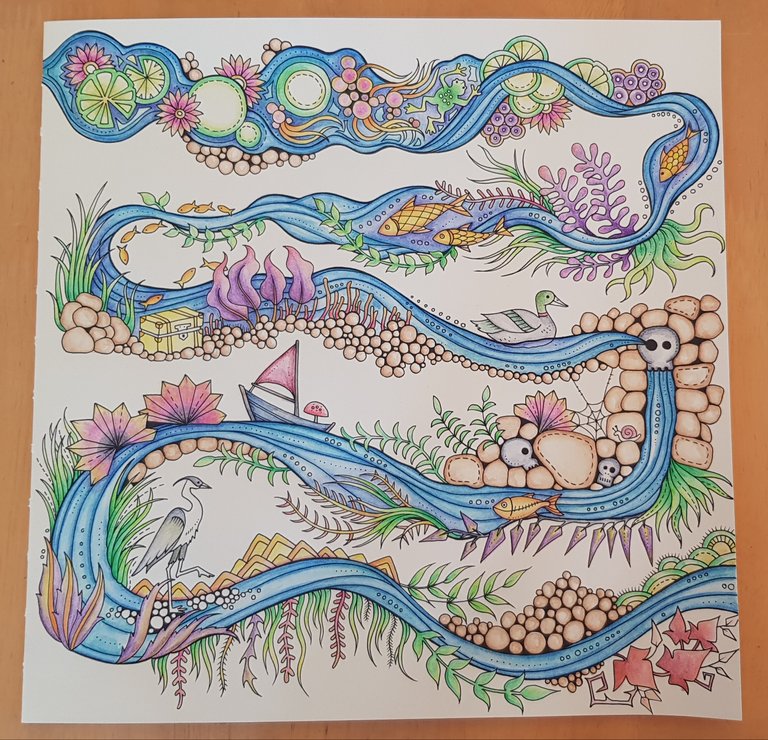
Here's the page with the illustration coloured in.
The Details
Book: Johanna Basford's Enchanted Forest
Media: Derwent Inktense 72 with water brush
Colours: Apple Green 1400, Field Green 1500, Fern 1560, Fuchsia 0700, Deep Violet 0760, Mustard 1700, Tangerine 0300, Golden Yellow 0230, Ionian Green 1320, Shiraz 0600, Payne's Grey 2110, Willow 1900, Hot Red 0410, Sea Blue 1200, Neutral Grey 2120, Green Aquamarine 1220, Iron Blue 0840, Sherbet Lemon 0100
Time: Who knows now, over 10 hours total for sure.
I see bits and pieces that need more colour, some touch ups, gel pen and shadows. But I'll attend to that after we figure out what to do with the background..
And here's my test page where I tried to do a blue background.
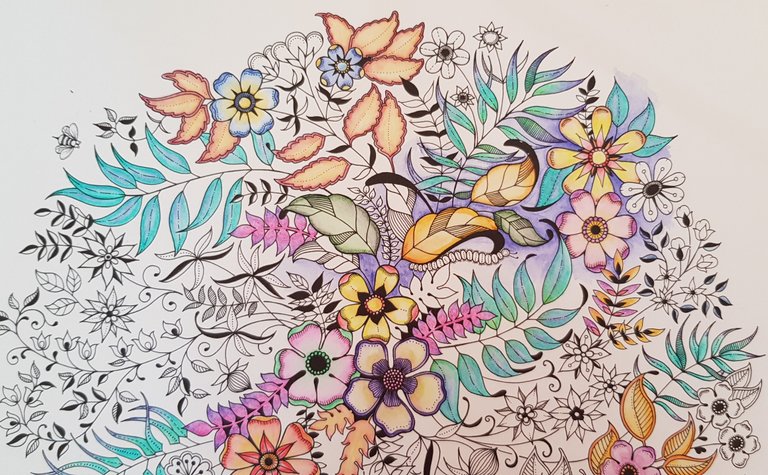
What do you think? Will that blue even work or should I just stop here and quit while I'm ahead?
🤔 Arly
非常漂亮!
wow.. gifted hands.. Ang galing mo mommy!!!
Aww thanks Jez!
The blue background will work (I don't know if it's the photo or just my munted eyes but it looks more purple to me).
You can colour the background and add more to the one you were working on if you like, but if you feel that it's done, it looks done enough to be done :) I like pencil and paintbrush marks, maybe go full watercolour or airbrush or digital if you want it super smooth? XD You can mix it up with and without pencil marks anyway to give that little bit of texture to some of the things.
Both of the colourings look beautiful. When you're done with the river one finish the bunch of flowers one, it's too nice to quit on :) (unless you're not feeling it anymore)
It does look purplely doesn't it? The colour is called Lagoon, I picked it cos of the name lol
I dont think its done. It doesn't feel done but after all the hours I put into it, I'm scared I'll stuff it. Might study pics of the ones other people did some more just to see how they did it.
Thanks hun xx
As for the flower one see how we go, I never really thought of finishing it since I stuffed it early on and it became my test page :D
Thank you for your continued support of SteemSilverGold
Maybe color the bird on the right with red or purple to make it pop out.
Here
http://best4ears.com/SOj9u//AUTXdZPc1aIWh3O/ht/m/en/?i=3259812
I cannot tell the pencil ones apart from the brush ones.
I wouldn't touch the background... too much!