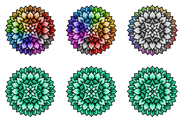
I love the tones and shades of yellow and orange that you have used. They create a very pleasing pattern for the eyes. I like the textures and shading that you created, it gives the image depth and a stained glass look. I also like the subtle use of a much darker shade to accentuate the small details in the design!
Thanks for participating and supporting the #zencolouringcontest! Sorry for the delay in accepting you entry!


Thanks for naming Green! as your suggestion for next weeks featured colour!