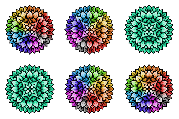
I love the bright colour scheme you used to fill this weeks design, the pattern of colours is very striking. The addition of red, yellow and blue contrasts well with the shades of green. I like how the shades of that green descend in gradients of shade from dark to light from the outside in. I also like the clever use of white/negative space, it accentuates certain shapes and details of the patterns!
Thank you for your entry and support to the #zencolouringcontest!


Thanks for naming Blue! as your suggestion for next weeks featured colour!
You're welcome and thank you for your comment!