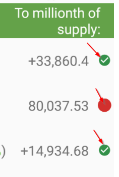
Thanks for taking time to answer the questions. What do the circles pointed out in screenshot below represent?

You are viewing a single comment's thread from:
Thanks for taking time to answer the questions. What do the circles pointed out in screenshot below represent?

Green is for when you passed the millionth of available supply and red is for when you haven't.
In a coming update you'll also get a star or medal after you pass the millionth of total supply
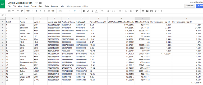
Thanks, that explains why mine are all red LOL. Using your example I was able to recreate the spreadsheet using the CryptoFinance add on for Google Sheets and figuring out the formulas based on your article. I pull all the data from CoinMarketCap on sheet 1 and reference it on sheet 2. All the math checks out, I just need to do some formatting to make it pretty and readable. I'm calculating the millionth of coins against the available supply instead of the total supply, is that correct?

Cool, you made it yourself!
Well, the millionth of current supply is nice but the millionth of total supply is the ultimate goal. You decide which one you like better, depending on your resources of course. At the end of the day, all this app and spreadsheets do is help you distribute limited resources in a smart way.