Life is a matter of choices, and every choice you make makes you. - John C. Maxwell
I couldn't have said it any better, John.
Today I'm in the luxurious situation that whatever choice I will make, the result will be awesome anyways.
The submissions in my current logo contest are incredibly good, so no matter which one I pick, they're all winners already.
The 'problem' is actually a mercy: there are so many qualified entries, that it's hard to choose only one!
@surfermarly being spoilt for choice
Let's give it a face!
A couple of days back I set up a new account on steemit called @dreamsoftheocean.
The blog will be the home for the charity project I've started recently.
Before publishing the first content and give you an insight into the project's mission and first activities, I want to define the 'look & feel' of the new brand. Charity is a serious business that requires 100% professionality. So I want to do things correctly right from the start.
A professional and trustworthy image is the number 1 premise for social commitment, so I'm glad that we have so many skilled people here on steemit that are able to help me out with their design expertise.
Numerous steemian graphic designers have submitted their entries so far. The one million dollar question (here: $150 SBD): which one would you choose?
The following order of entries is according to the one tracked in the original article.
Please also consider the blog posts made by these participants for further details on their designs.
Here we go:

submitted by @blueorgy
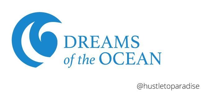
submitted by @hustletoparadise
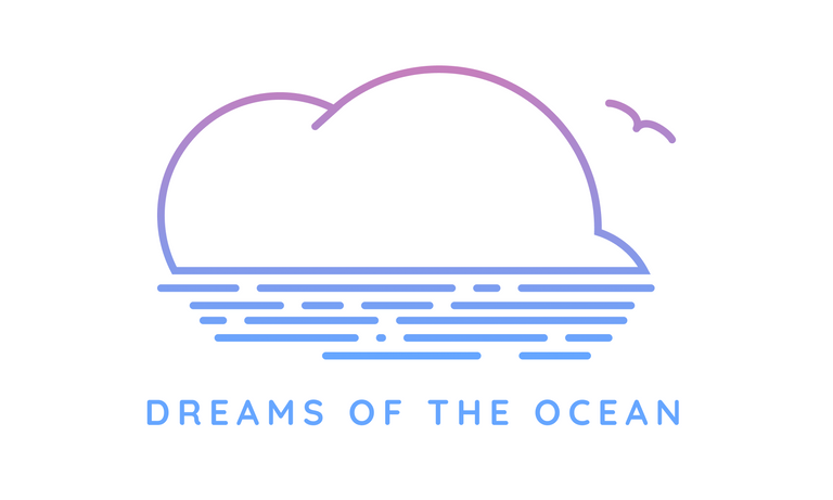
submitted by @sjennon
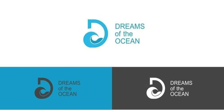
submitted by @podanrj
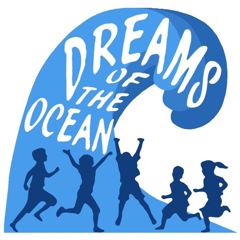
submitted by @dksart
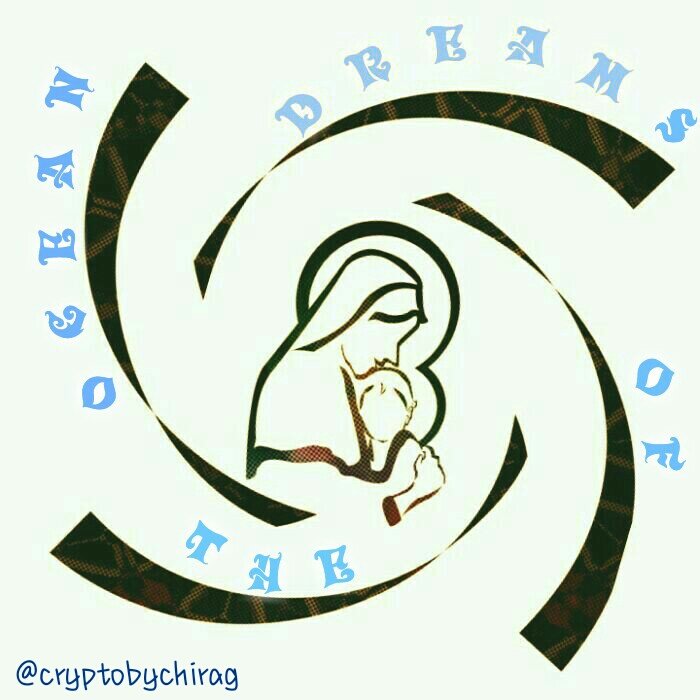
submitted by @cryptobychirag
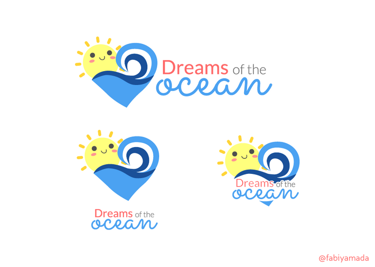
submitted by @fabiyamada
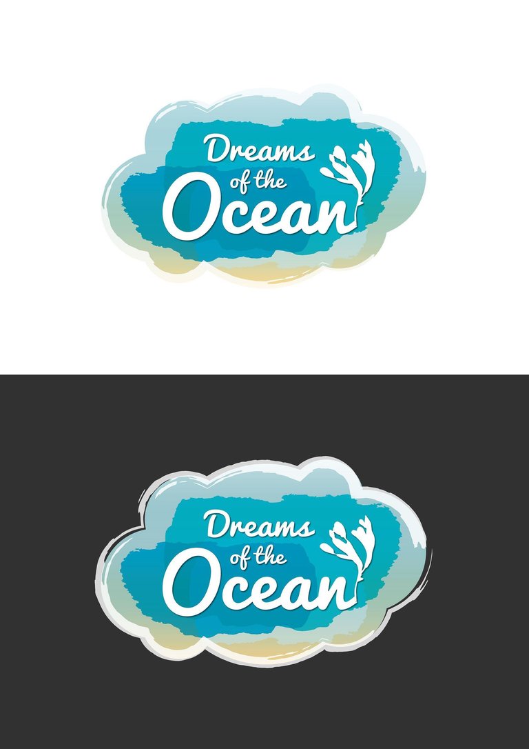
submitted by @miawallace
submitted by @mr-monk
submitted by @apprentice001
submitted by @jaldesign
submitted by @thaiprincess
On Tuesday 24th of October the competetion ends, so you can still vote for your favourite logo and/or submit an entry if you want to participate HERE! The winner(s) will be rewarded with $150 SBD so it's worth the action :-)
It's for a good cause: the winning logo will accompany all of the future activities run by @dreamsoftheocean.
I'm looking forward!
Have a great Sunday, steemians 💙
Marly -
For further details on my charity initiative please start following the account @dreamsoftheocean or stay tuned for the live-stream from this year's steemfest where the project will be presented.

Thanks for your valuable time!
This blog was launched at the end of July 2016
aiming to provide stories for open-minded
people who enjoy living on the edge of their lives,
stepping out of comfort zones, going on adventure,
doing extreme sports and embracing the new.
Welcome to the too-much-energy-blog!
PS: Don't forget that this is a troll-free zone.

Original content.
That's not the entry from @sjennon :-)
haha yes sorry I updated my comment. Classic copy/paste betrayal ;)
If you want to vote for this entry you should jump over to the original post and upvote it there. In this article your vote won't count.
You can upvote HERE :-)
On it thanks @surfermarly! <3
lol borderline troll there...
joking.
see logo. not one from the moment we see. but, the logo must be created through the system. proportion and composition. of all that exists, I choose @podanrj. simple and good, and running on the system. this one gets from the professional from him. see the post on his page, he made something of the elements and guided the system logo. in his post said, the logo is a combomark that can be separated between icons and text. upvoted, make your branding as standard, and the message contained in the logo.
Right. U understanding aboutit. Good bazla
@podanrj Has the better design
the @podanrj grey and white one is really nice -- i can see that working everywhere..
Thanks for stopping by and sharing your feedback!
If you like you can upvote your favourite logo HERE :-)
my bad. on it.
No problem, just trying to catch as many votes as possible for the participants :-)
yes mam. steemfest 2 soon huh? :) yayayay.
TIC TAC! If you're hearing a strange sound in the back it's my heart beating!!! haha
My vote to @podanrj. he make awesome logo. Upvoted
It is a very difficult choice.
All the best for this new beginning! I like the D of @mr-monk but I would put the letters with a more parallel way. (forming a rectangular like @podanrj (whose logo I prefer in terms of typography)
My vote to @podanrj
i following resteem ur post
I like the one from @mr-monk Thank you for your contributionism, Cheers ,Damir
Then you should jump over to the original post and vote for him :-)
HERE :-)
Good jop
My choice is @fabiyamada. I like when the logo is a mix of words and pictures in a pretty bubble :) Hope you find the perfect one for your pretty soul.
You could jump over to the original post and vote for your favourite one though.
HERE :-)Thanks for your lovely words, @teodora!
That is my favorite too.
Does need a little fine tuning maybe.
It epitomizes "ocean life" and "happy dreaming".
Since it's for kids, I like that one best, too!
It's not directly for kids, it's about kids. But the ones who should be attracted by the logo are people who are willing to participate (contribute / donate). So it can't be "too cute" :-)
OK then I would go for the Mr. Monk one. Very clean and attractive.
You could also upvote his entry if you want. That would be done HERE :-)
I like the logo of @hustletoparadise and @mr-monk. Simple but nice.
Thanks for your feedback! You can upvote your favourite logo HERE :-)
I like the Mr. Monk one :)
Thanks for your feedback! You can upvote him HERE :-)
Already have :)
Great, thanks for your support!! :)
no probs, I'm following your charity page now too. As a fellow lover of the ocean I look forward to seeing what you do.
Cool! I'm very happy to hear that :-)
The very first activity took place yesterday and it was a complete success. I will publish the results very soon!
@miawallace really caught my attention dear Marly!
Thanks for your feedback! You can upvote her HERE :-)
I just did Dear Marly, happy to read from you after a while.
Yeah indeed! I'm full speed preparing my presentation for steemfest, hehe
How are you doing?
I saw that we were dealing with the same troll here on steemit (doodlebear). Hope everything's alright now :-) I banned him from my blog.
hahahaa, really?
That dude got issues, i was told he is on Vigilance so i will let Steemit deal with him.
Have been awesome, got myself some wonderful team. Have you seen them @steem-lagos ? We having the First Steemit Workshop in Lagos Nigeria Come Next week Saturday. Hopefully i can afford next Steemfest After this one- Wishing you all going to Lisbon Godspeed.
That is good news :-)
Oh I just jumped over to @steem-lagos, what a great initiave. I will resteem that and follow the team. Very cool!!
Thanks for your wishes :-) See you in the life-stream then!
Thanks Dear Marly, you are the Best!
Can't wait to see you as a female Witness!
my favourite is the logo from @sjennon. to me it is the incorporation of dreaming of the ocean.
HERE :-)Thanks for your feedback @claudiapeters! Then you should give her a vote
Wohoo! Thanks for the support :D
Thanks for your lovely words, @teodora!
WOW! Pin em' up and throw a dart at them already! They're all fantastic! I really could go for any of them. I do however like the kids at play under the cresting wave............ dksart.
Oh no, I had just left my comment here and it's gone..... Nasty network :-(
OK, again: You're totally right, they're all brilliant. I'm happy that we have so many talented graphic designers on steemit, well skilled people in general!
Hope you're fully enjoying your Sunday @stillwater :-)
I am and you as well! The kids and I are on the couch watching Halloween cartoons while mama sleeps in! Coffee in hand with my two boogs! :)
Oh, that sounds terrible! Haha :-)
Love the scenery
I like the one on @mr-monk
Life is a matter of choices, and every choice you make makes you. - ....one of the best lines....
and the first logo is awesome
Hmmmm - great initiative @surfermarly but a hard one to decide here - also depends on visual way of looking at it from a business, charity or other perspective. Personally I like the ones (the right one) by @blueorgy and also the suggestion by @dksart
Thank you, Uwe!
I think first of all it has to stand for "trustworthiness" since charity needs to provide confidence.
It can't be too business-like, since we're talking about a project with/for kids. However, it needs to have a serious look & feel (no 'bling bling' :-)).
I won't talk about my favourites so far but I have them, too :-)
ok, in that case my vote goes to @dksart
upvote and comment done plz do for me also @mdatiqurrahman
I choose the logo designed by @mr-monk. It is powerful and clear.
Do you want to vote for him? Then you can do it HERE :-)
makes me aww and wonder about the project. :)I am just in love with the one submitted by @fabiyamada
You may want to vote for her HERE :-)Thanks for your feedback, @sumsum!!
first of all...good job!! I thought its going to be hard to choose one, but the fact that it has something to do with kids, made it quite easy for me. will vote on the original post. 😉
Go for it :-)
Thanks for your support!!
After looking at them all, I must say there is one that stands head and shoulders above the rest:

This one is the "triple overhead" entry, riding high. It is clean and simple, and it beautifully combines the Steemit theme with the theme of waves.
Congratulations, @mr-monk for your beautiful work!
😄😇😄
Triple overhead, haha! Nice way of describing a logo :-)
You might want to upvote your favourite one HERE :-)
Btw the first charity event was a complete success. Yesterday we had the first group of kids in the water, here's a snapshot from these legends (many more to come soon):

Have a great weekend, my friend!
PS: That was my third attempt to reply to your comment.... uaaaaaah nasty network :-P
Hey Marly,
Thanks for persisting! Yes, a lot of us are struggling with the user interface for now.
Congratulations on the success of your first outing with the kids, and Thank You so much for sharing the photo!
Also I did go and vote for this at the other link, thanks for the tip!
Hugs,
- @creatr
the one from @mr-monk is simple and clear
You can vote for him if you like :-)
The only thing you'd need to do is jump over to the original post and upvote the logo you like HERE :-)
done it ✔️
I like @blueorgy one more! Though would change the wave pattern a bit, but it looks great. Few others are good, but they look too pretentious, like an oil company or cruise ship company:)
It's funny that you mention these companies. I was thinking about airlines :-)
Yeah, it has to submit trustworthiness but it can't be too business-like. Charity for kids needs an element of ease, effortlessness,...
We did it (yesterday's first charity action):

Then his logo fits even more:) Well done with the action! :)
Thanks :-))
Vote for @hustletoparadise
The most like simple and cute little @blueorgy.
I like this one :
@thaiprincess is my choice. Great entries and so many!
Your post was mentioned in the hit parade in the following category:Congratulations @surfermarly!
wow. Amazing, many commented, but there are some who may not understand this. when you write and can not write, then learn. Essentially you have to learn before you do anything. and maybe you should read (STEEMIT TOS). just do what is right. Thanks u, this can be helping to other user in steemit.
my vote to podanrj. awesome logo
This is clearly the most superior; well done @mr-monk! :-)
Cg