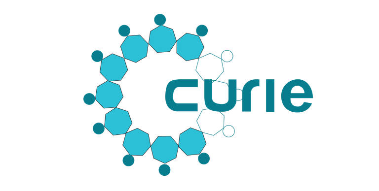
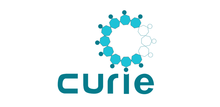
For Curie’s logo contest, I decided to create a logo based on community. This was created on Adobe Illustrator.
The first thought that came to my head was bees, that’s right bees not cees. A beehive is a thriving community that works tirelessly to produce honey. I found this metaphor to fit the work Curie does quite well.
A community of individuals dedicated to helping the steem community grow by promoting hidden gems. Thus spreading sweetness around.
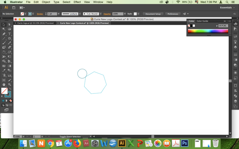
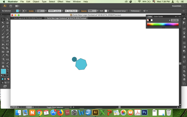
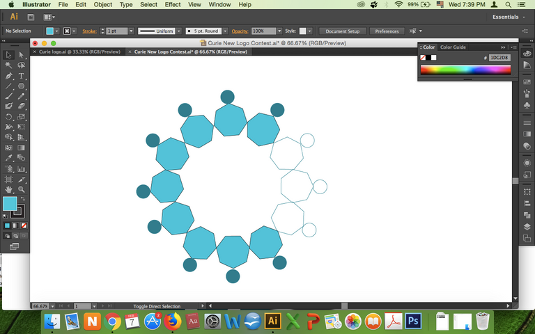
My first thought was a circular hexagonal image representing a beehive. But I wanted to refine on it.
This was my first draft. I was brainstorming with my friend @diebitch and we realized that perhaps the circle shouldn’t be complete.
So I thought about it and it was staring me right in the face, C for Curie. I did chuckle to myself at the B and C joke.
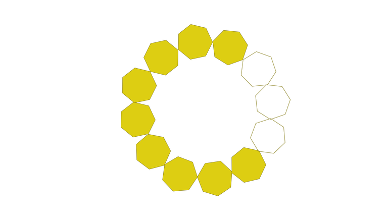
Now that I had my foundation in place, I wanted to incorporate the sense of community that Curie brings. This time the answer came organically, as I started drawing heads on the hexagons.
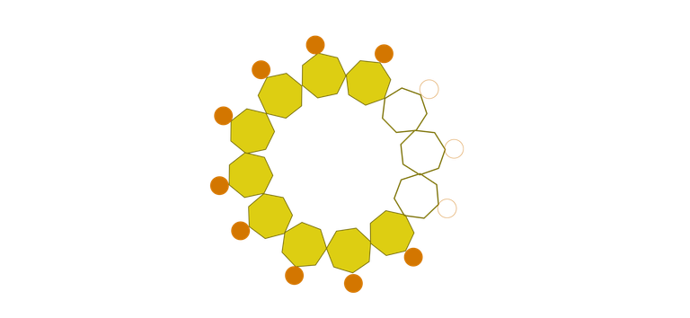
So the art began to take shape. I was still skeptical about the colour. I wanted to mute the colours to be more businesslike and tie it to steem. I tried with a variety of colours , as you can see but one clearly stood out.
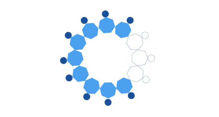
I began to experiment with the shading to see which effect is aesthetically more pleasing.

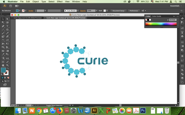
This variant of blue is subtle and unique. The next step was incorporating the curie text.
Again, I was plagued with three options.

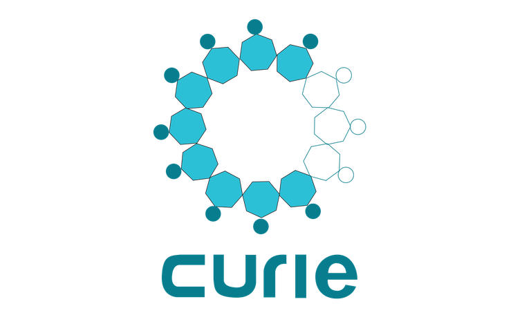
I liked the i being incorporated in the second one but it seemed off-centre. So, I went with the first . Here’s are the results:
More options
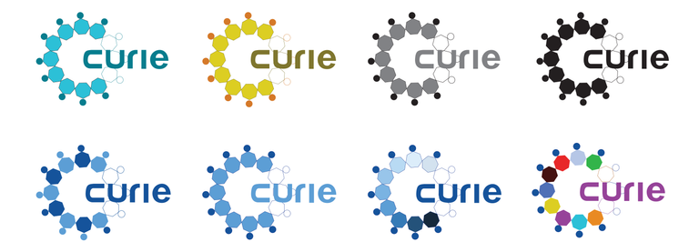
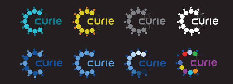
The logo on black background
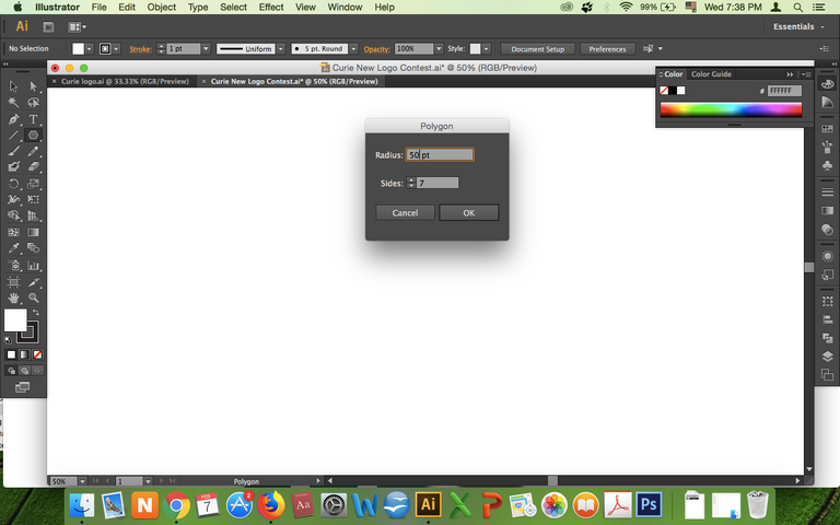
The processing of making mark of logo

its freaking beautiful :)
great job maty
Thank you for ur supported
Thanks for showing your workflow, nice design too. I did some logos for this contest too, see my blog or contest entry.
thank you
Whoa really coo.
Thank you, you should join too :D
Thanks for sharing your design process! I especially like the different color one. Good luck! Rooting on your entry!
yes me too like the different color it means that pplz comes from different nations can join to community.
I've never resteemed a post before, but this one definitely deserves it! Love how you detailed the whole process. Content like this will get you far!
hehhee thank you for supporting
Love this! I also like the one with the fading blue color. But it's just hard to decide which one is the best! I like the bees concept here too :)
thank you :D
hehe :)