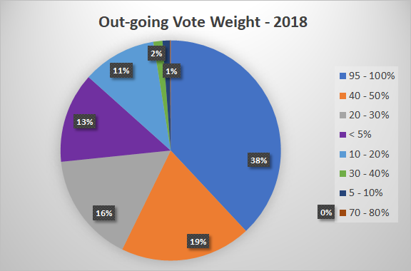
Pressure is on now to represent your chart with a pie!

Looks good to me. The ranges (required for a pie) give clues, your chart shows the exact weight and gives a reasonable representation of the number/% at each weight.
Should have left it to the master ;)
.
I don't have a single 80-90% vote cast this year - might as well for for the full monty!
.
.
.
.
Nerds.@abh12345 @crokkon
.
My pie looks like a 5 year olds work compared to the plot graph. Thanks though!