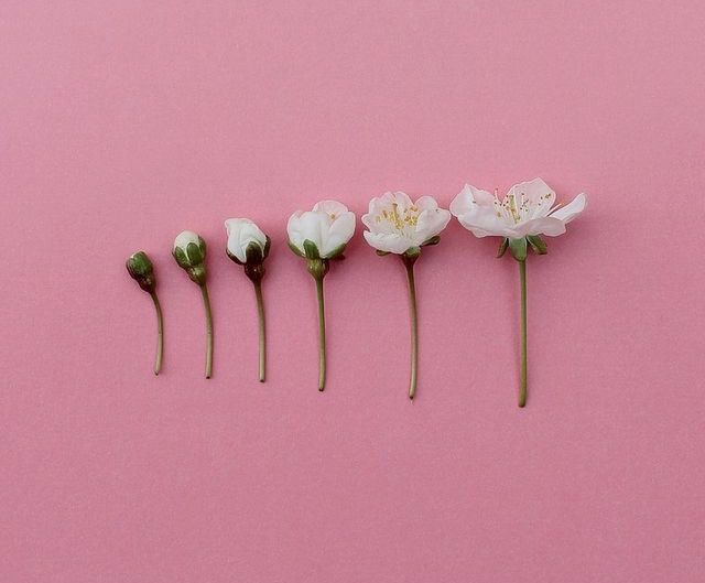
I prefer the first design. The cover is simple but very expressive. The first time I saw it, I have a small hint of what the book is all about. Unlike the third one, the woman on the first cover is vivid and the fragments are shattered smoothly. The texts are well-arranged too. Simplicity at its finest. Though, I prefer other shade for the background rather than a coral pink. I'm not really sure of the color though. 😅 But yeah, maybe a lighter shade like a vintage shade of pink or what. Classy and girly.
You are viewing a single comment's thread from:

Thank you! I ended up choosing the first book cover, though I kept the initial color. ;0)