Hi there! Hope you had a great summer and enjoyed yourselves in spite of the pandemic situation. As you may have noticed, I was absent from Hive and published new posts sporadically.
I have not given up on blogging, nor lost my appetite for writing. I simply got incredibly busy. I found myself working on too many projects and focused more on those with a strict deadline. Thus, blogging daily on Hive took a back seat for the moment.
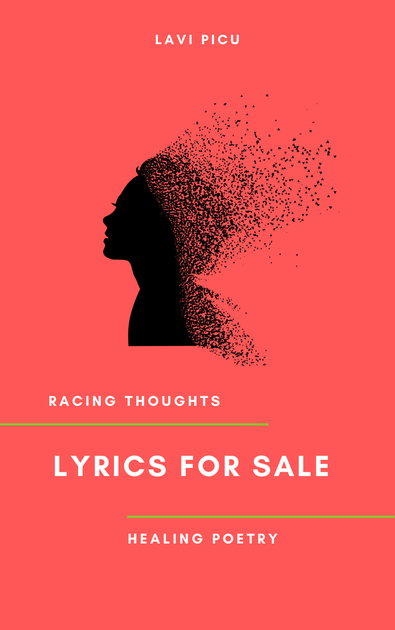
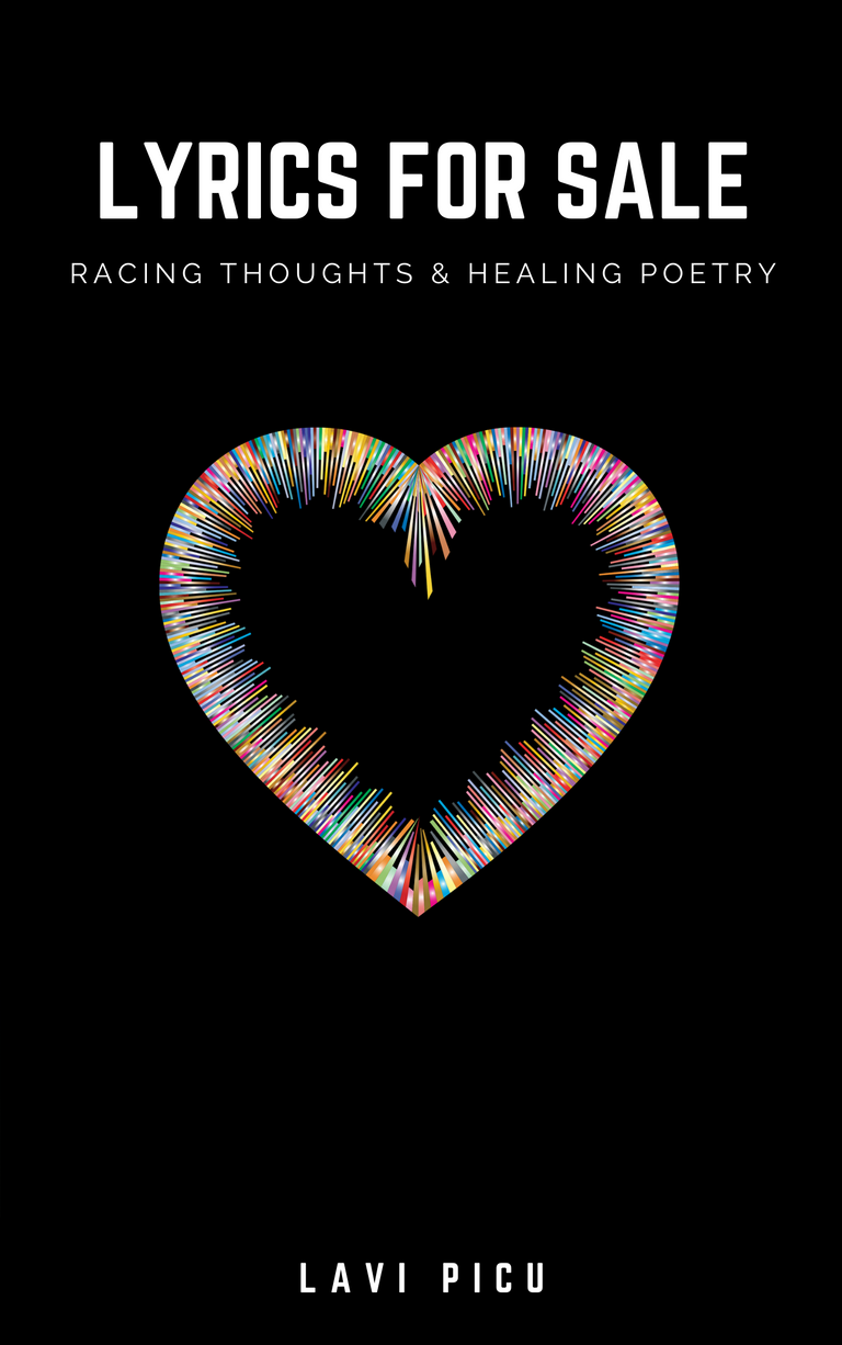
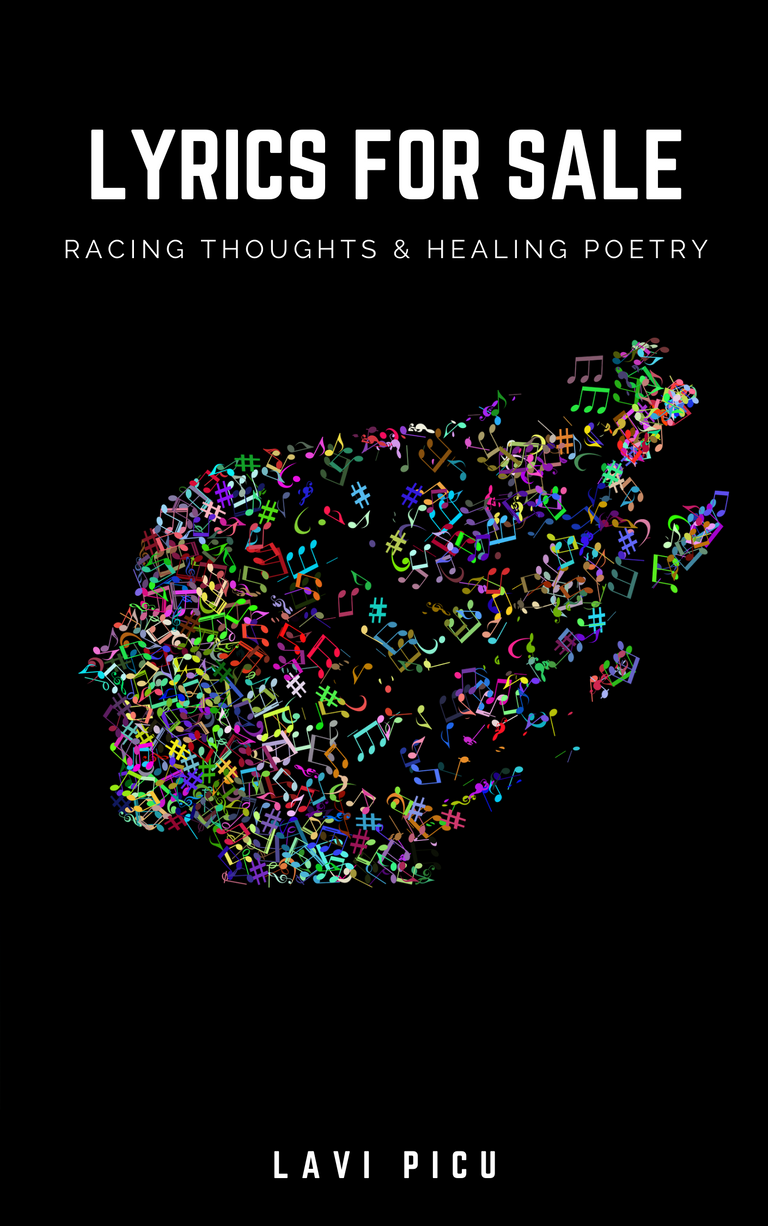
Meanwhile, I have finally managed to finish my 4th poetry collection and I am currently in the process of selecting a book cover for it. Thus, which one of the three images below looks more appealing to you?

Drop me a comment below sating which one attracts you more. I would really appreciate your feedback! Initially I had eight choices but I managed to narrow it down only to three.

I am drawn to the first and the last one, but I learnt from experience that I should not rely on my own opinion.

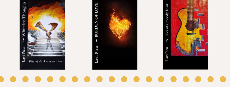
My previous poetry collections had a black background for their covers. For this reason I am having mixed feelings. Shall I continue the series with a black cover or shall I switch to another color?

To give you a quick insight on my new poetry collection: it`s an emotional journey, that takes you from all stages of a relationship, with racing thoughts caused by anxiety, sickness, and fear that will finally head towards self-love.
I will have a more detailed post about it, once it will be published.
Thank you for your feedback! Have a wonderful day!
I'm undecided between #1 and #3. I prefer the background colour on the #1... but I prefer the shape used in the #3. 🤔
I hope this helps...
Thank you for your feedback!
Pick one? I'd pick #1.
It may be because my default motorcycle color is red. But I really do like the design and feeling of #1 the best.
I hope that helps, but and I both know that it's your decision to make...
Thank you! It was not easy to pick one and having a poll on it made my job easier. The first cover made a better impact on people than the rest. I am beyond late with this reply, sorry about that!
You know, I'd be interested to see the graphic on number 3 with the background colour of number 1.
I did give it a try, but it did not turn out too well. I preferred the first one over it. Sorry for the late reply!
No worries! I'm sure you've got more than a few things going on. Did you get to choose one of the covers?
I chose the first one for both e-book and paperback. Guess it was a good choice cause I had few sales in the first day it was listed on Amazon. Hopefully I will get some reviews for it, that will certainly help. ;0)
Oh nice! I just found it and pre-ordered the Kindle version.
Thank you! Hope you will enjoy reading it!
i love the first one.
Thank you! That was my favorite too!
I'd pick #1 but I don't like how the title and subtitle are placed on it.
Thank you! That`s the one that got the most amount of votes.
So, have you decided on one then?
Good luck, by the way. :)
All are great designs... it's hard to choose, 1 is a bit loud imo but still a beautiful design maybe it would be easier on the eyes with a cream or off white colour, 2 and 3 are also great. My personal preference right now is 3. I hope this helps and good luck with your book. 😀
Thank you! All replies helped out deciding which one to choose. ;0)
I like #3 the most. ^^
Thank you!
Most welcome! ^^
Have an amazing day!
~Josie~
I like #3 overall. I like the graphic in #1 but not so much with the layout of the typography.
Thank you!
I like the first one.
Good luck on your book :)
Thank you!
I prefer the first design. The cover is simple but very expressive. The first time I saw it, I have a small hint of what the book is all about. Unlike the third one, the woman on the first cover is vivid and the fragments are shattered smoothly. The texts are well-arranged too. Simplicity at its finest. Though, I prefer other shade for the background rather than a coral pink. I'm not really sure of the color though. 😅 But yeah, maybe a lighter shade like a vintage shade of pink or what. Classy and girly.
Source
Thank you! I ended up choosing the first book cover, though I kept the initial color. ;0)
I realize how hard it is for you to choose ... if it's hard for me too, even though I'm not involved with anything.
Indeed, 1 and 3 are better and I am leaning towards 3. I hope it helps and I wish you much success with the new book!
Thank you! I chose the first one.
You know better!