Challenge:
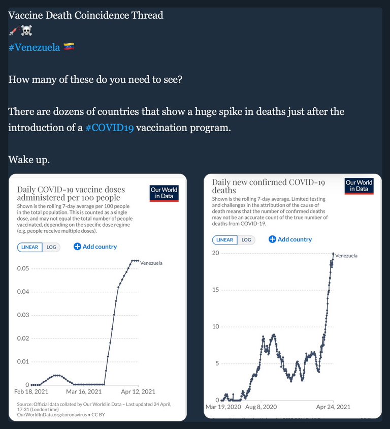
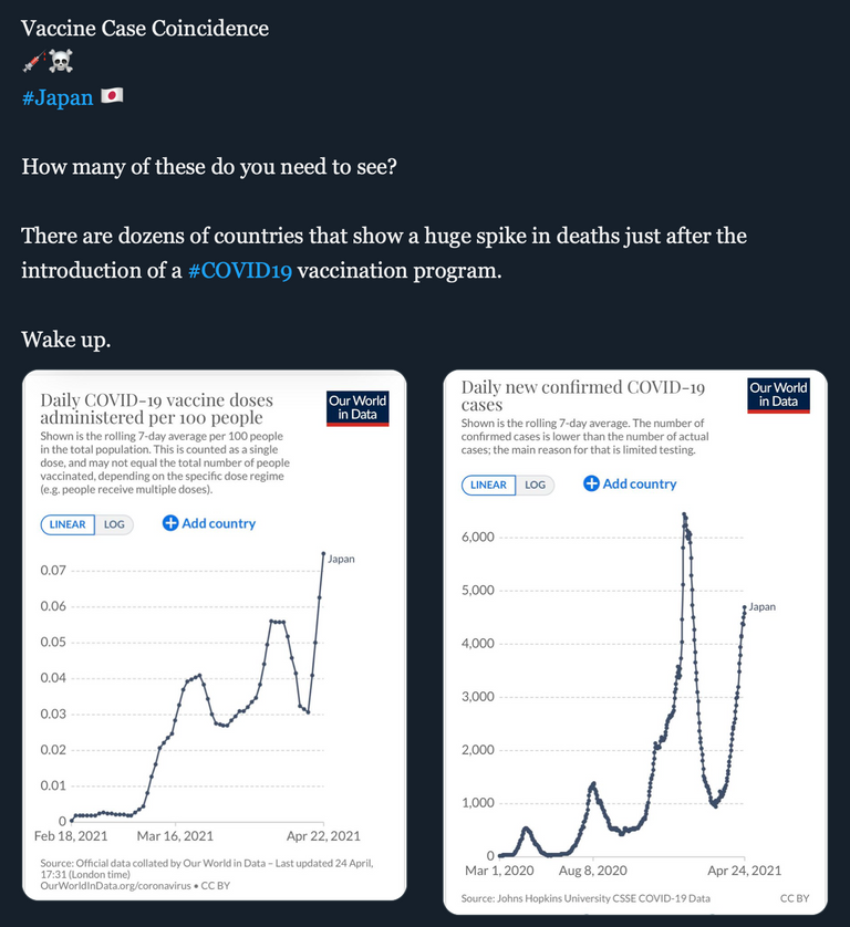
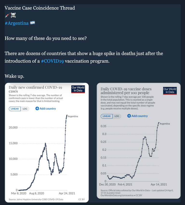
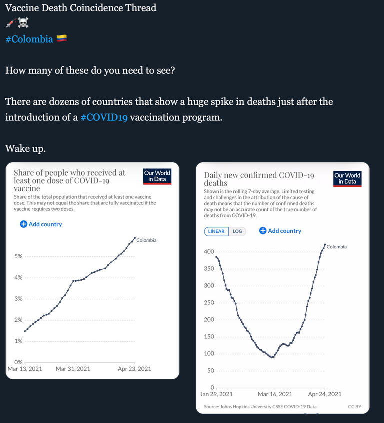
Anyone care to humor us with the "correlation does not equal causation" argument after taking in these snapshots...?
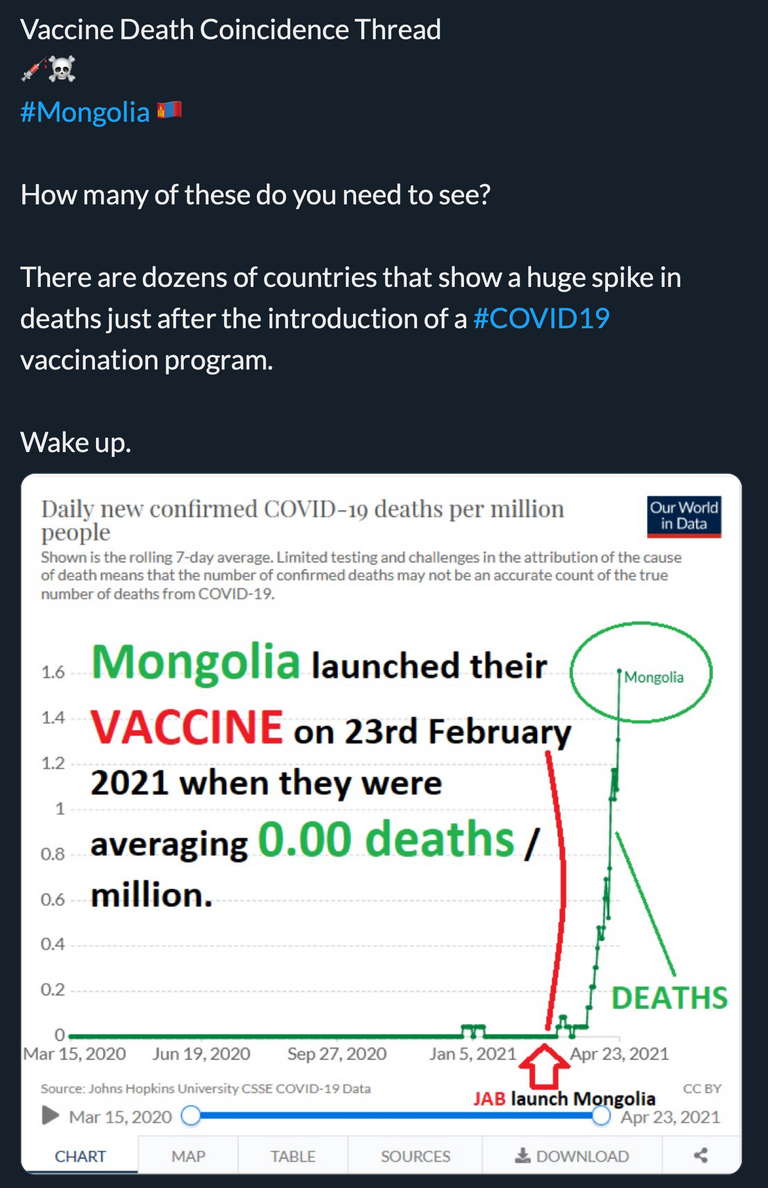
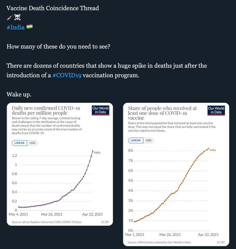
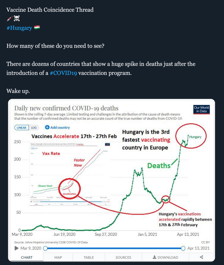
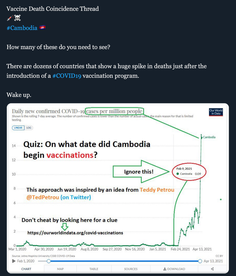
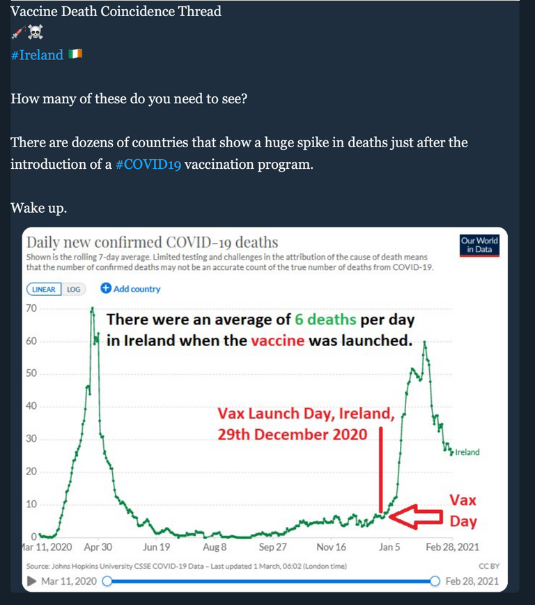
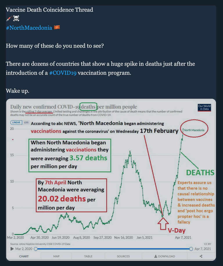
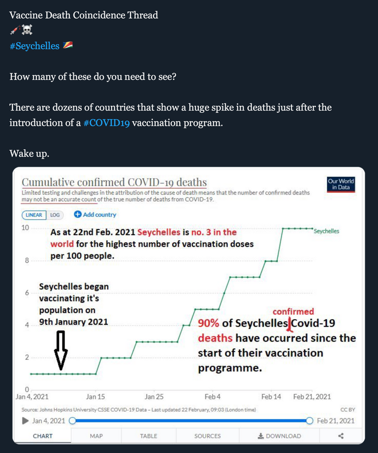
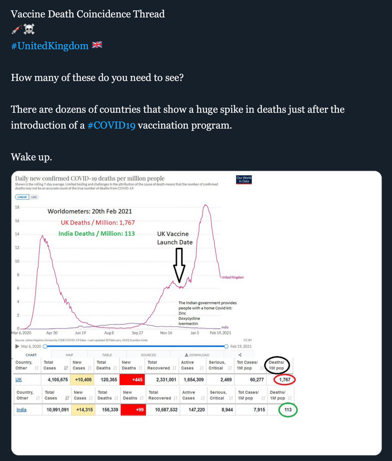
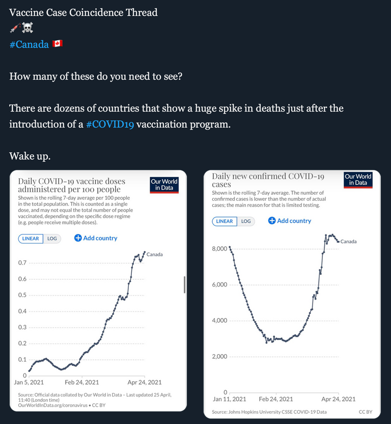
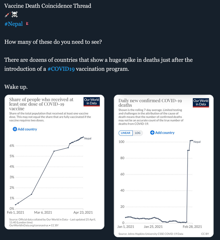
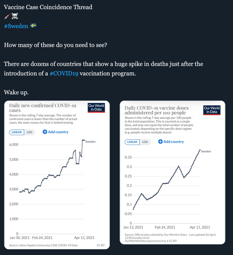
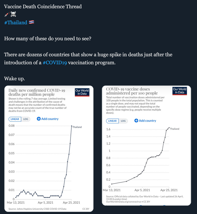
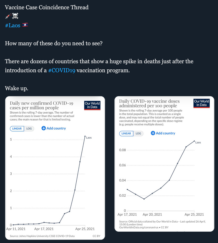
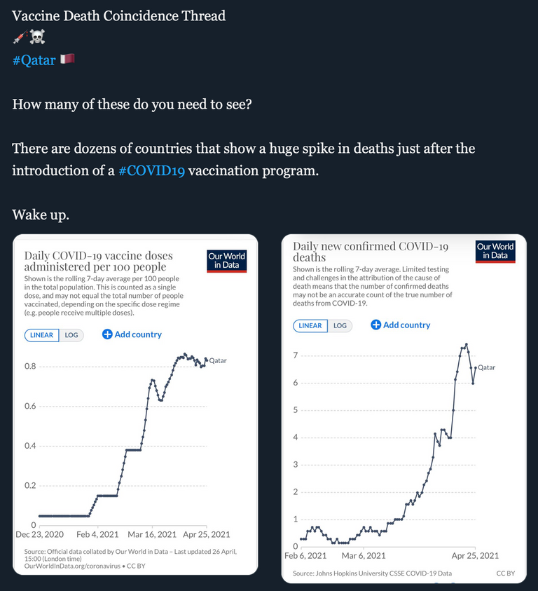
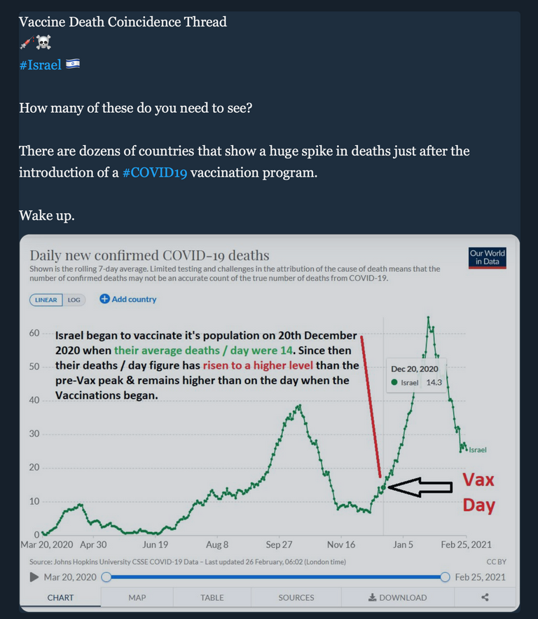
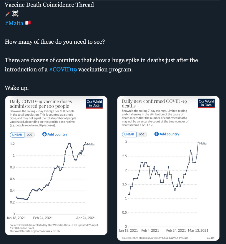
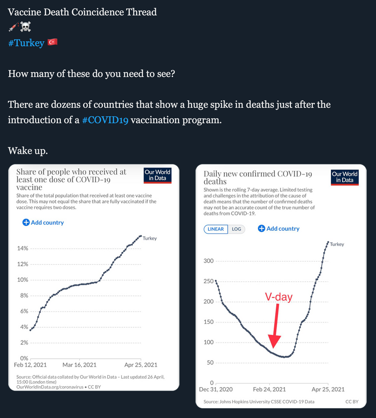
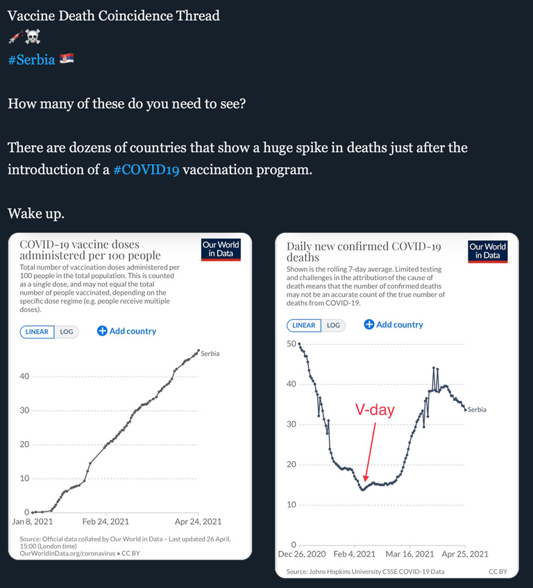
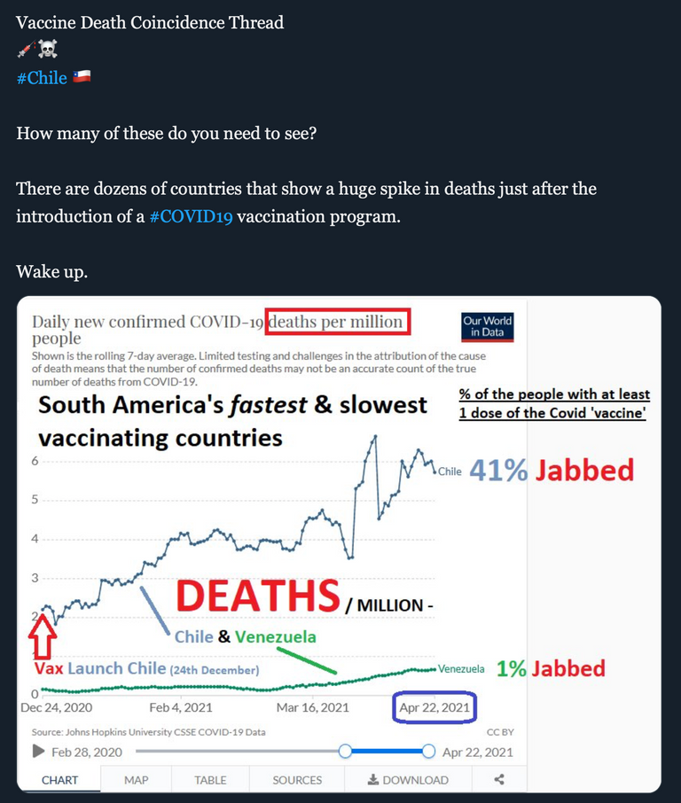
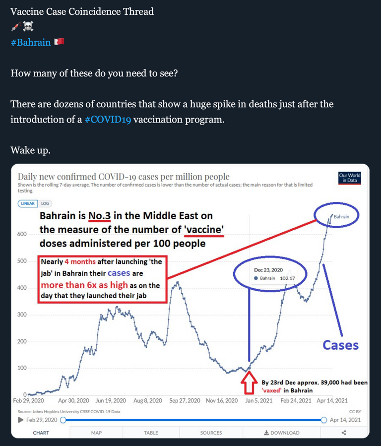
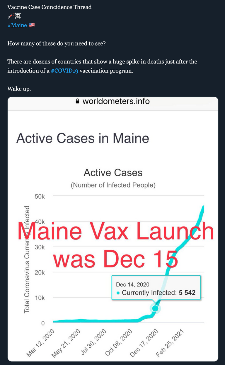
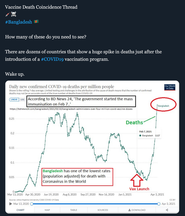
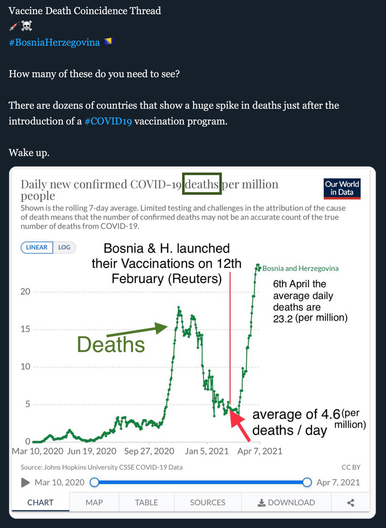
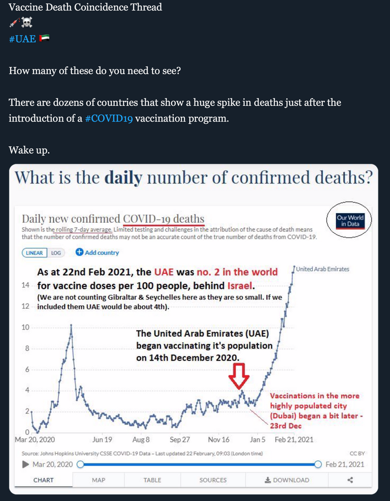
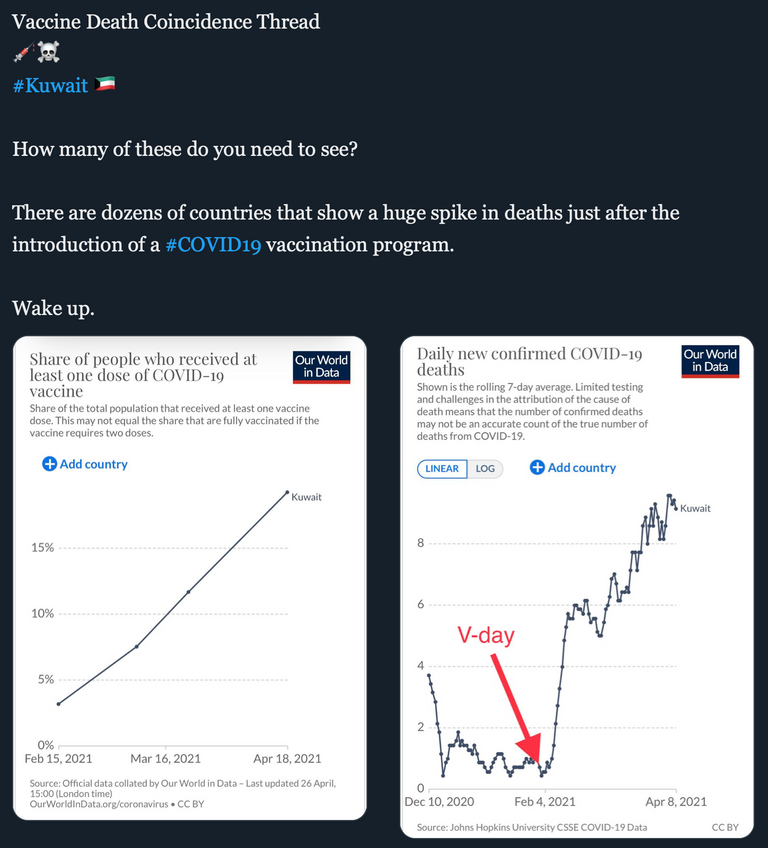
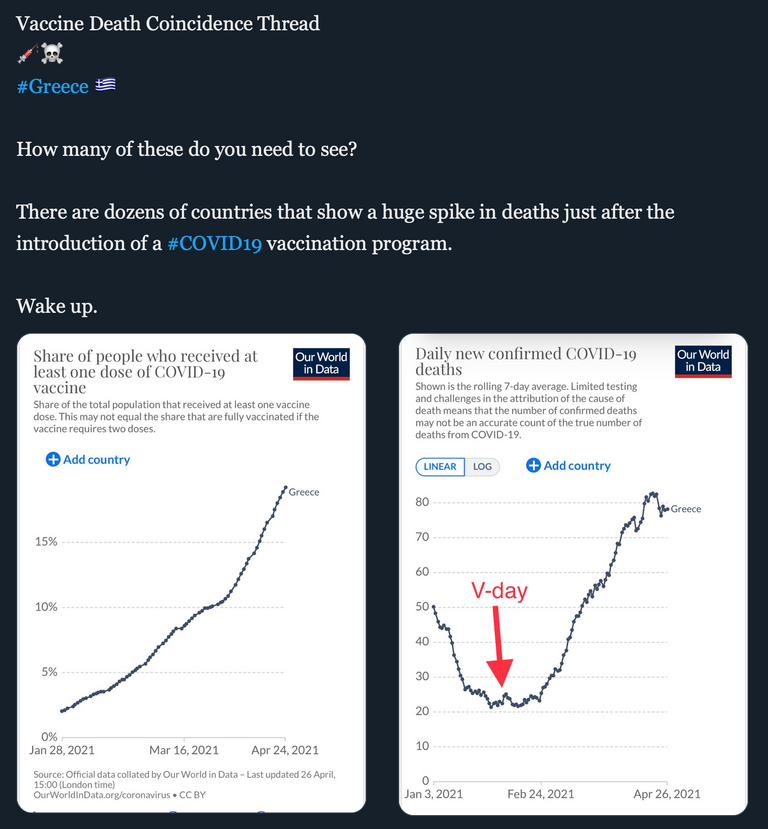
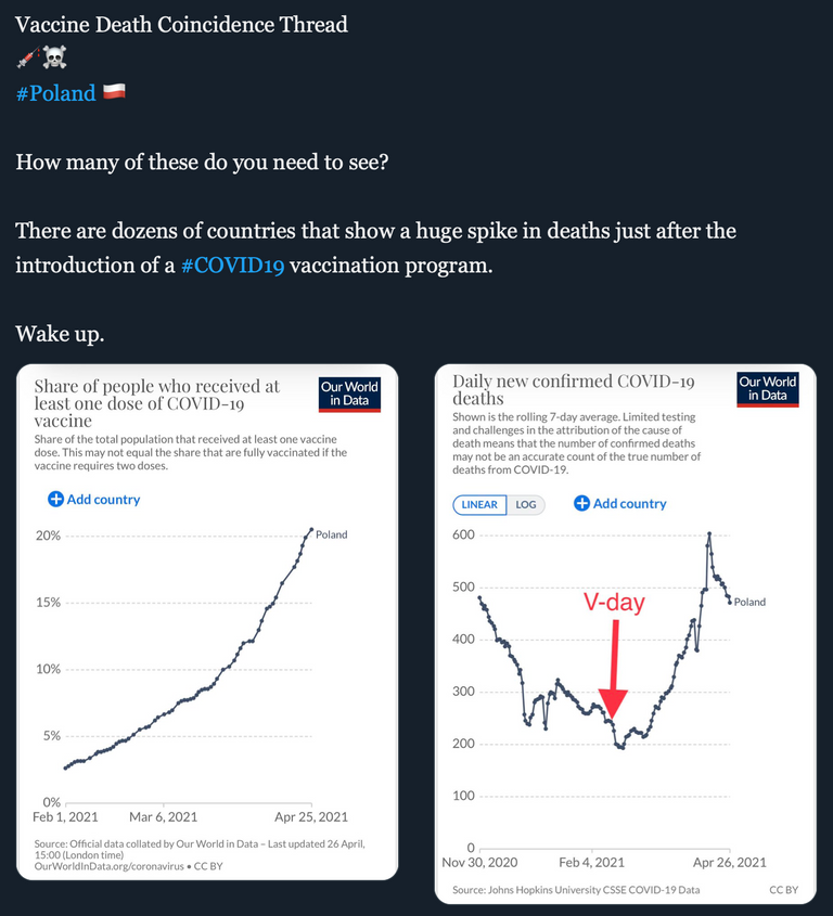
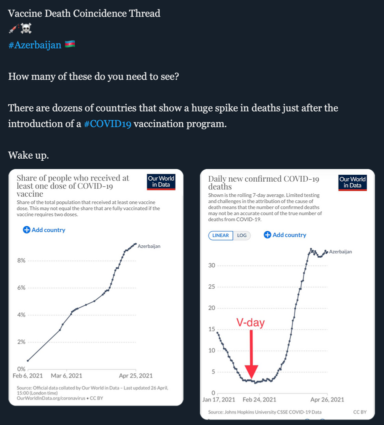
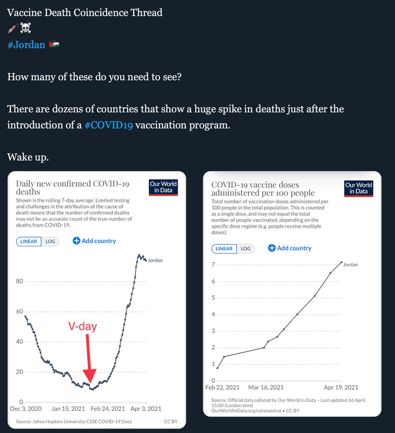
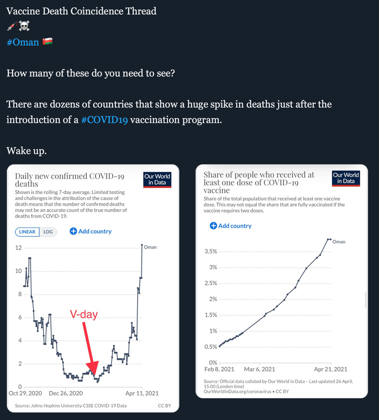
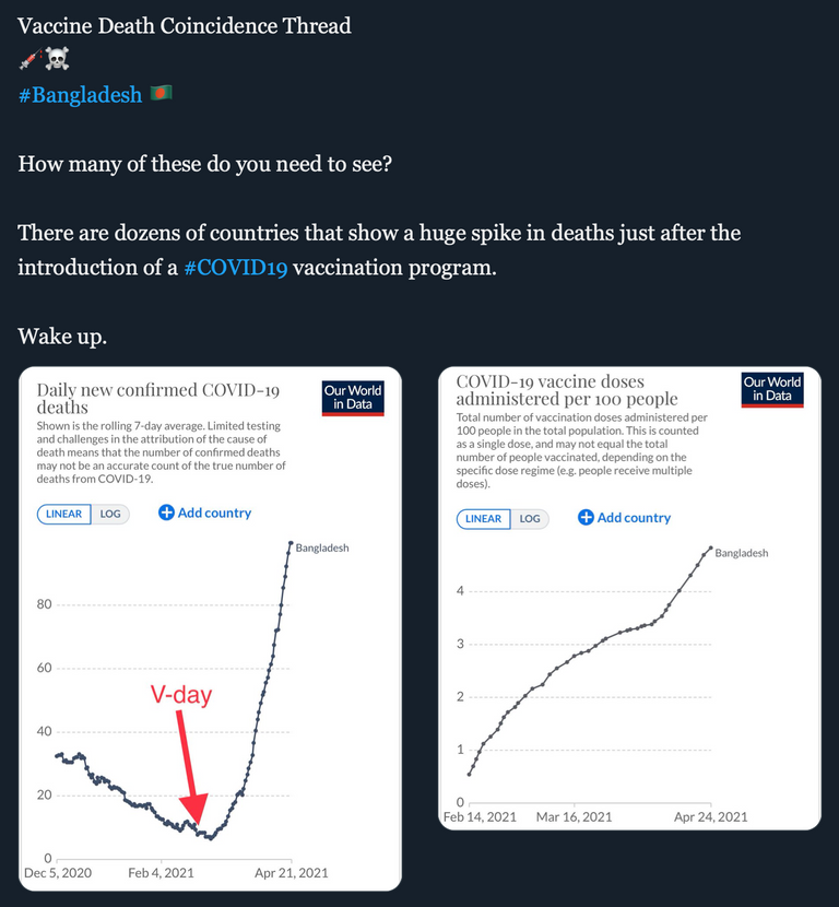
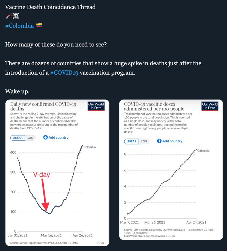
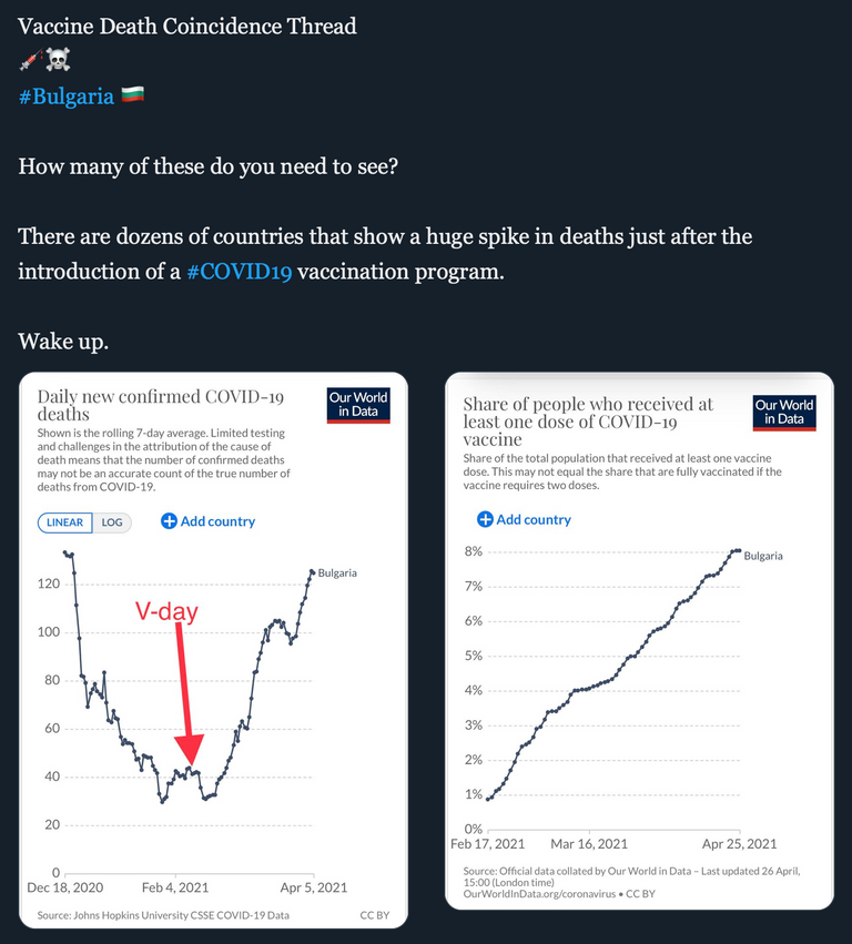
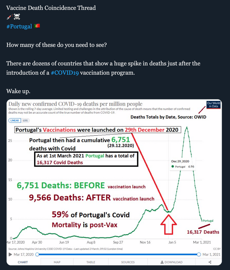
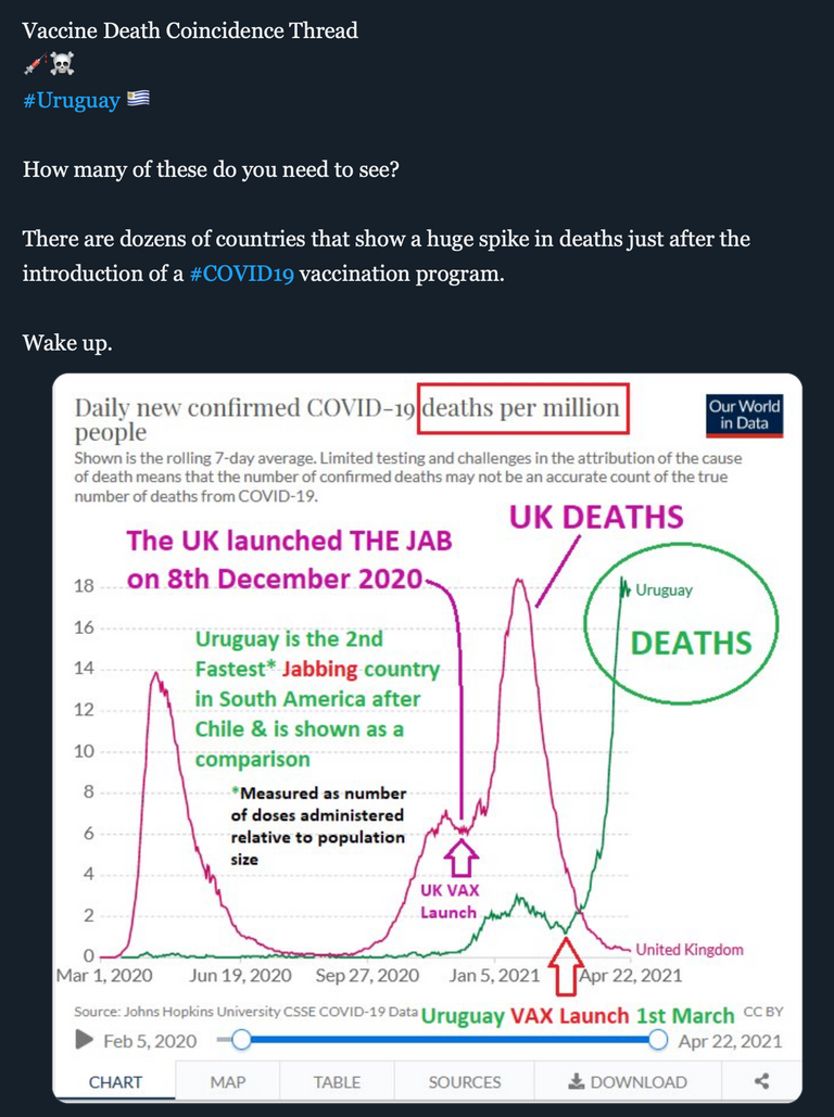
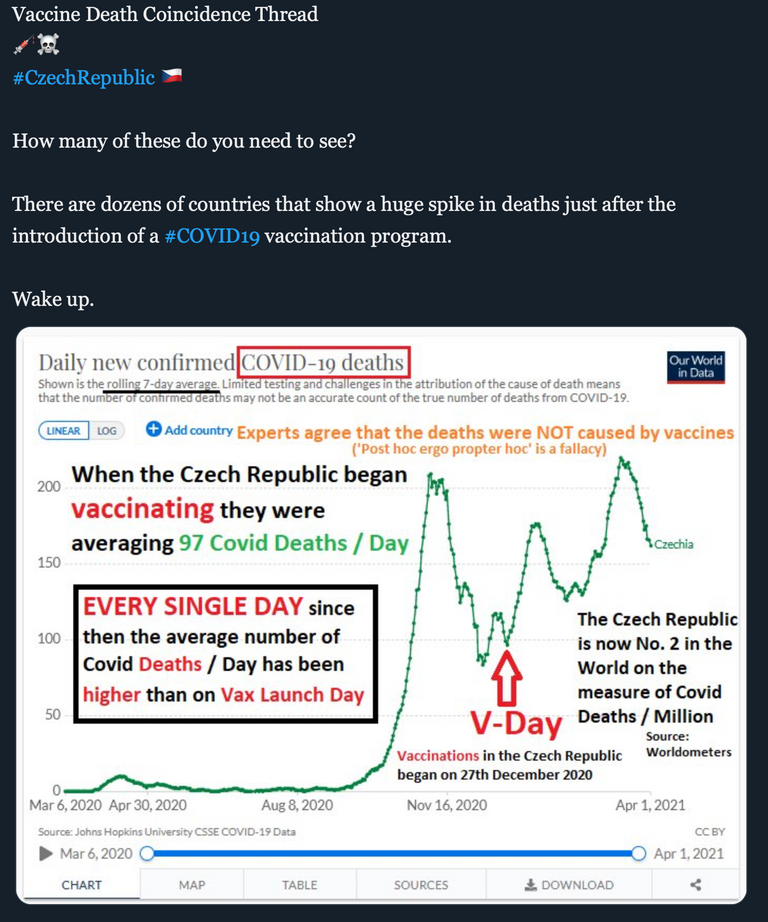
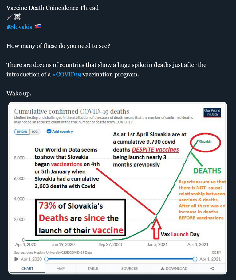
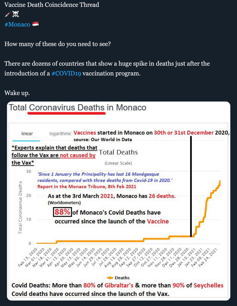
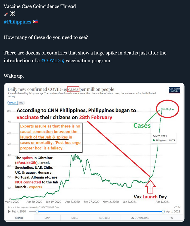
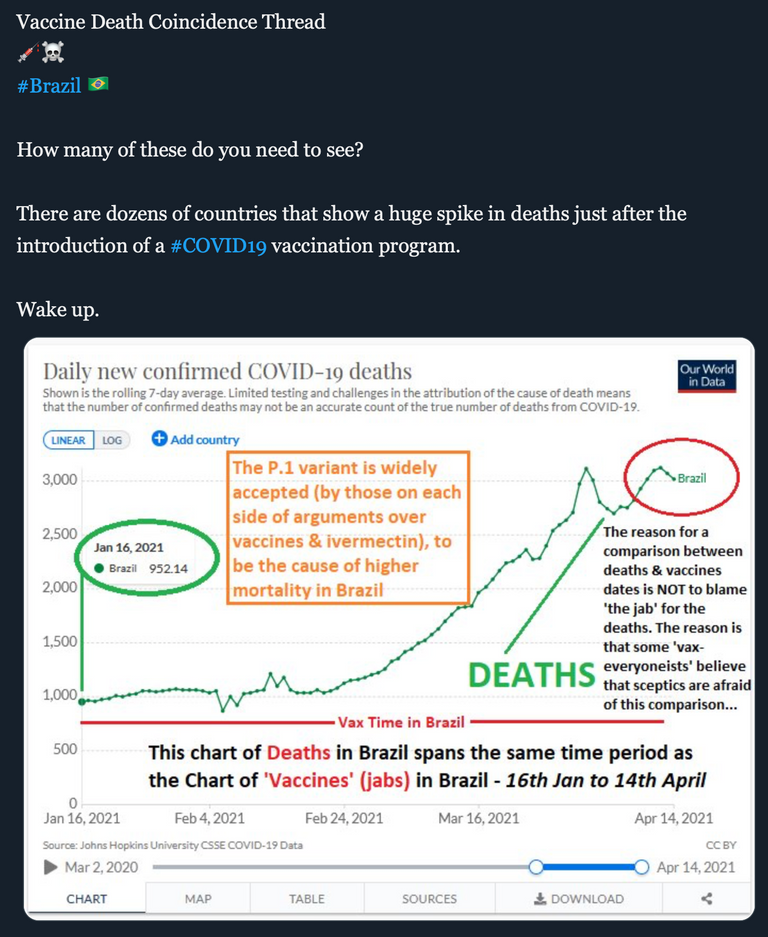
~ source
Challenge:
Anyone care to humor us with the "correlation does not equal causation" argument after taking in these snapshots...?


~ source
Thanks for this.
I have printed it out along with this article which first highlighted the issue and handed it to someone I know who is senior in the Israeli Health Ministry who is going to pass it on to the relevant committee.
Eugenics, population control, the great reset, whatever the fuck it is called it is evil. The fact that so many are SO willing to blindly go running to get injected with an experiment that changes their DNA is really telling. This is proof of the degeneration of the human mind, the ability to think clearly and rationally that has been bred out of so many people. It really is astonishing to look around at the masses of brain dead people just doing what the glowing box tells them.
The problem with graphs is they can be interpreted in any way people want to interpret them, depending on what they're most wanting to corroborate. For example, with the UK one, the vaccines may have started in December when they had a surge in covid cases and by all accounts it was spreading like wildfire. However, the deaths peak at the point where they were rolling the jabs out in a much bigger and more public way. Prior to this it was more of a testing faze and not many were vaccinated. So one could say that there weren't enough people vaccinated to stop this spread at that time, but with the big rollout the deaths decreased rapidly.
I can only speak for the UK graph in this regard as I have family there and my finger on the pulse a bit more, so to say. However, if this pattern goes for all the country graphs shown, I'd still be questioning why every single rollout coincided with an increase in covid cases.
Factor in more stats like the amount of post-vaccine deaths rising 8x in the US alone. Try pulling figures like those for all the countries in question and recalculate...
You don't need to convince me. I've been trying to convince my sister, but for everything I cam pull up, she's got something that puts it in a different perspective. I've been trying to find something indisputable; sadly, I'm too late anyway now, she's had her first jab.
You're not going to find many people who will pull up all the figures, especially if it's something they don't want to see. I don't have the time or health to do much on it myself. I really appreciate those who are putting these things together and the links are valuable. I merely pointed out the graph thing, because it's an easy thing to pull up and dispute.
The link owasco has left is some scary stuff. Did you see the Health Ranger video before the c started, pretty much warning us about the pattern we've seen from the start of the virus?
Just checked for Serbia. They also started to vaccinate early.
There is a slight correlation, but still a postive one.
vaccination started January 20, 2021,
death rate started to rise March 3, 2021.
Thanks for putting this all together.
Many will never see, not, at least, while they are still in the bodies they have now,
And you think all that's bad? Check this out
https://rumble.com/vfyvcn-critically-thinking-with-dr.-t-and-dr.-p-episode-44.html?fbclid=IwAR0I7-WJMezD1dteblH39SGQOeSuB63C-NWw_TxtTVi8knbZRKu0bcovr8I
This is insane. The scary part is that it's only beginning. Im afraid of what 5 years from now will look like.
No. Nooooo! This is just the coincidence of many many coincidences.
I think, we need info on how people who took vaccine are affected. They say, after 15 - 20 days of second shot, you will develop immunity against the virus. So we need data on that front ?
Sadly, I anticipate the majority data to be collected and transmitted to be highly biased in the favour of $cience. I’d really love to be wrong on that.