Hi everyone,
personally I like option E.
· I would though redesign it with the black / green theme we are already familiar with. it catches the eye and easier to spot.
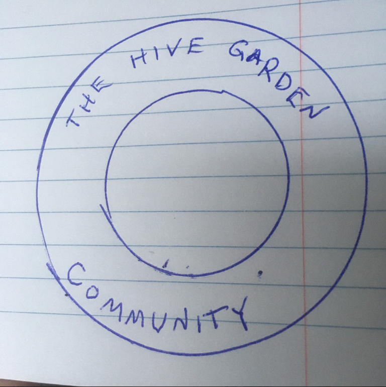
· for easier reading, I would place the text as in the following image:
· due to the small size of the avatar, maybe A / B is better.
cheers.
· Operating in dark mode I could not initially even see it @tydynrain . this is a point to bear in mind.
Ah good point on all counts. I'll add this to the logos and do another post later in week.
👍🙏
Ah, dark mode is the issue! That's very curious indeed! Thanks much for pointing that out, I appreciate it! 😁 🙏 💚 ✨ 🤙
No worries 🙏
Have a beautiful Tuesday! 😁 🙏 💚 ✨ 🤙
Same for you 🙏
Much appreciated! 😁 🙏 💚 ✨ 🤙