Every year or two we change the logo. It's a way of staying fresh, and we get a little bored with the same old logo all the time. We have even more of a reason to freshen it up this year, as @akiponn is going to distribute some stickers in Graz for the Hive Creator Days in May!
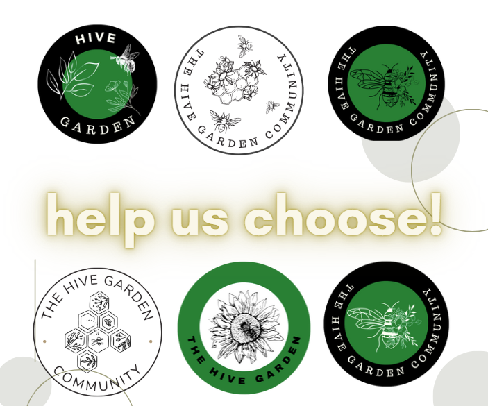
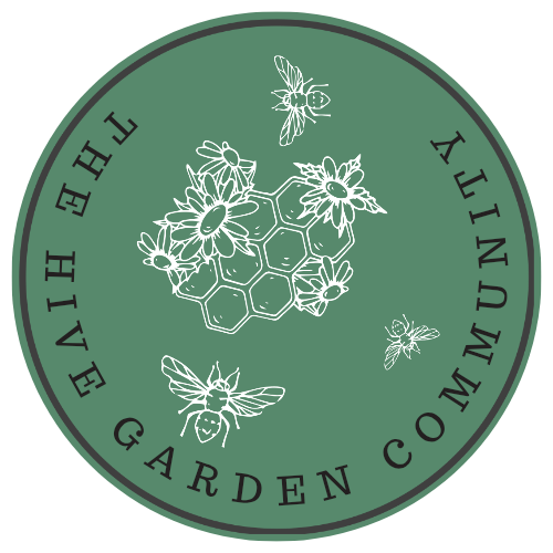
So, we need YOUR help - here's a few new logos we came up with. We really think it should have the word 'community' in it. They're designed on CANVA and we think the image of a bee or a hive and garden images of course make sense. Our old logo just says 'Hive Garden', but we're quite liking the 'THE HIVE GARDEN COMMUNITY' for the text.
So, here's what we need - either tell us which one you like the best, or tell us what combination you would prefer. For example, you might say 'I like Option B, but change the text to '.............' and change the image to be the same as the image in Option C'.
You might not like any of them - that's okay too! Ideas are absolutely welcome!
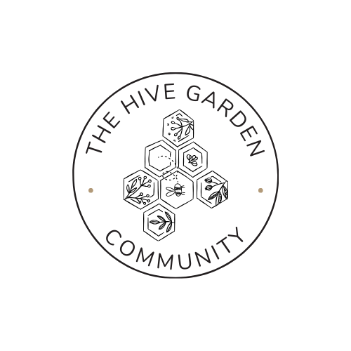
Option A
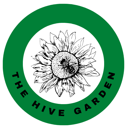
Option B
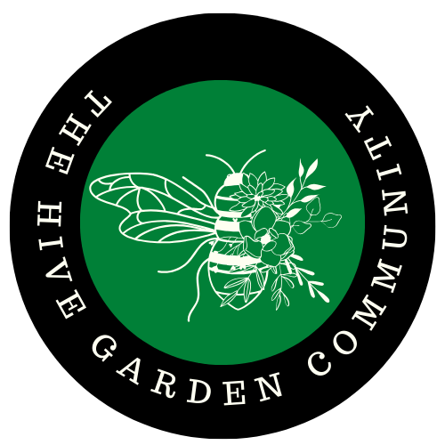
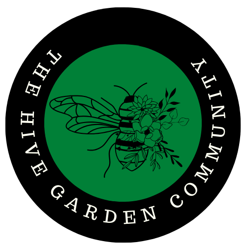
Option C
Option D
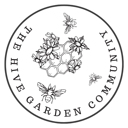
Option E
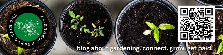
This is just a quick mock up, but I envisage the stickers looking something like this. I'm not sure of the size yet or the colours or text or anything else and would appreciate your input! I have to go cook dinner, so I'll play around more tomorrow. Please let me know what you think!
Sorry to tag you all, but we'd really love you to participate and help us make a decision! You might like to choose different colours, fonts, images - anything you like! Please comment below - we'll upvote the good comments as well!
@plantstoplanks @jude9 @sofs-su @nikv @owasco @umirais @vesytz @buckaroobaby @farm-mom @thebigsweed @polesinns @andrastia @multifacetas @amygoodrich @jenthoughts @fanyokami @isdarmady @anafae @tanjakolader @yolithy24 @andrastia @minismallholding @goldenoakfarm @sanjeevm @nainaztengra @rem-steem @almi @leoplaw @denmarkguy @akiponn @dodovietnam @fermentedphil @galenkp @ifarmgirl @tomidiwirja @tengolengo @mysteriousroad
@ciadanmea @kennyroy @simplymike @dodovietnam @babeltrips @trangbaby @kaelci @shanibeer @proto26 @ifarmgirl @artemislives @edprivat @meesterboom @momogrow @antnn @luckylaica @blingit @traisto @fotostef @tydynrain @hindavi @steven-patrick @vibeof100monkeys @samstonehill @anttn @friendlymoose @jacksonizer @ciadanmea @tuocchu @gertu @artywink @dora381 @stortebeker @zakludick @maytom @juwell11 @chuch @maxdevalue @travoved @sunscape @alt3r @ninahaskin, @housecatharsia @promisedland @chidiadi65 @bigorna1 @actioncats @lifewithchel @aichel @hadrianwild @zekepickleman @futuremind @smithlabs
We support gardening, homesteading, cannabis growers, permaculture and other garden related content. Delegations to the curation account, @gardenhive, are welcome! Keep an eye out for our weekly writing prompts and our monthly #gardenjournal challenge on the 1st of each month.
Opting C is the most aopealing to me
In my opinion, option B is more suitable. The colors on the bees and flowers look more modern. The white color provides higher contrast against the green background, so that the appearance of the element stands out more.
Option "A" is very okay and do not need a change, i think the logo and the text on it should be used, thank you.
Option C to me.. Just dropping by and telling what i like.. :)
Option E because of the honeycomb
The hexagonal structure represents organization and natural beauty. This can symbolize the structure and order within a community.
Also each cell in a honeycomb is connected to others, symbolizing the interconnectedness of community members. It shows how individuals can work together to create something strong and cohesive.
Here are suggestions for the logo design:
Expand the Honeycomb Image:
Stretch the honeycomb image from Option E to occupy most of the central space in the logo, ensuring it stands out prominently.
Simplify the Design:
Remove the bees and flowers from within the honeycomb to reduce visual clutter. This will focus attention on the honeycomb itself.
Reposition Secondary Elements:
Consider placing the bees and flowers either between the text elements or just below the honeycomb to maintain their presence without overwhelming the design.
Color Scheme:
Adopt the color palette from Option B to unify and enhance the visual appeal of the logo.
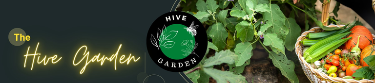
For some reason the last two images are not rendering correctly in Ecency, but the one that I like the most is in the cover image, bottom-left. It's clear, simple, and visually pleasing. 😁 🙏 💚 ✨ 🤙
Hmm, yes it's not loading here either. Ahhh..are you in dark mode?
OK, I'm glad to know it's not just on my end. Yep, I am. Light mode blinds me....lol! 😁 🙏 💚 ✨ 🤙
I like the option A the bee with flowers on a green circle with black border, it simple but elegant. The bee represents the name hive and the flowers represent to the garden.
Im in for option B
It feels like the logo needs to have some green in there because garden=green.
But uhh...I can't read green and blue on black...so uhhh...the white as contrast in there is better than in A
Good point!
I really like option B, with the drawing with white strokes and a dark background the bee stands out more and I think it would look great in the community ❤️
I love option B. The logo is beautifully designed and the bee at the center is in white color which attracts the background color on the side.
Option E but it needs to be Green...
Option B
Option B is my favorite.
I like the option 1 😀😀
Hi everyone,
personally I like option E.
· I would though redesign it with the black / green theme we are already familiar with. it catches the eye and easier to spot.
· for easier reading, I would place the text as in the following image:
· due to the small size of the avatar, maybe A / B is better.
cheers. · Operating in dark mode I could not initially even see it @tydynrain . this is a point to bear in mind.
Ah good point on all counts. I'll add this to the logos and do another post later in week.
👍🙏
Ah, dark mode is the issue! That's very curious indeed! Thanks much for pointing that out, I appreciate it! 😁 🙏 💚 ✨ 🤙
No worries 🙏
Have a beautiful Tuesday! 😁 🙏 💚 ✨ 🤙
Same for you 🙏
Much appreciated! 😁 🙏 💚 ✨ 🤙
Option B 😍
This one
What's your reasoning?
The hibiscus and the 🐝 bee are good description of a garden.
I like the simplicity of A, but I like the color style of C better.
So, A in the style of C 😄
Like this?
Oh, I actually ment this one:
I thought that was A. But then in the color style with green border, white center.
But that's just my opinion 😉
Your opinion is always important to me!
Thanks!
Ha, I'm so bored of that one and I really don't even like it anymore! I'm glad lots of people said Option B as that I can live with :P
Oh, that's the original one 😂
I didn't even notice that.
Then I go for option C.
I'd suggest E BUT I'd like it to have the green background throughout with either white or black outlining. I think the black is more drawing of attention, similar to Option A. The plain black and white just doesn't do it, but I love the design.
Kinda like this?
Yes, but the green was more grass, less sage.
Delegations welcome! You've been curated by @plantpoweronhive!
I like Option B. FWIW, on PeakD's UI, in Night mode, one can barely see Option D. And can't see Option E at all.
Option B, or Option E
But I prefer to option E. For me, the image in the center means a lot and connected with Hive
Option B -- bright like sunlight, beautiful, details easy to see and enjoy! I can make out every flower petal and leaf -- the contrast of white against that rich green makes a nice visual harmony with the white lettering on the black ring.
I like Option A.
Simple and neat looking. the logo speaks for itself. It says we are about gardening. the bee is multipurpose as it represents both hive platform and gardening. so I like option A. I think the black color bee pops more than the white color bee on the green background.
All are nice. While black and white ones are stylish, I love to have green as a plant lover. So C with “community” in addition to the text?
I look forward to printing and bringing the stickers to Hive Creator Days in May 😊
Ohh, they are all good. At first glance I would go for A, but I would like to see E with a bit of colour as I like the detail of it and yes I think community should be in the logo xx
Option A and E are my favorites.
of course you are right by changing the logo it will look new and beautiful, I am not good at designing images and logos but in my opinion option a is very interesting but it would be even more beautiful if the image in it was replaced with the image option d regarding the writing it is very good in my opinion, sorry if wrong🙏
@gardenhive, I paid out 0.927 HIVE and 0.298 HBD to reward 11 comments in this discussion thread.
I like the B with the Bee the most!
I think this logo is the best in every way and I have multiple reasons for it.
Hi, Opzione B =)
Option B. The bee and the distribution of colors stand out and I feel that they represent the meaning.
Nice logos - current one is good as well
B looks good - maybe some more color on the Bee to match the outer black color - so just stripes and head to be black as in first one
Then you have three colors black, white and green - outer black part of logo and part of the bee (head and the stripes), white outer letters and bee outline with wings and green in the middle
Or you add these changes to option A - basically a bit A and B option to combine
Others just need some color combinations and they are good
@gardenhive what about logos for each season maybe - so spring logo, summer logo - it may look nice
They all look beautiful and make good reference to the community. I love option C because of the black and white center that gives it a subtle, timeless feel with that flower, in combination with the strong, intense green that reminds us of the modern of the present. In any era and time, gardens will always be present in those of us who appreciate the beauties of life. 😍🍀🍁🌿
C