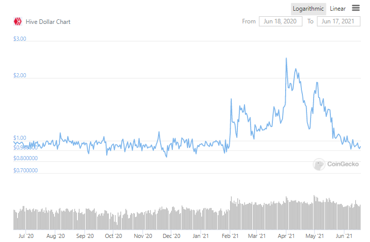
You should use a log chart (or a volatility metric) to show stability, because at lower prices the same level of volatility appears more stable on a linear chart.
(That is not to say it is not getting more stable, it's just the better way to present it in a chart)
Incidentally this is the last year on a log chart:
