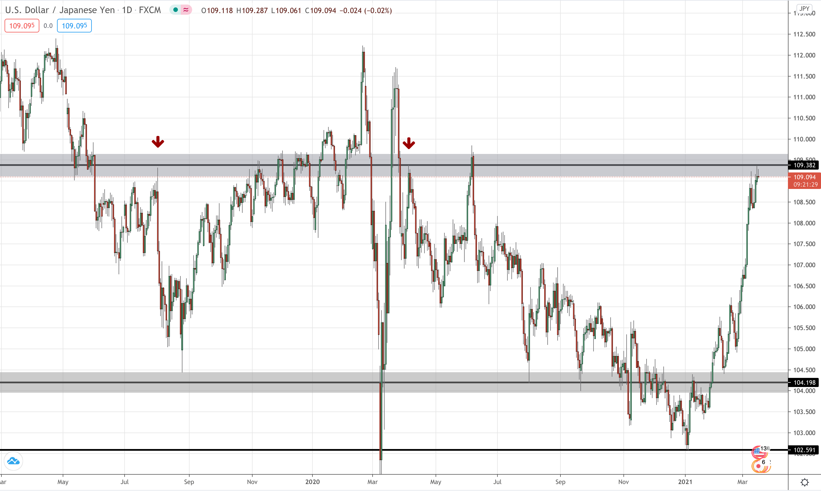
In all my charts, the grey zone is resistance on the daily chart which I call 'higher time frame resistance'. The higher the time frame (so daily, weekly, monthly), the more important it is.
The grey zone on that chart is drawn because the sellers rejected it big, multiple times. The following chart and my thoughts are in this blog:
USD/JPY Daily:
After I've determined whether price is above or below higher time frame resistance, then I zoom into an hourly chart to look for an entry like I have in this particular blog.
Posted Using LeoFinance Beta
