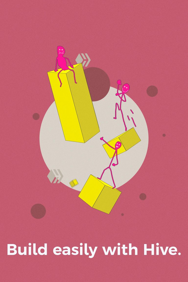
Thanks for sharing your thoughts! Much appreciated. This is exactly what I tried to display in this sample with the muted pink, white, gray and vibrant yellow (and tried to see if sticky-figures would work with the vibrant pink).

Thanks for sharing your thoughts! Much appreciated. This is exactly what I tried to display in this sample with the muted pink, white, gray and vibrant yellow (and tried to see if sticky-figures would work with the vibrant pink).

That's a lot of pink ... but muted pink is calming ... the sticky figures do stand out ... but the Hive logo is lost ... since the Hive logo has so many places to play in it, my thought is to let that replace the circle, and maybe let your sticky figures and building blocks use that space...
Ah, the sample is just a 10-minute sketch and is focused on the usage of color. I would love to see more shapes/objects from the logo being used.
Oh, for ten minutes that is exceptionally impressive ... as a study in color it certainly works!