Briefing for HiveCreators: Development
Third report for my @HiveCreators collaboration, note to Enrique: please leave a comment under the briefs for approval of the phase / and DM or place a comment for feedback. This report is all about Phases 3 (and 4). I have done quite a bit of research and visualized an idea/concept in my head that I started to develop. It is going to be pretty cool (IMO), and something that could completely refresh Hive's visual appearance and improve Hive's Web3 presence. These are one of the most important phases as it kind of reminds me of standing in front of an intersection. Deciding which way we're going will have an effect on the rest of the Visual Concept.
These phases require a CTA to HiveCreators where I need constructive input as we can go forward, and talk about how I can assist with supporting designers. Please read carefully, and throughout, as I move through the phases where parts are pretty detailed and some require more details and/or input. I can answer most of your questions (probably), and please feel free to ask me anything and propose your very-welcomed suggestions.
Note: This one has been taking a lot longer than the other reports that I've been doing. In the middle of it, I got pretty sick and decided to wait until I fully recovered so I wouldn't waste time and resources as it would take me longer. Still very tired and exhausted.
For approval: please comment on this blog post so I can start with Phase 5: Pre-Production
For Feedback: please comment below or DM me in our group chat on Discord.@Enrique89:
Phase 3: Development
In this phase, it is important to start developing what has been discovered. It became clear that a marketing strategy with a combination of targeting new and existing Hive users would result in the best bang for your buck. This is one observation that I couldn't ignore to exclude in my brief, as targeting new and existing Hive users is an ongoing process (Highest ROI). While developing a strategy isn't part of the collaboration with Hive Creators, it's good to keep this idea roaming free in my head before I started collecting and designing. Note to all: this is the reason why proper marketing has a pricetag. It saves so much money in the long run while discovering opportunities. Mapping out do's and don'ts before actual production is pretty valuable as a lot of hours of labor could be prevented, and be more precise.
Must, should, could, and won't have.
The MoSCoW principle won't really apply to my visual concept. The Visual Concept will be more or less a presentation to @HiveCreators including examples and a few guidelines that they can pick up so they can produce content with fewer hours spent on concepts and more hours on pin-pointed production.
Either way, identifying and setting up our must-, should-, could-, and won't have is a great way to prioritize "end game" decisions.
Whereas, the following applies:
- M - must haves: mandatory requirements
- S - should haves: without these, but still deployable
- C - could haves: if there is enough time
- W - won't haves: but could be interesting for future projects
This may be one of the most important steps to identify value and to tell if we thought about it enough. For example does it tick all the boxes? One target of mine for instance is developing a visual concept trying to trigger a positive emotion in the viewer (connecting and remembering Hive). Is this mandatory to make it work? No, but it surely adds value. These debates determine the quality of the end product most realistically.
about why I prioritize the way I do. This way, he can agree, or more importantly, challenge my priorities and introduce his own.In this development stage, I'm exploring and visualizing the ideas in my head into words. What I think they should all have. Followed by identifying priorities, and boxing these items in realistic boxes, so I can present this to @Enrique89 without convincing me why, but explaining more
- Educate viewers
- Focus on positive words
- Prevent usage of buzzwords/replace buzzwords
- Make it about them, not about Hive
- Trigger
I want our target audience to feel that they got rewarded with a bit of knowledge (for free). Everyone should be able to easily understand what is being displayed on the graphics. The graphics also need to define and introduce a new era of Hive graphics that is up-to-date, modern, and from this time.
Must haves
- More consistency in graphics/elements that represent Hive's values and mission
- Graphics about Hive that are easy to understand
- A modern and up-to-date design that speaks to a target audience
- A positive, friendly, and engaging tone-of-voice
Should Haves*
- Graphics that are easily scalable and can be used in a variety of formats
- Unique graphics/elements that stand out from other blockchain projects
- Recyclable graphics/elements that can be used for future campaigns or initiatives
Could Haves
- More designs that translate different segments of Hive
- Animated graphics to increase the chance of engagement
- Additional branding elements/color variations that cover different segments
- More fine-tuned samples
Won't Haves
- Extensive customized/personalized graphics for small(er) target audiences
- Complex and abstract designs that may be more difficult to recognize
The key here is to set focus on what to prioritize first. Once we have established a new fresh modern looking visual concept, we can start producing more graphics, and along the way, we can develop and evolve from there.
Development: Shapes
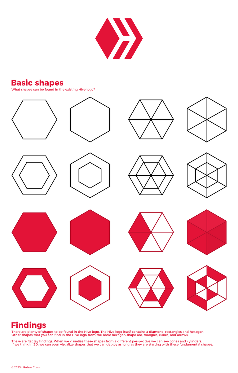
When we want to infuse a visual concept with core HIVE DNA, we should go back to the basics. Where else to begin, with @roelandp's Hive logo? What shapes can be found in the existing Hive logo?
Development: Finding more shapes and elements
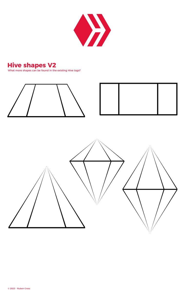
There are plenty of shapes to be found in the Hive logo. The Hive logo itself contains a diamond, rectangles, and hexagons. Other shapes that you can find in the Hive logo from the basic hexagon shape are triangles, cubes, arrows, and some more. People often look at a hexagon as a 3-sided cube, and a hexagon with a thick border could be seen as a 3-sided cube inside a transparent 3-sided cube.
Had to Google some of the English names, these (basic) shapes can be found in the logo:
- Triangle
- Rhombus
- Kite
- Rectangle
- Trapezoid
These are flat-lay findings. We can see cones and cylinders when we visualize these shapes from a different perspective. If we think in 3D, we can even visualize shapes that we can deploy as long as they are starting with these fundamental shapes.
Had to Google some of the English names, but these shapes could be interesting:
- Hexagonal Prism
- Hexagonal (Bi)Pyramid
- Hexagonal Cone
- Hexagonal Frustum
Conclusion: 9 more building blocks to empower Hive
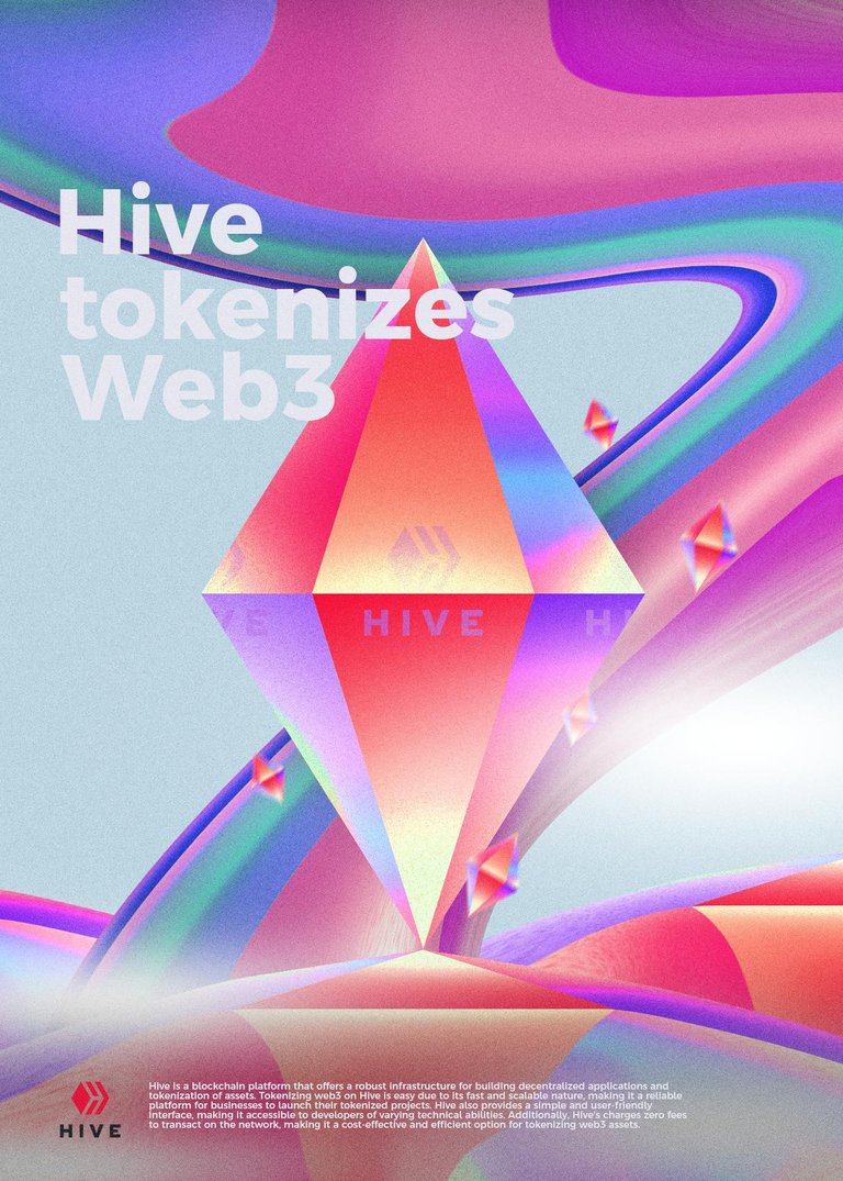
With this simple observation, we are now 9 shapes richer that all come from the Hive logo. If used and implemented correctly, this can become a great addition to the Hive kit. These shapes are perfect to build scenes with, or to use as background fillers, as moving objects, and soon.
Shapes and their meaning
Shapes are just shapes, right? However, if we add meaning to them, we can use these shapes as a tool to communicate and empower specific topics to make them easier to understand. For example, the Bi-Pyramid could represent different tokens in our ecosystem. If we were to shorten the top of the Bi-Pyramid, you'd give a more diamond look and feel to it, where it could represent tokens or value. Whereas a trapezoid could represent a launch pad. Or we can find multiple purposes that are distinctive enough from each other, for example, we could make a Pacman-like character with 2 trapezoids. These are just minor details where each of them would add a bit of value to the broader picture.
Color theory: Hive's current color palette
During my analysis of the Hive brand manual which I haven't included in the discovery phase (but did talk about with HiveCreators). I concluded that Hive's red color code #e31337 (ELEET) is fun and all, it is a fun easter egg if you'd ask me, but the sad truth about it is that it is making a design around it a bit hard due to the harsh contrast color. Sam has similar findings about the current color palette, and I couldn't agree more with her.
While there is nothing wrong with the color itself. It is a great color on its own; it is vibrant and warm and it pops. Changing that color won't be necessary, but adding variations of the Hive logo could open up new ways to brand our protocol. For example, introducing a light (white) and a dark (black) variant of the Hive logo will be sufficient enough to be more flexible for future designs.
The reasoning behind this is that it would suit the complex and broadly offered solutions that Hive has. The logo should be able to be placed on anything, anytime.
Color theory: Trending colors for 2023 and 2024
Since Retro-Futurism is trending, it is a good practice to be looking at old school Neo-Futuristic designs. It helps to understand the use of colors and style. For example, I've re-watched Akira, which is based on a manga released in 1982 that focuses on Neo Tokyo. It is full of futuristic hand-drawn graphics which is exactly what today's Retro Futurism looks like. Since the movie has been quite popular among Manga/Anime lovers, it is a great example of "how it should be done". I can highly recommend watching this movie to anyone who would like to be interested in how Neo Futurism looked back in the day, which is today's Retro Futurism.
Trending colors for 2023 and 204 are Muted/Vibrant colors. These colors are either used in a Flat display or used to emphasize Neon/Gradient colors. This trend started in 2016/2017 when we noticed that 'Millenials' and 'Gen-Z' started a movement to speak up for themselves. This also resulted in BOLD, and ALL CAPITAL font types (we are different, and we shall be heard). 5 years later, this can be seen in movements and communities like #BLM (BOLD) and #LGBTQ (using all colors of the rainbow) for example (there are many more).
Determining, or having more color options not only unlocks more ways to highlight Hive but also prepares us to adapt to the future. Hive's protocol is unique, and there is so much room for growth and expansion.
Muted Colors
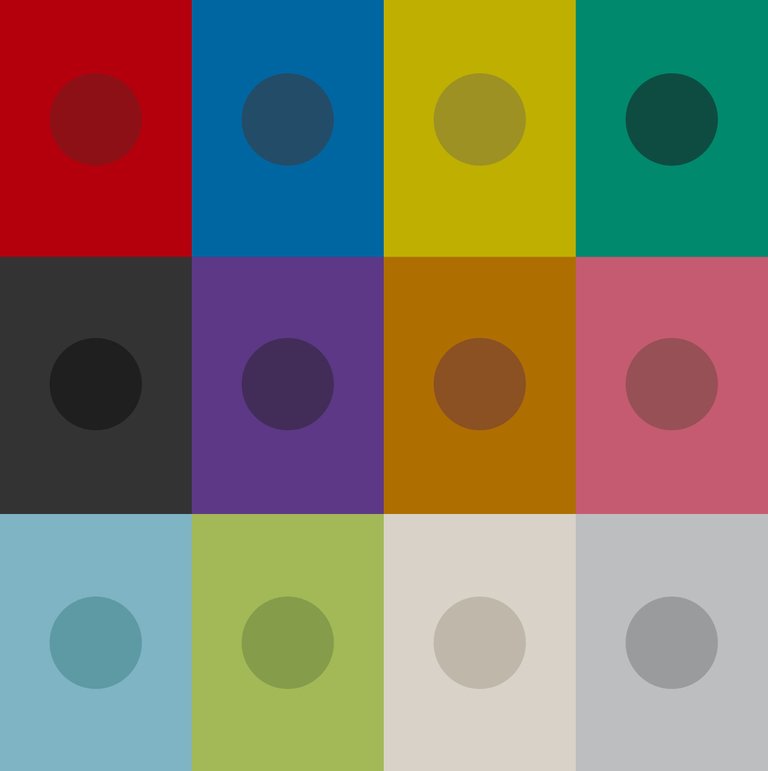
1. Muted Red: #B3000C or #8C1016
2. Muted Blue: #0066A2 or #224C67
3. Muted Yellow: #BFAF00 or #9C9122
4. Muted Green: #00896C or #0E4B40
5. Dark Grey/Black: #333333 or #1F1F1
6. Muted Purple: #5D3886 or #412D58
7. Muted Orange: #AF6E00 or #8C5122
8. Muted Pink: #C55B70 or #975056
9. Muted Light Blue: #7FB4C4 or #5E9AA4
10. Muted Lime Green: #A3B958 or #859C4B
11. Muted Off-White: #D8D2C9 or #BFB7A9
12. Muted Light Gray: #BDBEBF or #9A9B9C
Vibrant colors
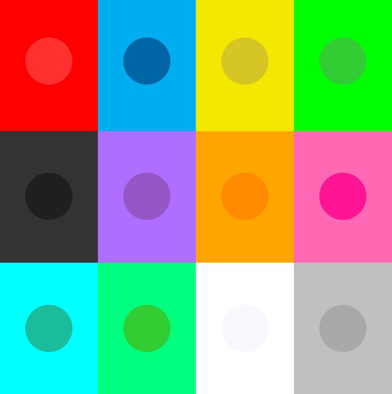
1. Vibrant Red: #FF0000 or #FF3030
2. Vibrant Blue: #00AEEF or #0065A5
3. Vibrant Yellow: #F3E800 or #D5C625
4. Vibrant Green: #00FF00 or #32CD32
5. Dark Grey/Black: #333333 or #1F1F1F
6. Vibrant Purple: #AF6EFF or #9457C4
7. Vibrant Orange: #FFA500 or #FF8C00
8. Vibrant Pink: #FF69B4 or #FF1493
9. Vibrant Light Blue: #00FFFF or #1ABC9C
10. Vibrant Lime Green: #00FF7F or #32CD32
11. Vibrant Off-White: #FFFFFF or #F8F8FF
12. Vibrant Light Gray: #C0C0C0 or #A9A9A9
These colors are not decided for (yet). It illustrated that both muted and vibrant colors can be used to distinctively design different topics and areas of Hive. The idea is to be able to let people/viewers identify their topic more easily so we can start "speaking" to those who are interested in a certain topic. For example Yellow: Art, NFTs, photography. Even if this muted/vibrant color is implemented subtly, it is something that people remember seeing even if they are unaware of it. This means that it will be much easier to process data and information, while highering the chances of getting a positive response in return.
This could also lead to enabling GameFi within Hive in terms of colors, which are branches, sub-sections within these color schemes, and various topics. Not that we're there yet, but it is nice to have that option once Hive matures even more.
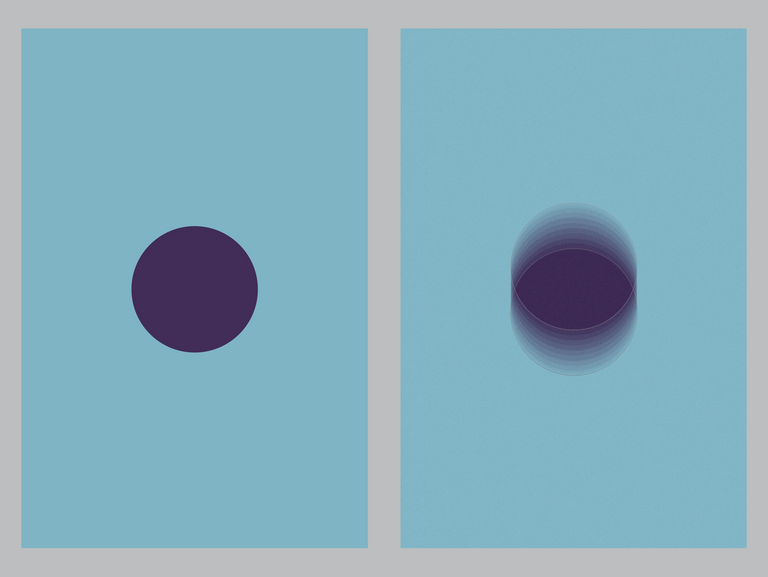
The magic happens when you combine the tones of the muted and/or vibrant palette with other colors in the same palette. It is nice and balanced, and it surely reminds me of Retro-Brutalism/Neo-Modern graphic patterns.
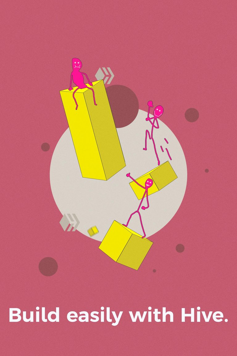
There's a lot of ground to cover to end up designing sophisticated, subtle, and minimalistic graphic designs that are powerful at the same time. In the above example, the characters are just doodles and need to be replaced with real Hive characters (like Mo below). In the sample, I just chose two colors from the muted palette, and one from the vibrant palette (excluding the character's vibrant pink). You can pretty much see everything no matter where you look.
What does this mean for the visual concept that I'm working on?
I'll be on the lookout for more than just diamond and hexagon shapes. First of all, they are very difficult to implement correctly without being seen as repetitive by the viewer. Secondly, variation is important, it goes without saying that balancing these shapes is key to preventing the idea and feeling of implemented randomness in graphic design.
hit that play button, or to stop a bit to see what is happening in a video, versus idle slides and promotions they are trained to skip.
For example, I showed this concept animation that I've been working on to the @HiveCreators team. While this animation loop is inspired by Sam's work that they have shown me, I made this short animation with the help of a tutorial to create the character. If we want to increase the chance of getting people's attention, the best idea is to have moving graphics, even if it is just a subtle one. People have been trained to
You see, the problem here is that -the character design- can't be used, since it is made from a tutorial. This should go for anything that is made with mock-ups, free graphics, and so on. If we want to show how unique Hive is, generic designs aren't the way, but it's always better to have something rather than nothing. While the quality may look great, in terms of being able to connect they look too generic, as they don't evoke emotions in the viewer. This is something we can score high on once we define our innovative style that translates our vision and mission into high-quality graphics.
Phase 4: Gathering visuals, creating a mood board
Whoops, seems I have messed up the roadmap of the phases. Gathering visuals is supposed to be part of development (lol).
Exploring styles
Exploring styles can be a rabbit hole. The internet is full of design trends that go decades back. Discovering what makes a style trending is a task, and discovering the evolution pattern will be a challenge.
The goal of this mood board is to find something that would work for Hive. During the discovery phase, it seemed that Sam and I were both fans of Retro-Futurism and Neo-Modern/Neo-Brutalism elements. I'll be diving into Retro-Futurism (as Neo-Brutalism looks quite similar, just more bold and flat).
Retro-Futurism
After spending some time on the interwebz, I've collected a few outstanding graphics made by highly skilled graphic designers and animators who work around the globe. I am not able to reproduce this, but it's good to have an inspiration board.
Moodboard: People and 2D Characters

Style:
- Retro-Futurism
- Thin/no Lines
- Textured
- Minimalistic ;or; exaggerating
- (2D) Depth
Keywords:
- Alienizing Humans
- Humanizing animals
- Small head, exaggerating body parts
- Unnatural skin tones
- Dynamic
- Movement / Moving
A few things that I noticed while browsing for Retro-Futurism Characters; 1) 2D was combined with 3D in 2022. I remember seeing this and I thought... hmm I'm not sure if this is going to be "it". 2) So, what I'm guessing is, is that the contrast between "photo-realistic" 3D elements versus the 2D characters was too big. 3) What we can expect to see in 2023 is a further development of 2D characters before making its way to implement realistic 3D elements. This is important to realize what's going on and to predict hopefully the future so you can be front-running it.
I've been saying that NEON and GRADIENTS were coming back since 2017. I'm not seeing 2D retro characters vanish, what I do see, is that it is getting more normal to be alienizing characters. As in the ratio: Small head, big body, or just weird funky/goofy looking faces, unrealistic color-fill, etc. or even humanizing animals.
It's awesome.
Note: the sample that I made earlier (Be like Mo), was before the research of trends. This means that this sample isn't the same style we should be going for, it's close but requires finishing touches.
Moodboard: Elements
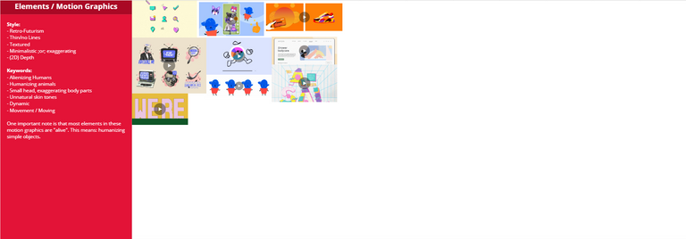
Style:
- Retro-Futurism
- Thin/no Lines
- Textured
- Minimalistic ;or; exaggerating
- (2D) Depth
Keywords:
- Alienizing Humans
- Humanizing animals
- Small head, exaggerating body parts
- Unnatural skin tones
- Dynamic
- Movement / Moving
One important note is that most elements in these motion graphics are "alive". This means: humanizing simple objects.
Retro-Futurism
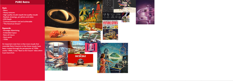
Style:
- Retro
- Heavy textures
- High-quality visuals equal low-quality visuals
- Realistic drawings, pre-photo, and video
- (2D) Depth
- Contrast between real and achievable
- "The American Dream" / Standards
Keywords:
- Nostalgic Advertising
- Embedded Space
- Retro & Future
- Atom punk
- the 1950s
An important note here is that most visuals that resemble Retro Futurism are that these visuals have been created from the perspective of the 1950s and/or 1960s. It has "Back to the Future" vibes when it just launched.
Ideation: Visualizing Hive
Visuals have always been a powerful tool to help tell a story easier. One of the most incredible stories to be told is still carved into stones and rocks. Visualizing Hive should help spread the story about Hive much easier as well. To do so, we need strong visuals that stick and are most of the part self-explanatory, and/or supportive of other visuals. This way, when someone enters or gets introduced to the world of Hive, they get a good idea of how much Hive has to offer.
I've been researching, analyzing, and gathering information for some time now. There is a lot of ground to cover for Hive, but, visual-wise we need to be performing on a higher level than we are doing right now if we want to get noticed. Rushed isn't the right approach either, so, why not continue with our steady growth, but add steadily growing visuals at the same time? We need to make a move, but we need to make a well-thought-out move at the same time.
Without meaning, there is not much use
Give something meaning, and it can be of use to many
"On Hive, one may create an account, which is also known as an SSDID (Self-Sovereign Digital Identity), which then allows access to all building and future-build dApps. These apps cover a broad area of segments that can currently be categorized into DeSo, DeFi, NFTs, and GameFi. These segments are under continuous development, and it is a matter of time before more segments become available to all SSDIDs. This makes an SSDID on Hive highly valuable."
While there is a lot more to Hive than the above-simplified paragraph, it gives a good idea of what is possible on Hive. For visualization, it is a great way to start illustrating these parts that sum up Hive. Once they are visualized, it is a lot easier to add defining properties of each topic later on. The key here, with the same logic behind the simplified paragraph, is that with simplified graphics, a lot can be visualized in a powerful way for Hive.
- Shapes and Elements --> Give meaning to them
- Visualizing Hive --> illustrates the continuously growing ecosystem of Hive
- Categories and Segments --> prioritizes what to illustrate/visualize first, and how/when to add more in-depth information about their properties (Fast, scalable, feeless, etc.)
While I'm not yet done with development, and have to update @HiveCreators with the additional paragraphs that I added after our call (whoops... quite some more eh). Anyway... I think that we're getting on the right track, I just need to make sure I don't lose my focus on making this Visual Concept. I do have a strong sense that this could be something worth setting up and developing more. Other than HiveCreators, I'm curious about what @crimsonclad, @guiltyparties, and @lordbutterfly think about the above idea (and the rest of my research and findings). I know you guys are busy, and reading 3 reports is maybe... a little bit too much. It would be a good moment for brainstorming sessions, or just let me roam free.
I'm still a bit under the weather. There is always something eh... so I do apologize for the late 3rd (and 4th) report.
For approval: please comment on this blog post so I can start with Phase 5: Pre-Production
For Feedback: please comment below or DM me in our group chat on Discord.@Enrique89:
I'd like to plan another voice call so we can discuss and brainstorm the above. This way we can also start the production collaboration so I can assist and help the current graphic designers. These two phases took pretty much 14.5 hours, totaling the hours to 23 used of the total 64. Of course, I can research a lot more and I do need to develop more before continuing, so: I would like to have some input besides my own voices in my head hehe.
Cheers,
Ruben

Follow me on Foundation | Follow me on Twitter | Follow me on Instagram
Posted Using LeoFinance Beta
Great job you are doing, branching the brand for communication strategies based on specific niches is difficult to determine with what we want to establish the reference, either with colors or shapes.
Yes, approved; continue with the next phase.
LETS GO! 🔥🔥🔥
As a fractal artist it was very rewarding to see Hive's logo considered in the shapes that make it up or are referenced to it, and in the play of palettes between muted and vibrant colors ... there is something to that because as an artist and writer, how I choose to illustrate my work often with more muted colors first allows people to be awakened to the ideas of a story and then build in art with those vibrant colors as the climax of the story approaches... or, just leave it muted if there is more to think through in a particular story... I didn't know there was a whole movement going on in Retro Futurism around this, BUT, I know it works!
Thanks for sharing your thoughts! Much appreciated. This is exactly what I tried to display in this sample with the muted pink, white, gray and vibrant yellow (and tried to see if sticky-figures would work with the vibrant pink).
That's a lot of pink ... but muted pink is calming ... the sticky figures do stand out ... but the Hive logo is lost ... since the Hive logo has so many places to play in it, my thought is to let that replace the circle, and maybe let your sticky figures and building blocks use that space...
Ah, the sample is just a 10-minute sketch and is focused on the usage of color. I would love to see more shapes/objects from the logo being used.
Oh, for ten minutes that is exceptionally impressive ... as a study in color it certainly works!
I like the ideas but Im not a designer so I cant really chip in here much. A standardized approach to design is always necessary. Crim for sure can add much more to the discussion. @doze as well imo. Eddie and his team for sure.
I'm also not a designer but yeah I have an opinion lol
I'm not the best fan of gradients, because there are gradients and gradients, each have a vibe and first of all you need to know what kind of vibe you want to put out.
I also have the opinion that high colourful or trending Visual Concept can be WOW at first glance but after that they start to suck. I prefer more minimalist Visual Concept, ironically they are the more difficult to create.
But more than my opinion I would like to know @roelandp's opinion.
Agreed! Appealing designs can be nice in the beginning, but when you zoom out and get deeper in the timeline when distributing more of them, it can also be as if you were shooting with loose blanks and missing the target.
Sophisticated and well-thought out designs are key for longer term branding (and are alwayssss a good practice to get right from the start). Whether they are minimalistic or full with gradients, as long as there is a pattern and recognition within the designs, it shouldn't matter much, as long as the balance is (always) right.
Less = more (and more time consuming yeah haha)
I'm locked in "Sophisticated" lol not because it is bad but it can have a mean to each of us. Not to say that Sophisticated is the key for some brands and have no mean to others. So, I would leave "Sophisticated" alone :p
Crim already spotted the Split Chevron shape was missing. Eddie is great, we've had a few long talks about the collab and its progress.
There is a part in the text (lol), which is about prioritizing what to visualize first and how to approach how to design (educating existing and new Hivers about Hive with visuals) which got me a bit curious about your take on that.
The one thing I would say is that variety through inclusion of community and topic representation would be important. But not such variety that it destroys the general established design. Design being the uniting feature and the topic being the individualized. So if you could have a design that is flexible enough to tell a story of a part of the community while still maintaining that its visually understood that each part is a part of the whole, you have a winner. Even better if it didnt require you to recreate everything from scratch every time you want to point to a specific community inside hive.
Nice, yeah! 100% agree with that (and aiming for exactly that as well). Unfortunately, nearly everything should be made from scratch to make it blend well together.
Thanks LBF!
By the way, lot of work in this post!
Thanks man! It surely does feel as if a bit of haste was involved due to the max time I'm got to spend on all the phases (64 hours in total)
I'm sure there are a reason, why are you counting the hours? For your own schedule?
Your content has been voted as a part of Encouragement program. Keep up the good work!
Use Ecency daily to boost your growth on platform!
Support Ecency
Vote for new Proposal
Delegate HP and earn more
AMAZING BRO! Great job! Absolutely...
I am also a designer and all your work was very well polished.