It's been two weeks and I've changed quite a few things about my portfolio.
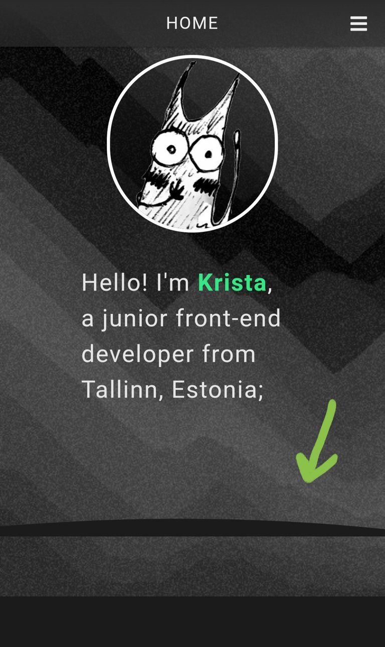
First, I added the ''wave'' divider... Only it's not a wave, it's a curve. And it's buggy.
How exactly? Well, viewed from my laptop it looks fine, viewed on other screen sizes through Edge's DevTools it looks fine aswell, but as I open the site on my actual phone and scroll down a little, the divider appears to float a bit and the background of the #welcome section continues for about a height of the browser's address bar.
The reason for this is that I have the #welcome section's height set as 100vh (100% of the viewport height) which is afraid of the black sheep of the family - the forementioned address bar which appears when a site is loaded and disappears when a user scrolls down.
So how can I fix it? After Googling a while I found out that the best way to fix such a thing is to use JavaScript (specifically window.innerHeight). I made a couple of tests based on a few tutorials and for some reason it did not work out (kept pushing commits (so I could open the site on mobile through Netlify) and later reverting them). I guess I need some more time for research and figuring things out or a helping hand. For now I set the display to be none on the dividers for mobile screen width. (I wonder how it looks like on tablets - do they have the same issue?)
EDIT: Fixed it by setting the heights of html, body and #welcome to 100%. Thanks, ILGE!

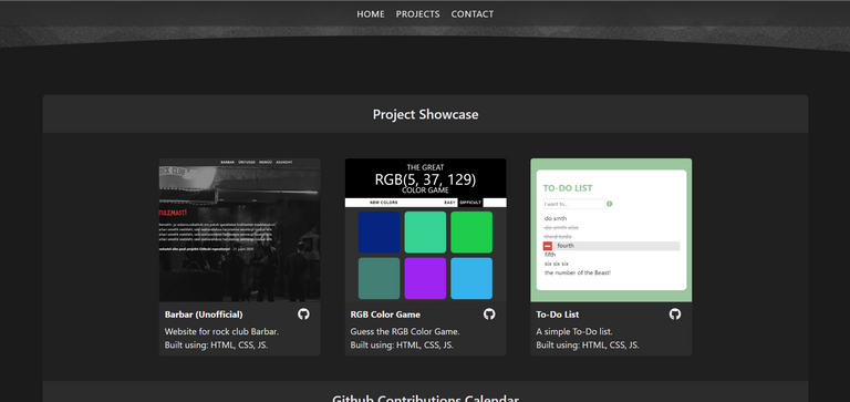
The next thing I did was make the container of the projects showcase a bit more distinctable by adding a background color to both the container itself and the heading(s). I also made the projects horizontally scrollable on tablets aswell in addition to them being so for mobile.
And as you've probably been spoiled already by the screenshot above, I decided to add my Github Contributions chart to my portfolio to show that I am in fact working on things other than the three projects I have displayed. Sadly Github doesn't have an official way of embedding the chart from one's profile but I found this Bloggify's repository that makes it possible to do so.

To top it all off, here's something I'm sure you guys will appreciate.


That's right, not even one, but TWO links to Hive.
I've been teasing you enough, now it's time to actually let you play with my site. Here's the link to my portfolio and here's the link to the portfolio's Github repo.
I don't want to admit how many times I've forgotten to do this.
I recognise this button, where'dya get it from? 😂
You're portfolio looks great (mine really needs some love, but idk when it'll ever get it) and I just noticed a little something odd at desktop resolution:
I might be wrong, but it seems if you were to swap out
heightformin-heightin the css rule.cards, this would solve the issue (I tried it in devtools):After:
Many thanks. It's a shame your series has come to an end, because you were providing a steady stream of content to #programming 😂 I hope to see more series' from you in the programming community.
Oh, oops! Totally forgot to give you the credit on that button. My brain's been smoking ang burning lately :D You're right, I got it from your Github README!
Thanks for telling me about the bug, it looks absolutely fine on my screen so I would've never known! Going to fix that right now.
Sure, my portfolio series has come to an end, but I'm still working on the heavy music festival website... and man, I've been raging for 2-3 days already because how the heck do I get a custom styled Google Maps embed map into my Vue project?! 😂
I've read several different documentations and tutorials and nothing works. I've yet to find the right tutorial.
No need to credit me. I'm just happy someone is using it lol
The joys of web development!
Yeah, I've only ever embedded basic styled google maps. I didn't even know that was a thing but it doesn't sound like fun!
I have also made some easier websites over 10 years ago, but now I don't remember much about it. 😀
So I got the curved divider issue fixed thanks to a Discord pal of mine (aitäh, ILGE!).
I had to set the heights of html, body and #welcome to 100%. (Edited the post too).