Dear Hivers,
I have been creating custom images for years now. I am not a graphic designer. Yet I create them to add uniqueness to my articles.
There are dozens of benefits. In fact, the end result is beautiful:
As mentioned in my one month Twitter experiment, images (especially animations) have outperformed every other tweets.
A good custom image grabs everyone’s attention.
For content creators: distinct images creates your unique style.
Even on Discord and through comments, I have been receiving questions on how to make these images. Plus, it is a good skill to pickup — people enjoy them too.
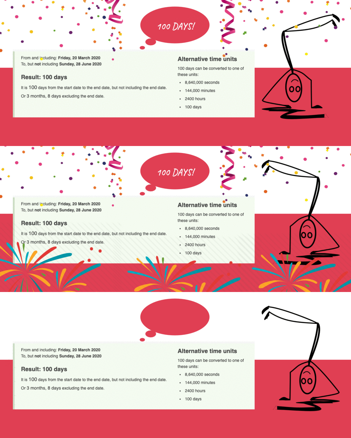
Example: For the 100 days on Hive post, I made this one:
If that's a bit complex, here is a simple animation created for the SEO keyword guide. Just a flash of text:
As I do them almost everyday now, I believe creating good graphics is like cutting vegetables. Anybody can do it.
But the more you practice, the easier it gets.
In this article, let’s see the process. And then explore how to make your own images and animations. This is not a rigid “guide” — it is flexible, which means you can add you own creativity and make images better than anyone else.
Not only do you impress others but also influence them in a better way. Plus, it only takes a couple of minutes. The fact is, the crazier you are with your choices — the more amazing things you can create.
The Psychology Behind These Images
First, people start to enjoy them — and resonate with them. For example, I made this image and sent it in a group. Then @gastontrussi tweeted it because he felt like doing so:
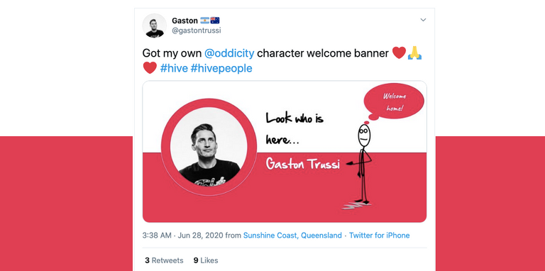
Even this exact GIF used was picked up by @planktonsupport to onboard new users on Hive. Took me a minute to make it — with @theycallmedan’s head.
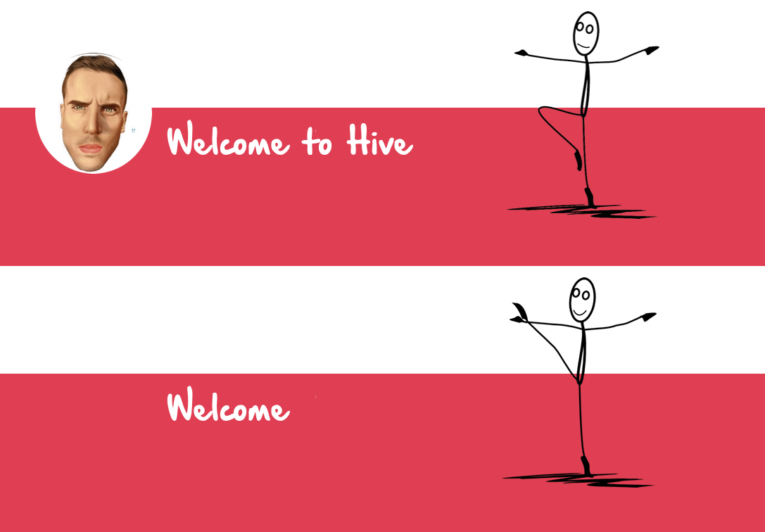
So why are people driven to use these images? It is NOT because they are neat and clean. It is simply because they are unique — and filled with emotions.
For example: See the image below and read the text. How do you feel about it?
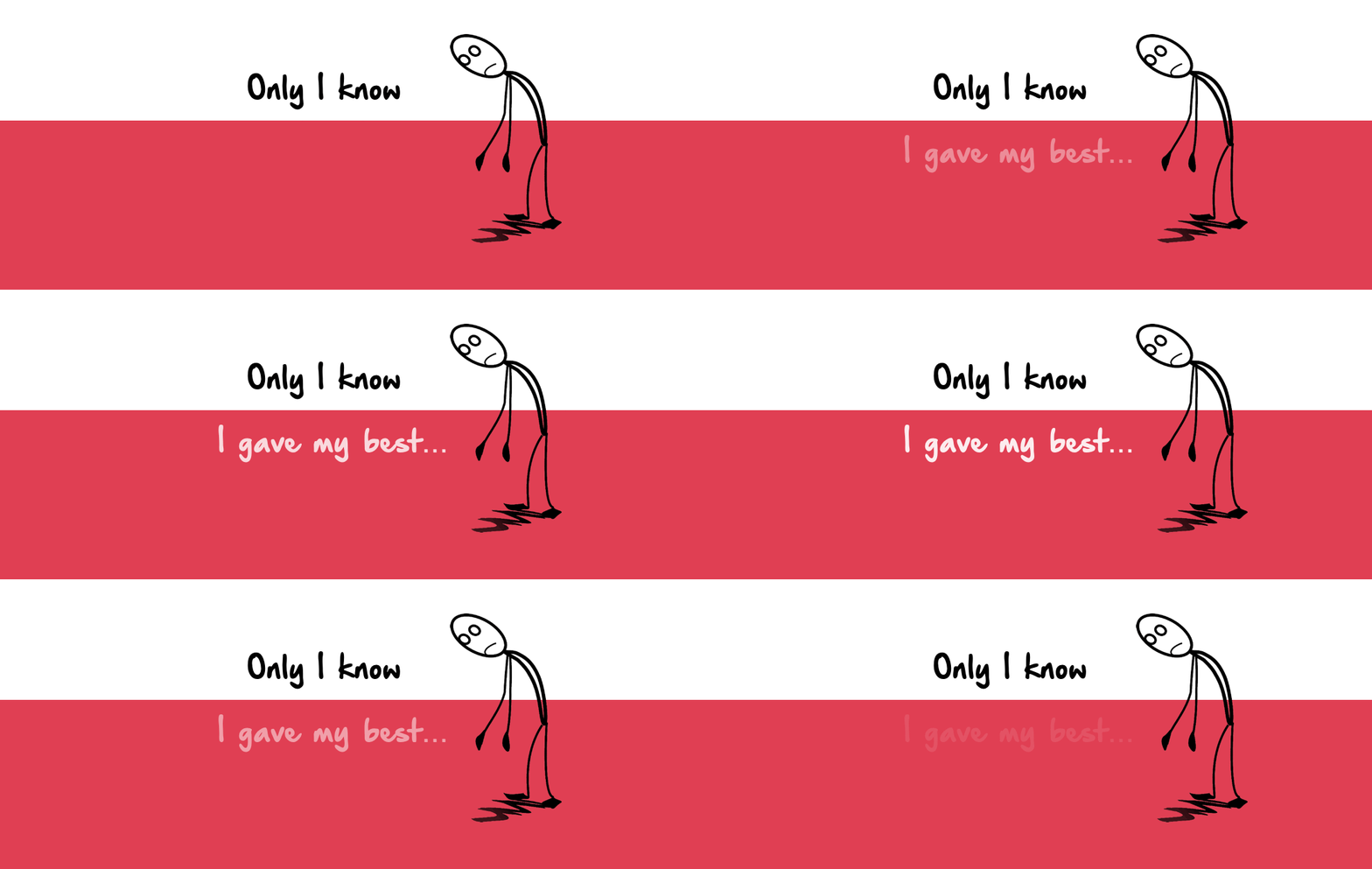
Sad, isn't it? Someone tried and perhaps failed.
Now here's the second version. We keep the text as it is — and use a different character. See how you feel when you look at this:
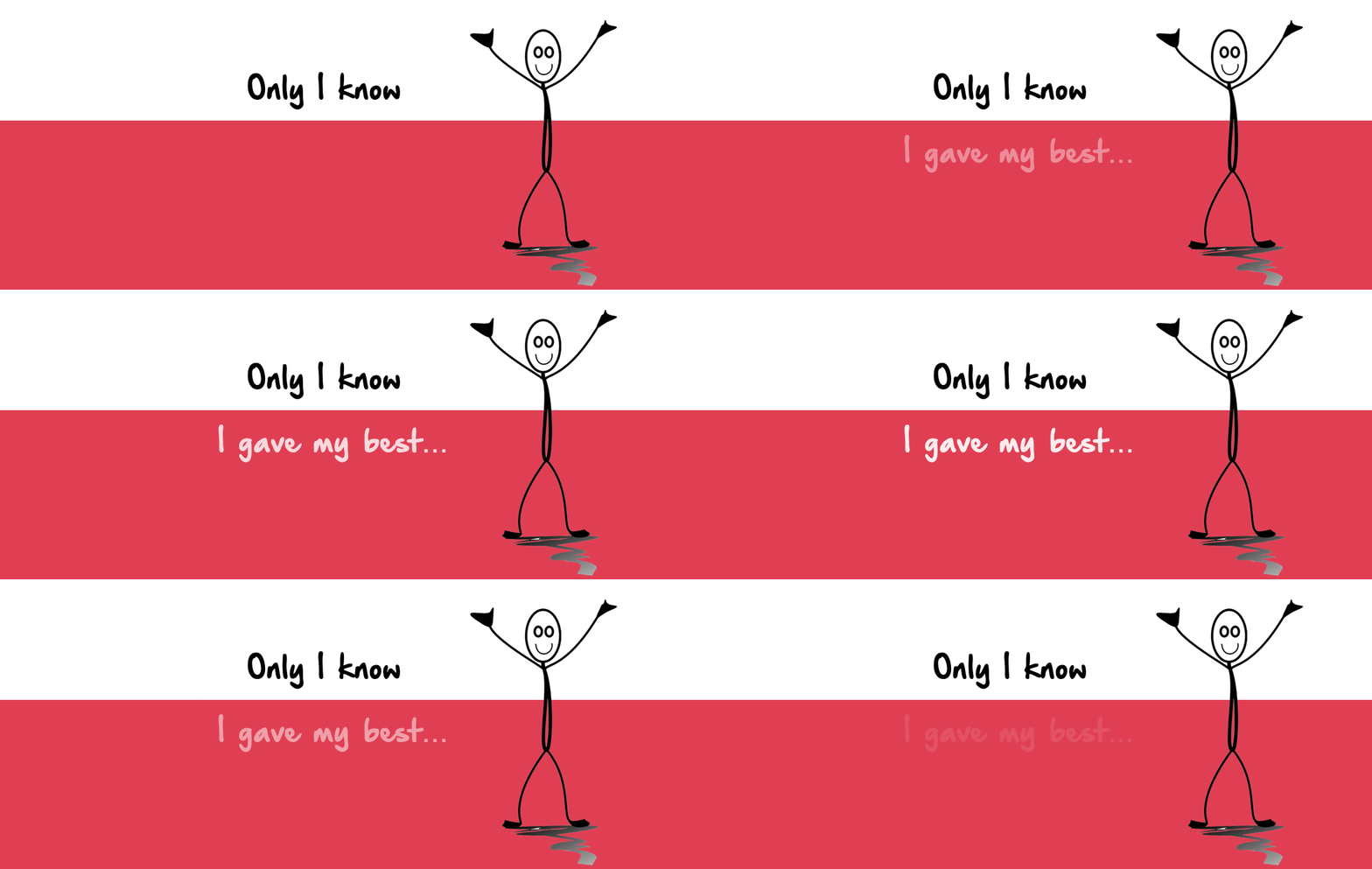
Just one change and emotions shift. That is why images are powerful. They shift our feelings. And move our thoughts in a new direction.
On top of this, there is an ongoing theme — this theme includes the color combination, the font, and the right character. Even if you spot them on the street, you might think Sidwrites made them. That’s the power of a good theme.
So let's explore the process of a good theme:

Before creating these images, you have to start with the basics.
Step #1: Select your foundation colors
Step #2: Select your font (you can do this while editing)
Step #3: Select your tool.
As you can see, my foundation colours are red and white. The font is fixed. And the tool I use is Snagit (paid one). I would recommend you to use any free tool like Canva or BeFunky.
You can also use GIMP or Adobe Photoshop. In fact, I strongly recommend you to read this tutorial: How to create your perfect featured image
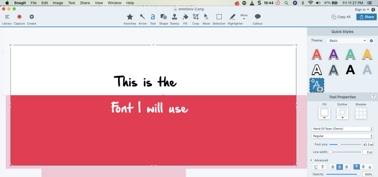

Once the colours, font, and the right tool has been selected, now you start adding character.
Most of us are not designers, so we can’t create characters. But you can find them online. This will require a lot of research though.
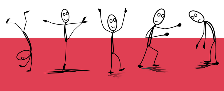
For example: It took me several hours to find these and then I saved them in a folder:
How to find: Simple. You can check out this post where I have listed 20 image websites — where you can find free images.
Or simply try this Google search. Go to any of the website. Then use keywords like "character" "cartoon" "avatar" "figure" to find characters.
Note: Always download the transparent (PNG format) image.

To create a GIF, you have to make two images. I simply duplicate these images — and then upload them.
Note: the first image should have a text missing. Then the second image should be complete. Combine both to create the animation effect.
I upload the images on EZGIF website.
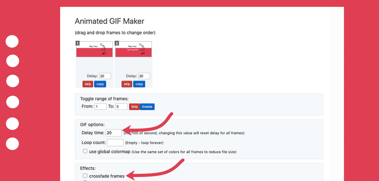
Note:
- I change delay time to 80.
- I use crossfade frames (sometimes)
- To really understand this, you should play with the tool.

- Do not overdo it. For example: There are so many animations in this post. Don’t do it this way. I did it to demonstrate.
- Focus on the emotion you wish to share. Then the text. The character is always important.
- this tool.Compress you GIF. If they are too big to be uploaded on @Peakd or Hive — then compress using
- Don’t add too many elements every time. Again, do it occasionally. Sometimes I skip the character as well.
- Always be consistent with your basics. Don’t change the colours or fonts way too often.
- Have fun. After all, this should be a FUN process.
Wow!
So that was it.
You saw a lot. From the psychology of images to the 3 step process to making your own images.
If you are eager to make your own, give it a try. As long as you have time and enjoy the process, be creative with your animations.
I hope and wish this tutorial was helpful. See in the next! :)
Cheers,
Sid
If you liked this article? Feel free to comment and upvote and reblog.
I like your mention of how the image matters to elicit a response (downtrodden image or joyous image). A little psychology...I saw a TED talk a while back about how to get people to slow down while driving in urban areas. We've all seen the digitial signs that report back to us the speed we're driving. They usually flash if we're over. Instead, some folks decided to try an alternative approach. Instead of reporting your speed (which you can see on your speedometer anyway), the sign would show either a frown face if you were driving over the limit, or a smiley face if you were under the limit. Apparently, it worked much better at getting people to slow down. The emotional reaction is intrinsic.
Gosh! That's a lovely story. Simple yet profound. Thank you!
HIVE.D!
Wonderfully written, superb post. Upvoted, Reblogged and Bookmarked.
Thank you for the LOVE. Years went into this. Glad you liked it.
SultI may just have to give this a try @sidwrites , thank you for sharing this information and also thanks to @lizelle for re-blogging it ; which is why I found it in the first place. Thanks to both you.
Amazing tutorial. I also agree that custom designs made by someone makes the post even better. I would absolutely try this for my next post. I use canva (paid one) to do simple minamalist designs for myself and friends .
Okay, paid tool! Sounds perfect. I didn't mention in detail (the first step) and linked to this article. Please do check. Once the basic foundational images are created, the next step should be easy. Can't wait to check it out.
Thank you so much 🙌🏽🙏
Totally agree on this
Anything in life I suppose! :)
This is cool and very creative of you!
Thank you! Appreciate it. :)
You are welcome
I shared this on Twitter with an animated GIF. #posh
This is awesome buddy! I always wondered how you design such engaging characters and images. Thanks for sharing!
This is indeed an ultimate guide. Thanks for sharing.
I will surely make it a try, I hope I can do it, thank you for the tips!
Just delicious information.
This post is Lit, glad you shared these useful tips....would check the links out and try some myself.
Cheers mate
Hi @sidwrites, your post has been upvoted by @bdcommunity courtesy of @rehan12!
Support us by voting as a Hive Witness and/or by delegating HIVE POWER.
JOIN US ON
Well written :-). I've been creating my own GIF for a while. Most of his photos. This is my last job. Gif for my competition.

I'm terrible doing this (haha!)... But that's a very nice post.
Thank you so much for sharing these tips, have reblogged so I can easily refer to it, definitely going to give it a try!
It's amazing to see how such simple illustrations and characters could bring such a pleasant message across. It's very emotive, and as you say, distinctive. Anytime I see this red and white backdrop with a stickman, I always remember that it belongs to none other than SidWrites.
I've been trying out doodles on Windows' Paint 3D today, and it's quite a fun distraction if I'm feeling a bit down. I think I might just practice even more of this. Cheers, and love <3
Thank you for this detailed post. I really liked your images and thanks to this article I will be able to make some awesome animations for my posts like yours!