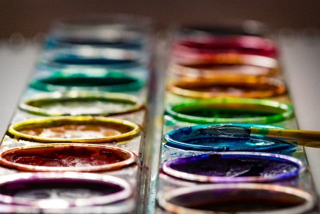
Cómo utilizar los colores de forma efectiva en el Marketing || How to use colors effectively in Marketing
Al construir una marca comercial, la psicología del color es un aspecto que se toma a consideración, para representar los elementos gráficos que se encontrarán alrededor del negocio.
La escogencia de los colores en el marketing no es aleatoria, estos se eligen según el propósito del emprendimiento, para incrementar el impacto hacia los consumidores.
Esto con el fin de conseguir aumentar las ventas o movilizarlos a una acción específica.
Pero esta psicología se llevó a la práctica gracias a estudios estadísticos realizados a lo largo de los años, donde se aprecia el comportamiento de los clientes, con reconocidas marcas comerciales.
When building a commercial brand, color psychology is an aspect that is taken into consideration to represent the graphic elements that will be found around the business.
The choice of colors in marketing is not random, they are chosen according to the purpose of the venture, to increase the impact on consumers.
This in order to increase sales or mobilize them to a specific action.
But this psychology was put into practice thanks to statistical studies conducted over the years, where the behavior of customers is appreciated, with recognized commercial brands.
¿Cómo influencian los colores a los consumidores?|| How do colors influence consumers?
A continuación se describe el efecto que aportan algunos colores dentro del marketing de una marca.
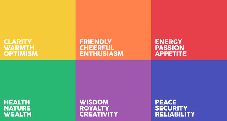
• Rojo: Se ha descubierto que es un color que estimula el apetito en el público. Es usado frecuentemente en cadenas de comida rápida.
Este color tiene la particularidad de generar sensación de urgencia, aportando energía y gran enfoque mental hacia la toma de decisiones.
• Azul: es un color relacionado con el género masculino, el agua, la paz y la confianza.
Los negocios que utilizan estos colores ofrecen una imagen de ser fiables y productivos. Suele aplicarse en emprendimientos corporativos, y oficinas.
• Verde: este se conecta con temas de la naturaleza, salud y la relajación. Investigaciones realizadas enfatizan que promueve el equilibrio entre el cuerpo y la mente, para tomar decisiones.
Es el color predominante en campañas de cuidado ambiental.
• Morado: asociado con el respeto, la realeza y la sabiduría. Es utilizado en emprendimientos creativos. Es empleado en varias oportunidades en productos de belleza y antiedad.
• Naranja: es un color que promueve el entusiasmo y el optimismo. Logra estimular el movimiento a la compra. Además de generar ansiedad en la audiencia.
• Negro: relacionado con la autoridad, poder y estabilidad. Debe usarse con prudencia, gracias al efecto de estrés que puede ocasionar.
• Gris: es un color que representa los sentimientos, el tiempo y la solidaridad. El uso exagerado del color, logra apreciarse como una sensación de vacío. En la publicidad, se utiliza en temas sobre enfermedades mentales, emociones de la tercera edad y la muerte.
• Blanco: evoca sensación de limpieza, claridad y seguridad. Es aplicado para resaltar la ausencia de color o neutralidad. Se emplea para activar la creatividad.
The following is a description of the effect that some colors have on the marketing of a brand.
- Red: It has been found to be a color that stimulates appetite in the public. It is frequently used in fast food chains.
This color has the particularity of generating a sense of urgency, providing energy and great mental focus towards decision making.
- Blue: it is a color related to the masculine gender, water, peace and confidence.
Businesses that use these colors offer an image of being reliable and productive. It is usually applied in corporate ventures, and offices.
- Green: this is connected with themes of nature, health and relaxation. Research emphasizes that it promotes balance between body and mind, to make decisions.
It is the predominant color in environmental care campaigns.
Purple: associated with respect, royalty and wisdom. It is used in creative endeavors. It is used several times in beauty and anti-aging products.
Orange: it is a color that promotes enthusiasm and optimism. It stimulates the movement to purchase. It also generates anxiety in the audience.
Black: related to authority, power and stability. It should be used with caution, due to the stress effect it can cause.
Gray: it is a color that represents feelings, time and solidarity. The exaggerated use of this color can be appreciated as a sensation of emptiness. In advertising, it is used in themes about mental illness, emotions of old age and death.
White: evokes a sensation of cleanliness, clarity and security. It is applied to highlight the absence of color or neutrality. It is used to activate creativity.
Utilizando la psicología del color para crear contraste || Using the psychology of color to create contrast.
Adoptar la técnica del contraste en la publicidad permite disminuir el estrés visual, y dirigir la atención en puntos específicos.
En los títulos se implementa esta técnica para conseguir facilitar la lectura. Además en los espacios donde se ubicará imágenes o fragmentos brillantes. El uso de transparencias también ayuda a reducir la tensión en los ojos.
Se aconseja emplear colores claros como lienzos, y utilizar colores oscuros para resaltar textos o botones; también puede emplearse de forma contraria.
Adopting the contrast technique in advertising allows reducing visual stress and directing attention to specific points.
This technique is implemented in titles to facilitate reading. Also in the spaces where images or bright fragments will be placed. The use of transparencies also helps to reduce eye strain.
It is advisable to use light colors as canvases, and use dark colors to highlight texts or buttons; it can also be used in the opposite way.
Maneras de aplicar los colores vibrantes || Ways to apply vibrant colors
Los colores vibrantes determinan las emociones que transmiten las comunicaciones. Al ser tonos llamativos, es más sencillo estimular una respuesta por parte de la audiencia.
En caso de presentar una página web, con contenido bastante denso, lo adecuado es utilizar tonalidades neutrales u oscuras, evitando el estrés visual.
Para esto se puede emplear paletas de colores monocromáticos, donde se combina un color en sus diferentes tonos. Aportando una imagen elegante y detallista.
También utilizar dos colores complementarios para aumentar la exposición de productos. Frecuentemente esta técnica se realiza en la publicidad impresa.
Incluyendo manejar tres colores o más, separados a distancias iguales en el círculo cromático. Estos facilitan un diseño más arriesgado y creativo, en productos y páginas webs.
Vibrant colors determine the emotions conveyed by communications. As they are striking tones, it is easier to stimulate a response from the audience.
In case of presenting a web page with dense content, it is appropriate to use neutral or dark tones, avoiding visual stress.
For this, monochromatic color palettes can be used, where a color is combined in its different tones. This provides an elegant and detailed image.
Also use two complementary colors to increase the exposure of products. This technique is frequently used in print advertising.
Including handling three colors or more, separated at equal distances in the chromatic circle. These facilitate a more daring and creative design, in products and web pages.
This translation was done through www.DeepL.com/Translator (free version).
PD: Sorry for any errors in coherence or spelling, it isn’t my native language.
Greetings @eldysredactor. The use of colors in marketing is extremely important although it is something that may seem unnoticed, because the design and color of a logo is what we can most easily recognize a brand and certainly influences our perception of it. If you allow me the observation, the link of the second image does not work and check that all the images are of public domain.
Thanks @emiliomoron, the color is important in marketing to optimize objectives, but you know that few people know this, including marketers and graphic designers, or they know it but prefer to ignore it and not educate customers.
I allow you to make observations, don't worry, I have already checked the links, maybe I made a mistake in placing them. Thank you for pointing it out.
Congratulations @eldysredactora! You have completed the following achievement on the Hive blockchain and have been rewarded with new badge(s) :
Your next target is to reach 700 upvotes.
You can view your badges on your board and compare yourself to others in the Ranking
If you no longer want to receive notifications, reply to this comment with the word
STOPSupport the HiveBuzz project. Vote for our proposal!
Wow, great recommendations that you offer in this publication.
It is very interesting to learn how from the world of design you can improve a brand and attract customers.
I had no idea that the color blue was associated with masculinity, the truth was I was impressed and I really liked your publication. I learned something new!
Thanks @reinaldoverdu to interact, and it is important to note that working with colors in the right way can help to improve the emotional state of the audience.
For example studies have found that the excessive use of the color yellow (not included in the post) can stimulate crying in babies, it is incredible to think that this can happen.