Today in Steemit Blogging 101 we are going to learn about the importance of headers and white space. Believe it or not, there is an art to blogging that goes beyond slapping words and pictures down and calling it a day.

image source
Headers and white space are vital to making your post aesthetically pleasing and reader-friendly, but their importance goes well beyond a pretty presentation.
Header tags and SEO
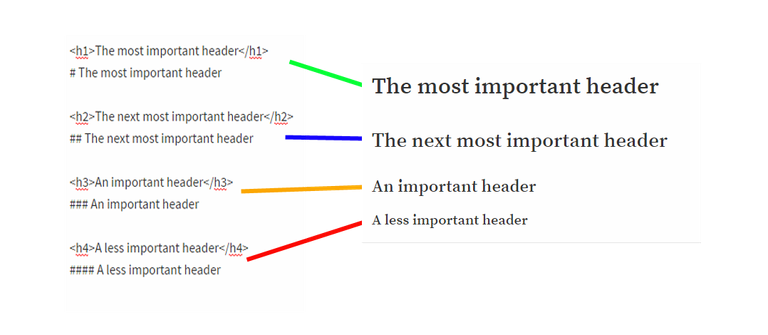
There is a hierarchy to H tags as shown below in the model I created.
Note: The H tag (HTML) and # (markdown) have the same results.
There is one little caveat:
Technically H tags run from h1 to h6.
Steemit only recognizes to h4 or markdown's #### which is essentially the default text.

Proper use of headers make searching for your content easier and may quite possibly boost your ranking as an authority on the subject, especially with appropriate keywords. Doing this provides effective SEO.
What is SEO?
You've probably seen the SEO acronym batted around - but what is it exactly?
Why is SEO important for your blog?
Beyond giving your post the best title, featured picture, and first 100 character introduction; beyond keyword stuffing and sharing your blog on all social media outlets that you are engaged in, proper SEO by way of intelligent headers is going to help major search engines find and rank your articles.
The higher you rank, the better chance you have of being recognized as a professional in your chosen subject(s); you have a greater chance of more views, which, in Steemit may equate to bigger rewards. Nothing is guaranteed but you have a better chance of being acknowledged.
Headers also provide your readers with a quick overview of you content beyond the first 100 characters of your post. Selective or busy readers can easily scan a post to get to the section they're most interested in.
Quickly scroll up and down this post. You know what the subjects are and can easily navigate to the section which most interests you because they are clearly marked.
The importance of White Space
White Space is the unused portion of your medium.
Your medium might be a blog article, newspapers and magazines, ads or posters, art and literature.
Examples of white space include:
- Unused space between pictures and text
- The extra line between paragraphs
- The reason you format a poem just so
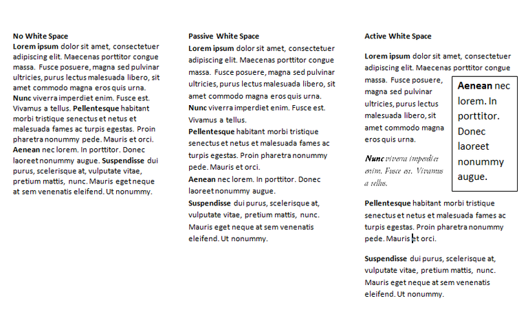
Notice the readability of this post. There are headers, pictures, short paragraphs and bulleted lists. Now take a look at the Lorem Ipsum example I put together showing the difference between no white space, passive white space, and active white space.

which one is most appealing and easier on the eyes?
No white space is a huge block of text which makes it very difficult to follow even when I bold the first word or two of a new sentence/paragraph.
Passive white space is a little better, but not by much. You can see the line breaks but it's still difficult to read.
Active white space is much more appealing and easier on the eyes. That extra break between lines; a little bit of italics, and a bold text box (or picture) guides the eyes in a road map of sorts.
Conclusion
There is an art to blogging that most people don't think about. Hopefully these little lessons will help improve your web presence and generate more traffic to your posts.
Formatting your posts is definitely time consuming but people take notice when you care to make an effort to please - not just in subject matter, but in overall presentation. I probably could have hammered out this post in less than an hour but I took the time to create samples and pictures, and design a post that would hold your attention. Have I done that?
Basically what I'm trying to say is if you don't care what your post looks like, why should I care to read it? There is more to Steemit than quick, sloppy posts. Our time is precious so our creative offerings should then be worthy to read.
Headers & White Space is the second of a 3-post series.
If you missed it, here is the first post:
Steemit Blogging 101: Title, Picture, First 100 Characters and WHY they're important!
COMING SOON
- Conclusion, Signature Line/Footer, and Review
Want more?
- Why you should use image ALT text.
Public Service Announcement
Educate yourself on what Steemit Witnesses do.
- Read @pfunk's User Guide to Steem Witnesses
- Place your educated votes for Witnesses HERE
Have a Steemit day!


Join my curation trail on Streemian
Excellent post dear friend @ merej99, thank you very much for these helpful tips.
@jlufer - I have missed your beautiful stories. I am getting ready to do some heavy reading before bedtime tonight! How have you been?
I have been very well dear friend @ merej99, missing your post, any time
I didn't notice it. The no-whitespace block is so ugly that I just saw it as a black coloured area.
Thank you for taking the tiem to write this post.
I appreciate you stopping by with a comment @javirid
Too many people make the mistake of not putting ANY spaces in their post. I often read so much that when I see huge blocks like that, I click away.
Me too. And I know about even very smart people with Literary degrees that are doing that. At first I was telling them, but now I prefer just to watch how they don't do as well online as they should.
That kind of long paragraphs are ok in novels or even in technical books, but are not working in the online world.
Good point. I've been trying to remind myself not to be so wordy for a long time. It took me far longer than it should to realize that people read differently online.
Very interesting and an eye opener. Will definitely try that thank you.
Very good info!
@kus-knee (The Old Dog)
Good advice as usual, good to see you back :)
This post is gold. Resteeming my luv ;)
Very good advices! :) So many interesting posts I have tried to read were actually unreadable because of missing white spaces...
I love that you mentioned poetry in your bullet list. I've always tried to remain not only cognizant of the white space, but to learn and enjoy manipulating it for different poems.
And like you, I click away from walls of texts. I don't currently have glasses so I can't even approach that much block text without getting a headache
Nice post, @merej99! This would definitely help people out! I've always said that formatting is such an underrated part of posting, but you articulated it so effectively. Great job :D
What a really thought out post this was. Thank you for taking the time to write this out. A great contribution to the community!!
Thanks for this. I try to format my posts so they are easy to read. 😃
Nice post! Stuff like this is so useful. I sometimes feel that I'm the only one who worries about how things work.
Very nice! I will use this in my future posts!
@merej99, thank you for the informative article. It will help me make my blog posts more entertaining and informative. I appreciate your hard work on this.