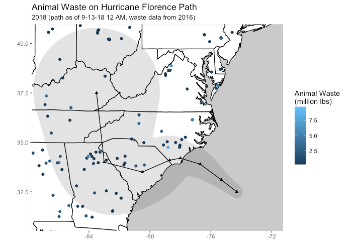
Last week, before Hurricane Florence hit the East Coast, I mapped out animal waste on its anticipated path:

Map anticipating animal waste on Florence's path from last week's post
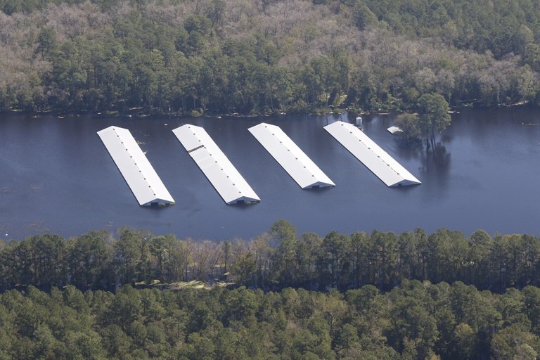
As of noon on September 21st, the North Carolina Department of Environmental Quality recorded that 6 lagoons face structural damage, 31 have leaked, and 23 have been inundated by water. Kendra Pierre-Louis of the New York Times reported Wednesday that in addition to these breaches, an estimated 5,500 pigs and 3.4 million chickens and turkeys died in the storm.

A submerged factory farm. Source: Larry Baldwin, Waterkeeper Alliance
When 1.9 million birds died after Hurricane Matthew in 2016, FEMA gave the state of North Carolina a $6 million grant to aid in composting carcasses that posed public health hazards. It remains to be seen what the monetary impacts of Florence will be on animal agriculture and its cleanup.

Awesome and chilling figure @somethingburger!
I incorrectly assumed at first that darker color = more waste. Personally, I'd flip the color axis. Also, perhaps exaggerate the color difference a bit more to make the waste size stand out? Another thing you could do is make the size of the dot reflect the lbs of animal waste (geom_point(size =lbs))?