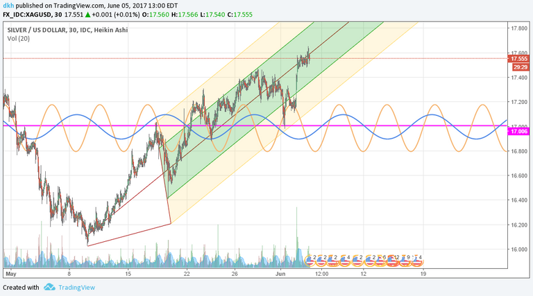
come to think of it, if I used XAG as the base chart and overlaid SLV then it might be easier for people to understand, but then again maybe it would be too complex
I chart it several different ways, the more important thing is for us to see an 'impulse move' to the upside this week. If it chops around this price for too long it will likely push down. Price + Time is the key, not just price alone
@netgains just posted his chart on gold, you might want to take a look. I've been chatting with the other regulars on tradingview to come over to steemit as this would be a platform for collaboration. I'm waiting on a 4th person to join and if it works out, we will be posting multiple analysis and set-ups together (all working on gold, silver, equities, etc). Separately we have our share of wins and losses, but as a team our wins greatly outnumber our losses
My TA is on SLV which is the trust managed by JPM so the price is lower than the XAG COMEX price. I track SLV because i can create option arrays overlaid on my long position
come to think of it, if I used XAG as the base chart and overlaid SLV then it might be easier for people to understand, but then again maybe it would be too complex
To complex for me I'm afraid! Cheers
Just for you. I made a chart of XAG. The chart reads "bullish" but is is definitely sitting at a decision point

It looks like it's starting to build a nice uptrend.
I chart it several different ways, the more important thing is for us to see an 'impulse move' to the upside this week. If it chops around this price for too long it will likely push down. Price + Time is the key, not just price alone
The price move up in the last couple of weeks has been quite aggressive. It looks like the momentum will likely continue. In my opinion.
@netgains just posted his chart on gold, you might want to take a look. I've been chatting with the other regulars on tradingview to come over to steemit as this would be a platform for collaboration. I'm waiting on a 4th person to join and if it works out, we will be posting multiple analysis and set-ups together (all working on gold, silver, equities, etc). Separately we have our share of wins and losses, but as a team our wins greatly outnumber our losses
My TA is on SLV which is the trust managed by JPM so the price is lower than the XAG COMEX price. I track SLV because i can create option arrays overlaid on my long position