Time for another Colums for Steem update!
.png)
This update brings two new features that were sorely missing from Columns for Steem until now. Hit the refresh button in your browser if you don't see the new version.
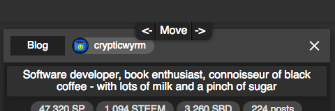
Move columns
When you hover over the top of a column, a little latch now pops up with arrows. Clicking the arrows moves the column in the direction the arrow is pointing at.

Image preview
The last update added the ability to show thumbnails instead of bigger images in posts, but sometimes you want to see a picture as big as possible, so now you can click on them to show a full window preview of the picture. Click anywhere to go back.
.png)
In one of the next updates I'll also add a little bar with thumbnails at the bottom of the preview window which will show all pictures inside of a post, so you can quickly browse through all of them. This should come in handy when viewing photos for example from a photographer on Steem you like, it will turn any Steem article into a nice image gallery with one click.
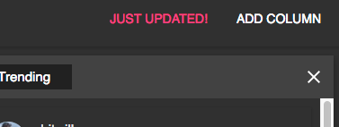
Just updated!
When there is a new update, the app will now show a pink button in the top right, clicking on it will bring you to the Steem article describing what's new. This will hopefully lead to a few more upvotes on these posts (they usually get 4 or so) to expose Colums for Steem to more people, there still are quite few people who even know about it.
Another nice property of this is that it shows you if you're on the latest version or need to refresh your browser first, which depending on the new features I add, isn't always visible. Now when you're on the latest version, you'll know because the pink update button will be there.

Bugfix
Columns automatically scroll in new posts from the top, but there was a bug which would also scroll the window horizontally when there were more columns opened than could be displayed on the screen, and whenver one of the columns would auto-scroll, the window would scroll horizontally as well. That's fixed now :)
Last but not least
Since I've made basically no money with Columns for Steem so far, if you want to help support the continued development, I've started accepting donations via Patreon (monthly) and Buy me a coffee (one time). Your help would be much appreciated and would allow me to spend more time on Columns for Steem development, my other Steem apps and my articles here.
great! I like the moving columns option and die image preview. However you made a change that you forget to mention in your post. The image previews are much much smaller, pushed back into a small rounded black square. I liked the full column width images much more. Now with the small images, it's all just more ore less typography ...maybe you clould add this is an viewing option. Anyway - thanks for pushing this - resteemed!
just found the big picture option in the side bar!
I changed that in the last update on Friday :)
Open the settings by clicking on the burger menu in the top left corner and then enable the "big pictures" option to go back to how it worked before.
Great! :) One thing I changed that you cannot undo with a setting right now is that I increased the minimum width of columns from 300 to 400 pixels, with 300 it was just too small to show the thumbnail next to the post title. I might actually change that back to 300 for the big picture version, there it doesn't matter and then you might be able to display one more column on the screen.
cool ... what would consider is having just one scrollbar - one scrollable page, rather than separately scrolling columns. I believe it's much more convenient for browsing. > you get to see more in less time ...
That would be like Pinterest then. I've been thinking about adding a view option for that, my first prototype about 10 months ago actually worked exactly like that since it's a lot easier to do than the columns scrolling separately:
I don't think it's actually more convenient, but it depends on how you use the app. If you just want to get a quick overview it probably is. I leave the app open all day to see new posts scrolling in as they are made, and to keep tabs on my own posts, see new upvotes and comments and things like that.
to have it as an option would be great.
I don't see why separate columns do have an advantage here.
I'd also prefer to have the option to let the content of one column/filter spread all over the page. you would still see 'columns', but just one feed.
It's probably a matter of taste, so it should be an option. I'll definitely add something like that at some point. Next thing on my list right now is finally adding re-steeming, upvoting and then writing posts which is a bit more elaborate, especially since SteemConnect doesn't support it yet (unless they've added that over the last few months, haven't checked again). I want to add lots of features like drafts and a version history with diffs, maybe optionally a WYSIWYG editor that you can use instead of markdown (but which uses markdown behind the scenes so you can switch back and forth between the two).
Feature request: Option to add a column that shows the comments of a user.
Ah, good idea. Seems easy to add, will be in the next update in a few days. I'll add it to the dropdown menu of user columns so that you can choose between blog, feed and comments.
another thing: the "Show reblogs"-option belongs to the add column dialog, rather than to the app settings. It's a column/filter setting. Shouldn't be a global setting. This will allow you to have to separate columns from one user: 1) his posts 2) his resteems.
Hmm, I hadn't thought of putting it there. I'll have to think about that, it's a neat idea. My original plan was to add per-column settings, a little button next to the X to close columns, with additional filtering options. But this might be a good way too and allows you to do it instantly without having to first create a column. Actually, I guess I could reuse the add column dialog as a column settings dialog too, by just prefilling it with the current settings of the column.
Right on!
On a side note, has anyone using the app in Firefox noticed it getting considerably slower lately? I'm not sure if I'm just imagining it and it was always this slow. It's not any of the updates I made, checked that, so maybe a Firefox update messed something up.
Right now, the app is so much faster in Google Chrome it's making me consider to switch back to Chrome again for my browsing. It's not just something like 50% slower in Firefox, it's multiple times slower. Netflix isn't the fastest on Firefox either which has been annoying me. Most people probably don't notice but I don't have the fastest computer.
An alternative would be to create an Electron version of the app, which basically is a stripped down version of Google Chrome making websites look like a desktop app, so Firefox users could download and use that without having to switch their whole browser until Firefox gets a bit faster. Let me know if there is any interest in that. That would be an addition to the website, I won't get rid of the website version.