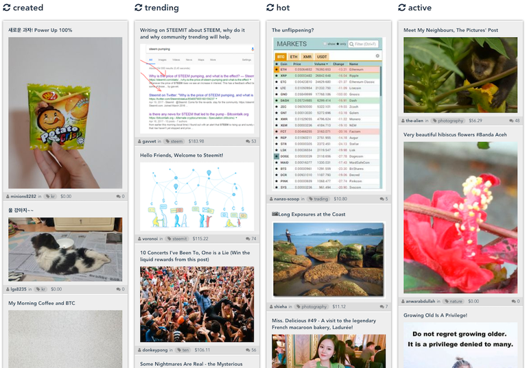
That would be like Pinterest then. I've been thinking about adding a view option for that, my first prototype about 10 months ago actually worked exactly like that since it's a lot easier to do than the columns scrolling separately:

I don't think it's actually more convenient, but it depends on how you use the app. If you just want to get a quick overview it probably is. I leave the app open all day to see new posts scrolling in as they are made, and to keep tabs on my own posts, see new upvotes and comments and things like that.
to have it as an option would be great.
I don't see why separate columns do have an advantage here.
I'd also prefer to have the option to let the content of one column/filter spread all over the page. you would still see 'columns', but just one feed.
It's probably a matter of taste, so it should be an option. I'll definitely add something like that at some point. Next thing on my list right now is finally adding re-steeming, upvoting and then writing posts which is a bit more elaborate, especially since SteemConnect doesn't support it yet (unless they've added that over the last few months, haven't checked again). I want to add lots of features like drafts and a version history with diffs, maybe optionally a WYSIWYG editor that you can use instead of markdown (but which uses markdown behind the scenes so you can switch back and forth between the two).
sounds very promising. looking forward to it!