Hey steemit community. I'm Eduardo and I'm a designer from Brazil. I'm also the guy who rode across Brazil on his scooter.
I've been playing around with the source code the last few days and these are some suggestions I think would help make the steemit community better.
I've also been obessed with how I'm going to intergrate steemit with my company Scribe.
I can honestly say I haven't been as excited as I am for Steemit in many many years. The potential is amazing and I will do everything I can to help build this community with you all!
While I believe in the future of Steemit , I think what will set it apart in the future is a design that is both welcoming and bold. A design that invites those around the world to share even just a small piece of their life. A design that says the world of crypto is very real.
These are a few mockups which I think will help Steemit reach its true potential. Sure, a strong community, commitment to the steemit technology matter. But a good design is a foundation to all things great
Bright Theme

Dark Theme
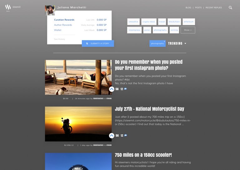
Default Theme
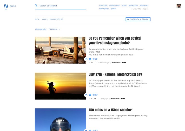
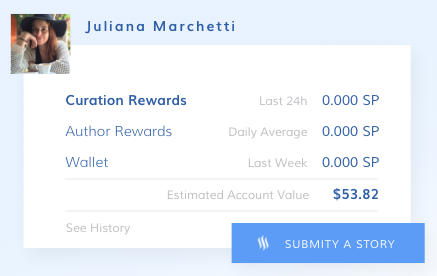
While the ability to share our stories with a finacial upside is the back bone of Steemit, I believe my design will place a focus on community by highlighting both comments and votes.

I would love to hear any and all feedback you might have on my suggested designs or how I could best integrate steemit with Scribe when the time is right.
i like it, good start man! Some areas are to noisy but at least maybe just to me .. i would no overlap the voting icon section, this could reduce the noise extremely IMO. But man .. GOOD work!
Thank you! Yeah, I like to break some rules when Im creating. I'm anxious to put this mockups to work and have the real feeling of using it.
I made the first clone of Steemit
https://steemit.com/steemit/@artakan/welcome-to-the-first-steemit-com-clone-notice-the-i-instead-of-the-i
just as a proof of concept, it works ! I haven't touch at all the apparence ... so if you need help to put your idea into reality from a technical perspective, maybe we can work together . ....
And yes your designs are great !
Hello @artakan would be incredible to have a chat with you. I'm on slack as @dudutaulois too. Thank you
I have put up a guide for how to build it
https://steemit.com/steemit/@artakan/how-to-build-your-own-steemit-com-website
https://steemit.chat/channel/general
I thought slack was down, i don't know where to contact you
You can find me there https://steemit.chat/channel/general under my artakan name
I do think there should be some mention of the money or payout. When scrolling through Steemit a higher paid post definitely gets noticed.
I really like the top design. Congrats on the good work.
I also think that it might be better not to mention money amounts but instead maybe just the amount of upvotes. It surely raises security concerns if someone has published all his/hers identity information while everyone can easily spot how much money they make per post. This might lead to a higher risk of physical attacks (i.e. robberies) and cyber attacks (i.e. hacking/phishing attacks).
Hey @mctiller. Thank you.
I agree with you. Showing the amount of money has another side effect. People get excited to see the posts with big numbers but soon feels frustrated to not be able to generate the same money even dedicating a lot of effort and posting good content. Succes should be measured by the audience it generate and not how much money it value.
Yes, you are absolutely right!. It really has this "disapointed", "frustrated", "angry" effect on lots of people.
or at least it should be users choice. I would put
all under one tab called settings
There would be also enough room for putting some advanced yes/no etc settings - like disable votes and payout amount .. if wanted by the user ..just brainstorming of course
It looks way too clunky imo. Good effort tho.
Focusing on upvotes could be relatively meaningless due to bots. You see some posts get 40 bot votes within the first minute and others not so much. Money on the other hand, well... that can't be faked.
I like the way you approach it in general though, it's refreshing.
Thank you. I didn't though about the bots. Good point.
@dudutaulois I wouldn't stress the upvote bots. They all run the same code we're all getting the same number of upvotes from them. Nice work though!
@alexgr Weight a post with money, but only show upvotes?
It could be an option... obviously some people would start wondering "why does this rank higher with less votes?"...
Well then they would know that it's money but they don't have to see how much money and if they can't see it, they can't feel jealous about it.
Yep... however I wouldn't bet against the platform managers actually wanting to display amounts in order to increase platform attractiveness and success story narratives...
It's too empty meaning I need to scroll more to get more posts, which is a negative UX in my opinion. with the current design I can see about 8 posts in one screen.
Hi @ooak it's hard to have one size to fits all. I understand that some people that use small screen prefer to see more post at time and for that reason I'm already creating a new mockup based on this idea. Stay tuned! Best.
will stay tuned.
Yeah they both are pretty awesome.. Great job!
Maybe like a day mode/night mode like on Poloniex :D
I like the idea! Thank you!
I seriously love the job you did, and I would be impressed if they take you as example to make up the new design of steemit, I would be honored to use it with that graphic!
Thank you!
We Steemers appreciate quote "I will do everything I can to help build this community with you all!" Thanks and welcome aboard! I personally love all your themes, and think they would be a great addition. Looking forward to seeing what else you come up with.
Together we really can 'Disturb the Universe' ;)
Very sleek. I really like it. Looks much more like what a site like this deserves.
We'll be talking to new users one day and use the words "Now, the way we did it back on the old version of the site..."
Good initiative Eduardo!
Good work
#takeiteasy
Thank you!
It's so........ calming!! I would triple my usage of steemit if it were to look like this! Brilliant! Gorgeous! Simplistic! Minimalistic! Love it!
nice work but I love the current minimalistic design
only needs the dark mode natively 8]
Looks neat! How about smaller thumbnails?
Yeah smaller thumbnails would be ideal for seeing more content at a glance.
I really like the bright theme.
I love the dark theme! This is beautiful work
Thank you! ;)
My only question for the rest of the internet is why the best web designers always seem to come from brazil. Is it like a cultural thing? Really good schools? They hand out design tools in kindergarten to get you started young or what? :)
Really? I can tell for my own experience, design is something much more accessible to learn than to coding. To learn how to code you first need to learn another language although design is all about drawing and everybody exercise it in the kindergarten, right?
Thank you
I have taken some design/art classes before and believe there is too much empty space or negative space that kinda makes it not efficient to navigate. I think people would prefer a more simple design mostly based off the one that already exists like in the screenshot of this post:
https://steemit.com/steemit/@r0achtheunsavory/steemit-feature-wish-list
Yes, for sure there is plenty of room for improvements and once I transform this on a usable mockup new ideas will come along. I like some of yours suggestions like a better profile page and messaging. Great work.
Wow love it, this site reminds me of when I used to collaborate with Buzzfeed years ago and still has so much room for success. Keep it up and look forward to how the developments turn out.
Thank you @darkstar1o9
Hello, great work! I love to see the tweaker and tinkers start modding the Steemit UI. I don't quite like it in its current state.
Suggestions:
Can you squeeze the top bar into a smaller form and have that persistently there while you scroll through he page? Maybe eventually have auto-hide function.
Hello @loewan
Thank you. Sure.. as this is a static layout it's hard to show how de UX works but that is a good solution for scrolling the page.
This is awesome. You're a true pioneer, Sir, and I'm sure the Scribe community will grow and grow using the Steem blockchain.
Thank you! I hope Scribers can also benefit from the value they create and Steem Blockchain is the perfect solution for it.
Maybe a day or night/spring, summer, fall, winter mode?
It looks fabulous for what you have accomplished in such a short time.
Haha.. 4 seasons themes... I like it! ;)
Looks great, I like dark theme. Maybe small wallet section would be useful. Thank you.
yeah... it could be an option for the user to customize this header dashboard.
These are great looking designs. This is an excellent example of why they made Steemit open source! Keep up the good work!
Looks great
Wow, I hope steemit can have a setting that user can set their own theme, so it will more as an optional feature.
i like the dark theme the best out of everything posted.
Thank you! I have another mockups on the way... stay tuned.
Hi @dudutaulois, I have a new product built on top of the steem network and I would really like if you could help me out. https://steemit.com/steem/@picokernel/pre-alpha-introducting-screem-the-first-alternative-social-network-for-steem it needs a user interface. It is essentially twitter on the steem network.
Sure @picokernel ! I just message you there. Find me at slack or Steemit Chat as @dudutaulois and we can talk about it! Thank you!
I think you have a good eye for design. But rather than focusing on improvements that can be made to steemit.com, I hope you will focus on creating a Portuguese language version of Steemit to address the sizable Brazilian market.
looks good. here's one other user working on some nice designs:
https://steemit.com/steemit/@etherdesign/new-website-design-for-steemit
Very nice post. We need more of this.