Why mascot of Steem should be simple enough to be editable by everyone
I’m advocate of open source design for Steem! To make it happen please do one thing before reading further:
Please upvote comment to this post with my image below: Mascot Contest for Steemit
It's my submission to contest and we can make a new contest only if I win. I have a lot of upvotes here, but almost no one upvoted my comment in contest post.
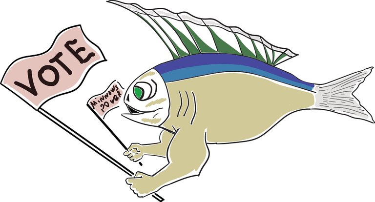
Here is version that I created and submitted today:

It consists of only 6 circles that you can rotate to get different moods and we can work on guidelines so anyone can easily get new looks of this character, some now we can edit it with no restrictions and get anything like this:

Feel free to change my source made in Sketch for Mac and submit your options
or get it in SVG (just 3kb).
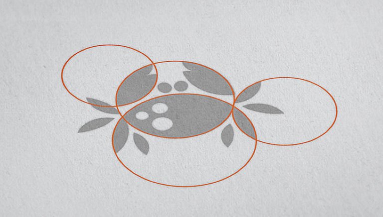
Making logo of just arcs of a minimum number of circles is a challenge, this is one great example from my colleague, Yury Akulin, who created my own logo and many amazing logos during our 12 years of work in my studio.
Here is what I got from news about logo above”
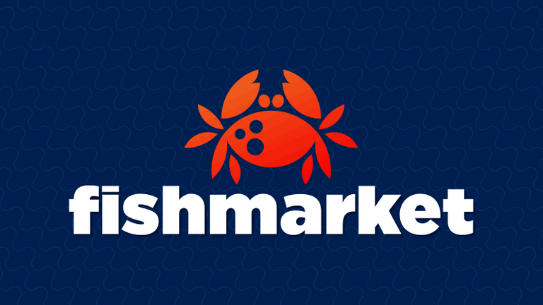
out of 36,000 logos sent to the team of LogoLounge, LogoLounge – a collection of the world’s best logotypes – the panel of judges selected top 20. Among the highest ranked 20 logos, there it was: this work is done for FishMarket– a red crab entirely constructed from various circular arcs.
This one was literally chosen by LogoLounge as the best logo of the year!
So If you are interested in making a decision on how the majority will perceive SteemIt for years to come, vote for a mascot here, the contest is opened. Vote or submit your version here.
UPDATE
I have a cool idea! Why don’t I make another contest in case my variant wins?
I promise to distribute whatever I win to winners of my new contest, that will follow initial one. Contesters can change the original mascot. Anyone will be able to this as it's just moving around and resizing of 6 circles. As a result, we will have a lot of different images with our mascot and really great one to use as a default one.
- The mascot should be alive and needs a lot of images with variations of for one same character to use in different situations (emotions, composition, etc).
- Good design takes time. I don't like contests we had till now just because there is no modification of initial dirty drafts people post for the contest. The final result should be refined. It takes time.
Why don't we use time of all of the Steemers to it shot such contest ?
Steemers on our Telegram chat voted for this idea, so I promise to share my prize between all of you, who will contribute by changing my initial design, either here or on GitHub if I win.
For now here is my repo where you can submit your files or update mine keeping original version and adding your name of steem account next to yours:
https://github.com/granin/steemmascot
I’ll be happy to see more options based on my source!


How i can try to join?
just post your version in comments or even better push your variant to my github repo here: https://github.com/granin/steemmascot
UPDATE: UPVOTE HERE OR WE'LL LOOSE THE CONTEST!!
Pleople is upvoting this post, but the actual contest is happening in the contest post, please upvote @granin's proposal THERE: https://steemit.com/steemit/@knozaki2015/mascot-contest-for-steemit-calling-all-designers#@granin/re-knozaki2015-mascot-contest-for-steemit-calling-all-designers-20160920t042142470z
Excellent design! Would you mind to upload the SVG format of it to github.com? I plan to contribute changes and github is a great tool for tracking changes and get people's feedback!
-- develCuy
feel free to creat repo if you are in a hurry or wait for an hour, i'll get to computer and do it. For now here is my empty repo where you can dish your files, but please push original as well if you will use it https://github.com/granin/steemmascot
Thanks for upvoting! share in comments what you think about OpenSource design and let me know if you need help with my sources.
Circle based designs have a pretty high profile. Apple's logo is made this way, and, apparently, with all kinds of special proportions in the ratios between them. Some think. This appears to be nonsense, and here is the indepth article that debunks it:
http://gizmodo.com/does-the-apple-logo-really-adhere-to-the-golden-ratio-511410550
Nevertheless, you can see that it is heavily based on circles.
ReSteemed because I want this to be the Steem Mascot, like Tux is for Linux. It's so freakin cute.
goood!!
Thank you! Please share & reblog it.
done)

I will be working today to make a shiny post to present a business model and some basic visual interface concepts for making a Steem POS system, which I am going to call SteemPay. I am going to use this design in the marketing and link back to you and especially the competition post. I want this logo to be what the public associates with Steem in the broader marketplace, because it is super cute and friendly, and that's fitting cos we are awesome and friendly. And cute. ;)
Hi . Are you interested join to another logo contest ?
https://steemit.com/logo/@airmike/golem-logo-contest-100-sbd-prize-quarantee
Congratulations @granin! You have received a personal award!
Click on the badge to view your own Board of Honor on SteemitBoard.
For more information about this award, click here
Congratulations @granin! You received a personal award!
You can view your badges on your Steem Board and compare to others on the Steem Ranking
Vote for @Steemitboard as a witness to get one more award and increased upvotes!