A bit of the steemit green shade at the button area (the inner part) will brighten up the front of the outfit. Username at the sleeves will be ideal so that you do not end up scanning the person’s chest for name 😂
First I love my friend @iamjadeline, but I find the back tshirt too many kotak kotak to see...lols! I would put the WRITE, VOTE, EARN on top instead of near my rear so people know what Steemit is all about. Good luck babe!
I love you too. Hehe. Banyak kotak right? chit chat too much. or think too much. 🤣 thank you @angiechin28. Anyway if this design win sure can make amendment if the judges ask me to.
@iamjadeline you have done good job too😊👍🏻 My suggestion is...It just i felt quite alot of chat 💭 box on the behind part & for the front part, the logo could be at the sleeve part, tq 👍🏻😊 all the best!
Haha this T shirt design is cute! I like the simple minimalist at the front and the idea of having mini icons of steemit features at the back. Just that I feel that placement of the icons is a bit messy, hence it looks busy at the back. It will either turn away people's attention or will intrigue people to peek real close at your back to see each meaning of the icons. Hahaha.
Maybe can consider to realign the icons placements or to reduce icons to only the main ones. Or to have icons to illustrate our steemit writing process. Eg: Step 1: Take pic (camera icon with food) or write (pencil on paper icon) - > Step 2: Upvote icon -> Step 3: Comment/Resteem icon -> Step 4: Earn $ (steemit logo) etc etc
I actually like the bubble talks and conversation boxes at the back of the shirt. It personifies what Steemit is all about, which is about striking conversations with strangers. So I wouldn't change a thing. What I would change is perhaps the position of the word "Steemit" and "#teammalaysia". Instead of making it vertical, I would reduce the font size and make it horizontal and place it at the same row as the Steem logo for #teammalaysia
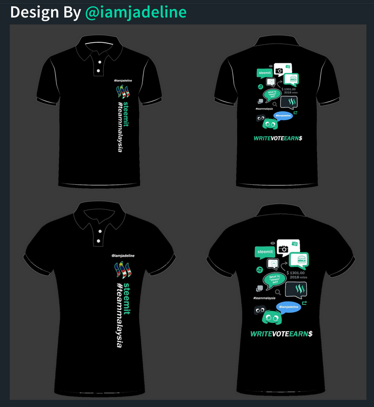
This is the cutest design of the three. I dunno what to add or tweak...
Thank you @elizacheng. ;)
A bit of the steemit green shade at the button area (the inner part) will brighten up the front of the outfit. Username at the sleeves will be ideal so that you do not end up scanning the person’s chest for name 😂
hehehe.
Mana upvote button tu? 😂
This design is the easiest to attract attention due to the cute design on backwards
Belakang at one of the bubble chat. Too small hoh? lol... let people cari lah. lol. anyway still can tweak one.
Oh haha didnt saw it, i tot is was separated outside 😂
Great.. now I need to save up STEEM/SBD to buy one of these
First I love my friend @iamjadeline, but I find the back tshirt too many kotak kotak to see...lols! I would put the WRITE, VOTE, EARN on top instead of near my rear so people know what Steemit is all about. Good luck babe!
I love you too. Hehe. Banyak kotak right? chit chat too much. or think too much. 🤣 thank you @angiechin28. Anyway if this design win sure can make amendment if the judges ask me to.
@iamjadeline you have done good job too😊👍🏻 My suggestion is...It just i felt quite alot of chat 💭 box on the behind part & for the front part, the logo could be at the sleeve part, tq 👍🏻😊 all the best!
Thank you @rizqiah. Thank you for suggestion. If my design win sure can reduce the chat box, if the judges ask me to.
@iamjadeline I like the front part simply because I like simple designs. One look can see what the t-shirt is all about.
2 suggestions for improvement :
Good luck!
Thank you @francesaw. Good suggestion. Sure can make amendment if I win and the judges ask me to do so.
This design is perfect, especially the bubbles. For me, no tweaking needs to be done with this design.
Aww....thank you so much @kokuryo. ;)
like the interactive at the rear of the t-shirt. I believe nothing need to be changed , like the way it is.
Haha this T shirt design is cute! I like the simple minimalist at the front and the idea of having mini icons of steemit features at the back. Just that I feel that placement of the icons is a bit messy, hence it looks busy at the back. It will either turn away people's attention or will intrigue people to peek real close at your back to see each meaning of the icons. Hahaha.
Maybe can consider to realign the icons placements or to reduce icons to only the main ones. Or to have icons to illustrate our steemit writing process. Eg: Step 1: Take pic (camera icon with food) or write (pencil on paper icon) - > Step 2: Upvote icon -> Step 3: Comment/Resteem icon -> Step 4: Earn $ (steemit logo) etc etc
I actually like the bubble talks and conversation boxes at the back of the shirt. It personifies what Steemit is all about, which is about striking conversations with strangers. So I wouldn't change a thing. What I would change is perhaps the position of the word "Steemit" and "#teammalaysia". Instead of making it vertical, I would reduce the font size and make it horizontal and place it at the same row as the Steem logo for #teammalaysia