.jpg)
YOU HAVE MADE YOUR CHOICE
Thank you for the participation in voting for your favorite designs. The favorite pick is now in the hands of the judges which would be @voronoi & @hansikouse ( from sndbox ) and also @kevinwong plus a mystery judge ! The votes by the judges would be anonymous and all decision would be final !
Here are the awesome finalist !
Not in any sorting order !
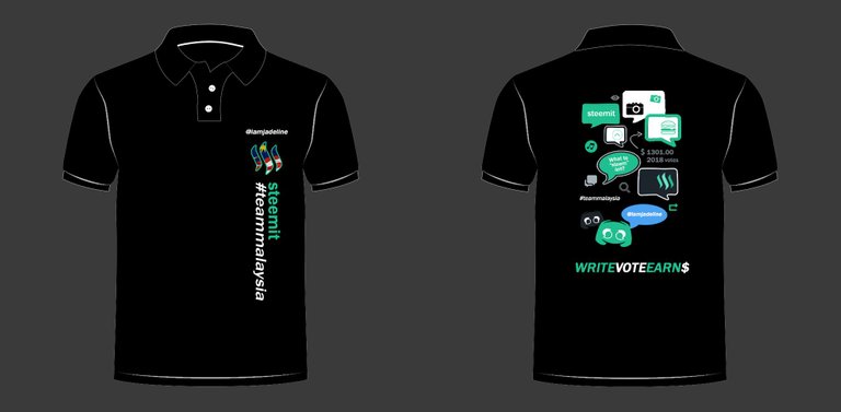
Design By @iamjadeline

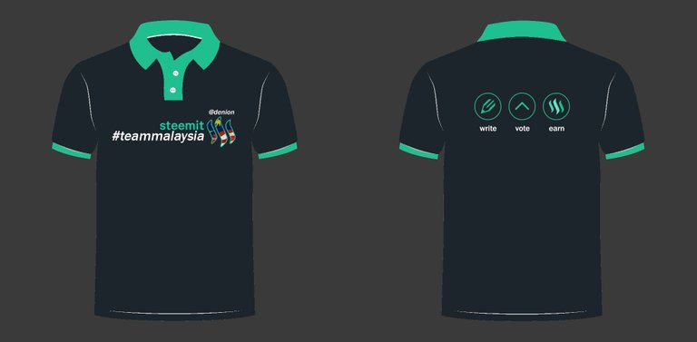
Design by @denion

Design by @iamsusan


What would I like to change if this design wins ?
Hi. since everyone missspelled my ID above, a minor change will do. Hehe. The correct ID is @iamsuzan ☺️
the steemit-ID and #teammalaysia label can swap places. other than that it is already perfect!
Love the world map! I come, I see, I conquer...
This is my fav!
There is nothing to change about the design except add our ID name in front of the shirt, on top of #teammalaysia.
The world map should be more appropiate to use Malaysia map for teammalaysia theme?
Also, this design didnt use 'Steemit' is a plus point for me. We should use Steem instead because Steemit is just a tiny part of Steem.
Steemit ID to put in front is quite good and also can put ID behind near collar.
Despite my entry did not gain enough votes to get to the top 3 (ha-ha), i still pretty much love this design.
Things I'd suggest for improvement:
Other than that, this is the best (for me) amongst the three. All the best @iamsusan! Looking forward to wearing this one soon!
My 2cents would be instead of Write, i would suggest words such as Create / Compose / Produce
Also second this! :D Create would really suit the idea :))
The #teammalaysia hastag and the Steemit-ID should switch with each others, or else you can place the Steemit-ID above the #teammalaysia hastag, the world map background grey can be slightly darker to show up more of the message, can also slightly enlarge the message "write, vote, earn" "together we grow" with the website link. The Male version upvote pattern can be slightly lower and reduce abit. Other then that, will be totally good for it. :D
My suggestion will be:
Overall, great design 😆
I have my eye on this design much earlier, I love the simplicity, on point message, branding awareness. The only thing I would change is to add our name on it (front and back). Not just any name, but our Steemit handle just in case you bump onto another Steemians they would know its you! Good job @iamsusan.
I would pick this one, I loved the ways @iamsusan put the stripes on the right hand side of the shirt.
Also, the sleeves design with #teammalaysia symbol is top notch!
Loved this design best of the three! Nice contrast with the wording and the maps. Gives a little WWF feel to it or of the sort xD
The only thing I would prefer is if the kerning on 'write, vote earn' would be more consistent. And if the malaysia flag could be made to stand out more. Also agreeing with others on the switching of ID and hashtag placement.
Good luck to all finalists! Looking forward to the final chosen design :D
For me ,
Add ID Name front, on top of #teammalaysia .
i would like to add another word.
 Another way is also Left Collar Bottom is #teammalaysia , then right bottom collar is www.steemit.com
not sure , if this is too much to see. Add the word Steemit on the bottom of the collar, OR www.steemit.com, its a great unique touch when ask , what is this shirt you wearing? can show on the collar , "its Steeemit .
then Front of the Shirt is just your ID Name . hahahaha... sorry ah .. i speak thru my mind telling me ... i saw somebody wore like this last week. its unique.
For Example :
The Collar Lining (Small Line) or the sleeve around (small Line) all around with steemit green color , will add a little bit of flare to it.
For Example below pic, (just imagine la k , if its Green Lining around)
The Back is awesome , with the World Map, its feel like Globalisation. and the Steemit Malaysia Logo, perfect touch. Oh ya btw, if the green lining approve looks good , the left and right sleeve tak payah letak green color square box.
Cheers, Good Luck to Top 3 ContestantOk i stop here , write too much, nanti @bitrocker2020 marah. :) ... just my opinion ahh @iamsuzan , no heart feeling ahh...
I like this design @iamsusan good job 👍🏻 It just got my attention hihi 😁
just a suggestion instead of “together we grow” maybe can chg to “mine $SBD together”
All the best ya😊👍🏻
Still my favorite out of all 3. Here's some possible tweak :
Overall the whole design i like lahh
I would to suggest the following:
thumbs up. Malaysia map will be nice instead of world map since it is teammalaysia. Otherwise, nice design.Design is awesome. Just add Steemit ID in front, on top of #teammalaysia then
Would like to have the ID and teammalaysia logo on the left side chest area as well. Left and right sleeve can leave it blank. Also, put the teammalaysia logo on the back of the Tee (top middle, near collar)
Only 1 suggestion - move the wearer's Steemit ID from the sleeve and place on front & back So when meeting up, easy to greet / recognise one another.@iamsusan I love the Malaysia map at the back and the simplicity of the design in front.
Good luck!
Love this version of design. Kudos to all the contributors as well.
Some suggestions:
This is my favorite among the three. :) I like how @iamsuzan play with different color shades for the upvote button at the front. Just some suggestions:
Front: Can consider to put the word "Steemit" above #teammalaysia, so that at 1 glance, people will know this is something to do about team malaysia in a community/organization/company etc.
Back: Can consider to put "Upvote' instead of "Vote", tho I know it may be nicer to have shorter word. My concern is that people might think this is a political party for people to "vote".
Back: Can consider to put Msia map instead of World map, cause "Together we grow" as Team Msia, tho I understand steemit is a worldwide platform. OR
Back: Remain the world map, but highlight country Msia in the map, put teal color or sth, but might not be easily seen cause Msia is small compare to other countries.
steemit-ID wrong tagging already!the only thing need to change is @iamsusan to @iamsuzan
I like this design as I find the arrows rather striking and unique. I will add the Steemit ID on either side of the sleeves for easy identification. I will also add #teammalaysia logo on top of the #teammalaysia word as well
What would I like to change if this design wins ?
My take:
Both the front and rear graphic elements is in horizontal alignments
Maybe should at least flip one of those to incorporate a vertical elements.
Not a fan of the green hue, even tho I know it's official color on the Steemit. I like the busy.org blue tho
This is the most simple design. Minimalist.
My opinion :
All finalists are black in color :( . So for me, to choose among the black, I'll go for this which appear more non-black at front and brighter .
And the icons at the back, will be easier to explain to newbies in future. So I go for this design.
加油!
If I would suggest , change the green to blue so it matches the teammalaysia crew tee design.
Im backing on this one. Plain and simple. :)
Front Side:
The Steemit-ID with the whole steemit, #teammalaysia hastag and #teammalaysia logo can move down abit, because due to the Steemit-ID abit closer to the button collar there.
Back Side:
Can try make the "write, vote, earn" as in all capitals letter with a loose tracking typo setting will be perfect for it.
Nothing much needed to tweak as this is the most minimalist design of all three.
I love this design the most, simple and straight forward. The other two are nice but too 'busy' for me. Nothing to tweak on this one. It's perfect the way it is.
Simple, good branding and with our Steemit name on it. The design would complement on any tshirt colors (if you dont fancy black). However, if you print on white tee, you will need to change the #teammalaysia font color to grey.
My vote goes for this design - simple, straight forward, direct - the message goes straight across!
No need to amend anything
This t shirt looks good as well. The Malaysia flag maybe can be on the sleeve part instead of just on the front part & hope for some design on the front bottom part due to mostly will be closed as for muslim lady who wear this with their scarf on them 😀 just a suggestion ya, tq 👍🏻😊 all the best!
As for this one, I like the simplicity of it. Maybe i like blue so, i will go with blue :P
Simple design. Straight to the point. Live up to TeamMalaysia's Steem Malaysia theme. No amendment needed.
Good luck!@denion Only 1 suggestion - place the wearer's Steemit account name on the back as well.
My only suggestion for this design is to have teammalaysia logo at the back of the Tee as well. (top middle near collar)
This is the simplest T-shirt design! :D Just some suggestions:
I find this design simple and minimalist. Straight to the point and easy to grasp what it is all about. Perhaps the only thing I will add is to include the Steemit ID on one side of the sleeve (be it left or right sleeve)
What i would like to change if this design wins ?
This is the cutest design of the three. I dunno what to add or tweak...
Thank you @elizacheng. ;)
A bit of the steemit green shade at the button area (the inner part) will brighten up the front of the outfit. Username at the sleeves will be ideal so that you do not end up scanning the person’s chest for name 😂
hehehe.
Mana upvote button tu? 😂
This design is the easiest to attract attention due to the cute design on backwards
Belakang at one of the bubble chat. Too small hoh? lol... let people cari lah. lol. anyway still can tweak one.
Oh haha didnt saw it, i tot is was separated outside 😂
Great.. now I need to save up STEEM/SBD to buy one of these
First I love my friend @iamjadeline, but I find the back tshirt too many kotak kotak to see...lols! I would put the WRITE, VOTE, EARN on top instead of near my rear so people know what Steemit is all about. Good luck babe!
I love you too. Hehe. Banyak kotak right? chit chat too much. or think too much. 🤣 thank you @angiechin28. Anyway if this design win sure can make amendment if the judges ask me to.
@iamjadeline you have done good job too😊👍🏻 My suggestion is...It just i felt quite alot of chat 💭 box on the behind part & for the front part, the logo could be at the sleeve part, tq 👍🏻😊 all the best!
Thank you @rizqiah. Thank you for suggestion. If my design win sure can reduce the chat box, if the judges ask me to.
@iamjadeline I like the front part simply because I like simple designs. One look can see what the t-shirt is all about.
2 suggestions for improvement :
Good luck!
Thank you @francesaw. Good suggestion. Sure can make amendment if I win and the judges ask me to do so.
This design is perfect, especially the bubbles. For me, no tweaking needs to be done with this design.
Aww....thank you so much @kokuryo. ;)
like the interactive at the rear of the t-shirt. I believe nothing need to be changed , like the way it is.
Haha this T shirt design is cute! I like the simple minimalist at the front and the idea of having mini icons of steemit features at the back. Just that I feel that placement of the icons is a bit messy, hence it looks busy at the back. It will either turn away people's attention or will intrigue people to peek real close at your back to see each meaning of the icons. Hahaha.
Maybe can consider to realign the icons placements or to reduce icons to only the main ones. Or to have icons to illustrate our steemit writing process. Eg: Step 1: Take pic (camera icon with food) or write (pencil on paper icon) - > Step 2: Upvote icon -> Step 3: Comment/Resteem icon -> Step 4: Earn $ (steemit logo) etc etc
I actually like the bubble talks and conversation boxes at the back of the shirt. It personifies what Steemit is all about, which is about striking conversations with strangers. So I wouldn't change a thing. What I would change is perhaps the position of the word "Steemit" and "#teammalaysia". Instead of making it vertical, I would reduce the font size and make it horizontal and place it at the same row as the Steem logo for #teammalaysia
the design by @iamsusan looks good and solid, that is the best that i have seen
Nice designs.. i surely will want 1 for me..
Awesome! I love the first one by @iamjadeline, I have 2 suggestions:
Thank you @yasminep. Good suggestion. And if my design win, will make amendment if judges ask me to do so. ;)
Awesome! Hope you win. Definitely the best design! Love the back!
Since content is being generated in various formats now in Steemit, would it better to replace the word 'Write' with 'Create'? The 3 contending designs are really nice. I would be happy to wear one. My favourite is the 1st designed by @iamjadeline
Thank you so much @acdevan. ;)
Nice designs but I think the best is 2. t-shirt. :) Because looking color harmony is great
Awesome three! How to choose? There's nothing that I wanna tweak or change. It's already super awesome!💕💖 💓 💗
Dulu saya pernah tinggal di kampung baharu Kuala lumpur.terimakasih..Hi en cik @myach salam kenal dr saya @nasrulnazar95 i from aceh.
i like the second design hope to buy one
Good Luck to all finalist! May the best design wins!
Hmm, this one is tough. I love all the three of them...
Well, I think I will cast my vote to @iamsusan design. Reason - I love how she presented Steemit with a world map~
Good luck to all the contestants :)
I especially like this design, other than the ID label and #teammalaysia swap places, I would suggest changing the teal color on inner collar and the front part upvote arrow to 'blue' or 'red', the same color tone as the Malaysian flag. I think blue and red would look bolder and striking, and at the same time take out the faint impression of Petronas' shirt. It can also be coordinated like blue to male and red to female design. The ID label can either change to one of the color shades of the upvote arrow of either white or silver grey. The teal colored tag on the left sleeve be taken out.
Just an added suggestion other than the already awesome design. Wouldn't mind not changing it at all too!
1 thing i will tweak is the upvote arrow... on the side... can ma it smaller .. cause when put on the polo.. tied in it still can be seen
I vote for @iamsusan 's design. She really put into account for male & female shirt design. She also give details for the sleeve design. Besides, the colour play seems to be interesting. Hopefully #teammalaysia will be wearing her design soon. Best of luck to all the contestants. Cheers!