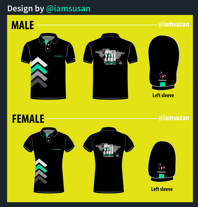
The #teammalaysia hastag and the Steemit-ID should switch with each others, or else you can place the Steemit-ID above the #teammalaysia hastag, the world map background grey can be slightly darker to show up more of the message, can also slightly enlarge the message "write, vote, earn" "together we grow" with the website link. The Male version upvote pattern can be slightly lower and reduce abit. Other then that, will be totally good for it. :D
I have my eye on this design much earlier, I love the simplicity, on point message, branding awareness. The only thing I would change is to add our name on it (front and back). Not just any name, but our Steemit handle just in case you bump onto another Steemians they would know its you! Good job @iamsusan.
Loved this design best of the three! Nice contrast with the wording and the maps. Gives a little WWF feel to it or of the sort xD
The only thing I would prefer is if the kerning on 'write, vote earn' would be more consistent. And if the malaysia flag could be made to stand out more. Also agreeing with others on the switching of ID and hashtag placement.
Good luck to all finalists! Looking forward to the final chosen design :D
i would like to add another word.
not sure , if this is too much to see. Add the word Steemit on the bottom of the collar, OR www.steemit.com, its a great unique touch when ask , what is this shirt you wearing? can show on the collar , "its Steeemit .
then Front of the Shirt is just your ID Name . hahahaha... sorry ah .. i speak thru my mind telling me ... i saw somebody wore like this last week. its unique.
For Example :
Another way is also Left Collar Bottom is #teammalaysia , then right bottom collar is www.steemit.com
The Collar Lining (Small Line) or the sleeve around (small Line) all around with steemit green color , will add a little bit of flare to it.
For Example below pic, (just imagine la k , if its Green Lining around)
The Back is awesome , with the World Map, its feel like Globalisation. and the Steemit Malaysia Logo, perfect touch. Oh ya btw, if the green lining approve looks good , the left and right sleeve tak payah letak green color square box.
Cheers, Good Luck to Top 3 ContestantOk i stop here , write too much, nanti @bitrocker2020 marah. :) ... just my opinion ahh @iamsuzan , no heart feeling ahh...
thumbs up. Malaysia map will be nice instead of world map since it is teammalaysia. Otherwise, nice design.Design is awesome. Just add Steemit ID in front, on top of #teammalaysia then
Would like to have the ID and teammalaysia logo on the left side chest area as well. Left and right sleeve can leave it blank. Also, put the teammalaysia logo on the back of the Tee (top middle, near collar)
Only 1 suggestion - move the wearer's Steemit ID from the sleeve and place on front & back So when meeting up, easy to greet / recognise one another.@iamsusan I love the Malaysia map at the back and the simplicity of the design in front.
This is my favorite among the three. :) I like how @iamsuzan play with different color shades for the upvote button at the front. Just some suggestions:
Front: Can consider to put the word "Steemit" above #teammalaysia, so that at 1 glance, people will know this is something to do about team malaysia in a community/organization/company etc.
Back: Can consider to put "Upvote' instead of "Vote", tho I know it may be nicer to have shorter word. My concern is that people might think this is a political party for people to "vote".
Back: Can consider to put Msia map instead of World map, cause "Together we grow" as Team Msia, tho I understand steemit is a worldwide platform. OR
Back: Remain the world map, but highlight country Msia in the map, put teal color or sth, but might not be easily seen cause Msia is small compare to other countries.
I like this design as I find the arrows rather striking and unique. I will add the Steemit ID on either side of the sleeves for easy identification. I will also add #teammalaysia logo on top of the #teammalaysia word as well
Hi. since everyone missspelled my ID above, a minor change will do. Hehe. The correct ID is @iamsuzan ☺️
the steemit-ID and #teammalaysia label can swap places. other than that it is already perfect!
Love the world map! I come, I see, I conquer...
This is my fav!
There is nothing to change about the design except add our ID name in front of the shirt, on top of #teammalaysia.
The world map should be more appropiate to use Malaysia map for teammalaysia theme?
Also, this design didnt use 'Steemit' is a plus point for me. We should use Steem instead because Steemit is just a tiny part of Steem.
Steemit ID to put in front is quite good and also can put ID behind near collar.
Despite my entry did not gain enough votes to get to the top 3 (ha-ha), i still pretty much love this design.
Things I'd suggest for improvement:
Other than that, this is the best (for me) amongst the three. All the best @iamsusan! Looking forward to wearing this one soon!
My 2cents would be instead of Write, i would suggest words such as Create / Compose / Produce
Also second this! :D Create would really suit the idea :))
The #teammalaysia hastag and the Steemit-ID should switch with each others, or else you can place the Steemit-ID above the #teammalaysia hastag, the world map background grey can be slightly darker to show up more of the message, can also slightly enlarge the message "write, vote, earn" "together we grow" with the website link. The Male version upvote pattern can be slightly lower and reduce abit. Other then that, will be totally good for it. :D
My suggestion will be:
Overall, great design 😆
I have my eye on this design much earlier, I love the simplicity, on point message, branding awareness. The only thing I would change is to add our name on it (front and back). Not just any name, but our Steemit handle just in case you bump onto another Steemians they would know its you! Good job @iamsusan.
I would pick this one, I loved the ways @iamsusan put the stripes on the right hand side of the shirt.
Also, the sleeves design with #teammalaysia symbol is top notch!
Loved this design best of the three! Nice contrast with the wording and the maps. Gives a little WWF feel to it or of the sort xD
The only thing I would prefer is if the kerning on 'write, vote earn' would be more consistent. And if the malaysia flag could be made to stand out more. Also agreeing with others on the switching of ID and hashtag placement.
Good luck to all finalists! Looking forward to the final chosen design :D
For me ,
Add ID Name front, on top of #teammalaysia .
i would like to add another word.
 Another way is also Left Collar Bottom is #teammalaysia , then right bottom collar is www.steemit.com
not sure , if this is too much to see. Add the word Steemit on the bottom of the collar, OR www.steemit.com, its a great unique touch when ask , what is this shirt you wearing? can show on the collar , "its Steeemit .
then Front of the Shirt is just your ID Name . hahahaha... sorry ah .. i speak thru my mind telling me ... i saw somebody wore like this last week. its unique.
For Example :
The Collar Lining (Small Line) or the sleeve around (small Line) all around with steemit green color , will add a little bit of flare to it.
For Example below pic, (just imagine la k , if its Green Lining around)
The Back is awesome , with the World Map, its feel like Globalisation. and the Steemit Malaysia Logo, perfect touch. Oh ya btw, if the green lining approve looks good , the left and right sleeve tak payah letak green color square box.
Cheers, Good Luck to Top 3 ContestantOk i stop here , write too much, nanti @bitrocker2020 marah. :) ... just my opinion ahh @iamsuzan , no heart feeling ahh...
I like this design @iamsusan good job 👍🏻 It just got my attention hihi 😁
just a suggestion instead of “together we grow” maybe can chg to “mine $SBD together”
All the best ya😊👍🏻
Still my favorite out of all 3. Here's some possible tweak :
Overall the whole design i like lahh
I would to suggest the following:
thumbs up. Malaysia map will be nice instead of world map since it is teammalaysia. Otherwise, nice design.Design is awesome. Just add Steemit ID in front, on top of #teammalaysia then
Would like to have the ID and teammalaysia logo on the left side chest area as well. Left and right sleeve can leave it blank. Also, put the teammalaysia logo on the back of the Tee (top middle, near collar)
Only 1 suggestion - move the wearer's Steemit ID from the sleeve and place on front & back So when meeting up, easy to greet / recognise one another.@iamsusan I love the Malaysia map at the back and the simplicity of the design in front.
Good luck!
Love this version of design. Kudos to all the contributors as well.
Some suggestions:
This is my favorite among the three. :) I like how @iamsuzan play with different color shades for the upvote button at the front. Just some suggestions:
Front: Can consider to put the word "Steemit" above #teammalaysia, so that at 1 glance, people will know this is something to do about team malaysia in a community/organization/company etc.
Back: Can consider to put "Upvote' instead of "Vote", tho I know it may be nicer to have shorter word. My concern is that people might think this is a political party for people to "vote".
Back: Can consider to put Msia map instead of World map, cause "Together we grow" as Team Msia, tho I understand steemit is a worldwide platform. OR
Back: Remain the world map, but highlight country Msia in the map, put teal color or sth, but might not be easily seen cause Msia is small compare to other countries.
steemit-ID wrong tagging already!the only thing need to change is @iamsusan to @iamsuzan
I like this design as I find the arrows rather striking and unique. I will add the Steemit ID on either side of the sleeves for easy identification. I will also add #teammalaysia logo on top of the #teammalaysia word as well