Repository
https://github.com/Dsiner/CommenPlayer
Linked Task Request
This is not an Utopian Task Request. I searched open source projects on GitHub that didn't have a logo. I contacted the Project Owner and offered him a logo for his project as my open source contribution. After I showed my logo, the Project Owner liked it and decided to using my logo on the project.
Details
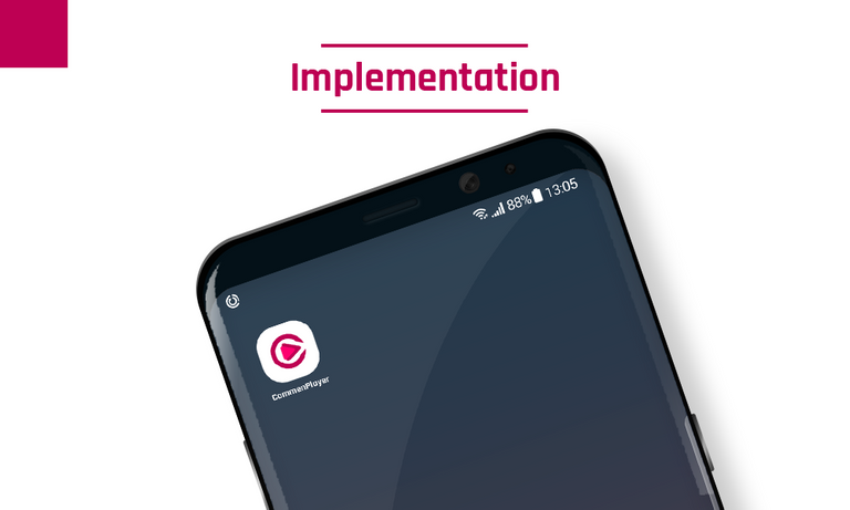
CommenPlayer is a Video Player that run on Android platform. This video player works based on ijkplayer, Android MediaPlayer, and ExoPlayer / vlc. CommenPlayer supports local and network video playback, live streaming, playback control, screen size switching, full screen mode switching, etc.
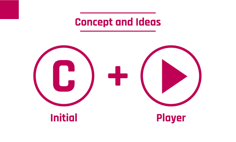
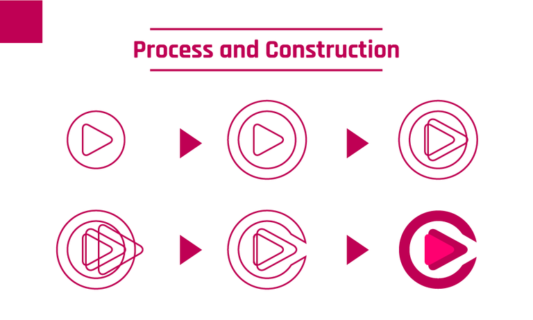
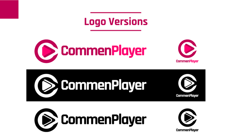
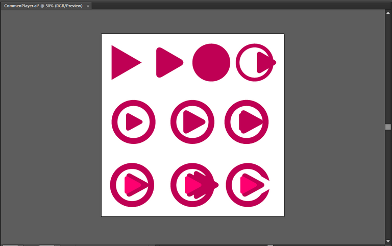
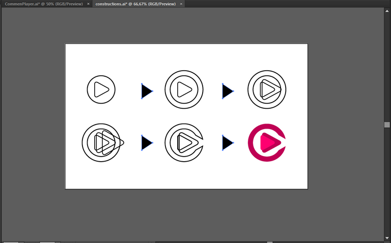
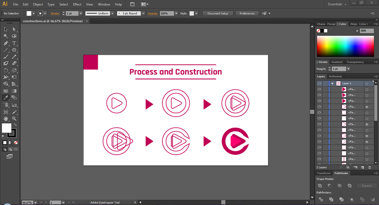
This logo design is trying to delivered some idea about video player. Using 'C' initial element from 'CommonPlayer' and player element from Video Player as main idea. Then, trying to combine it uniquely.
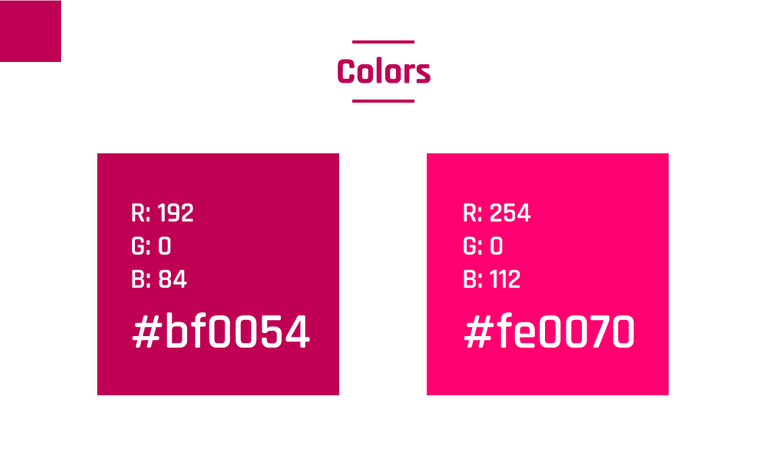
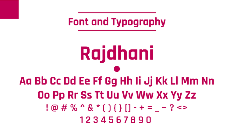
This project didn't have a logo and brand identity color before. Then, I chose two unique colors and combined it to the logo. I chose soft reddish color palletes. For the typeface, I chose the little bit rounded font like Rajdhani to making it appropriate with the logomark.
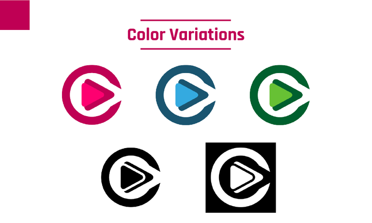
For another color versions, I chose green and blue palletes, the most generic color pallete besides the black and white version.
![]()
Benefits / Improvements
This logo proposal help the Project Owner to improve the visual and identity of this project because this project didn't have logo and brand identity before. This logo also simple, flat, unique, and eye-catching. After all, the Project Owner liked this logo at the first sight.
Proof of authorship
Tools
Using Adobe Illustrator CS6 to create the logo and presentation.
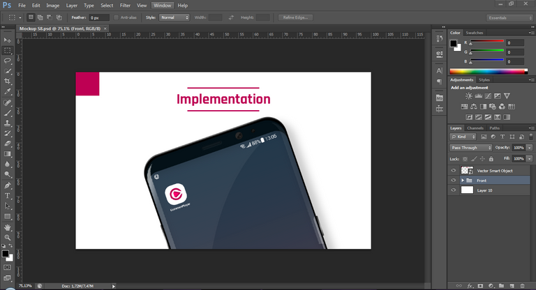
Using Adobe Photoshop CS6 to the mockup.
Original files
Proof of Work Done
https://github.com/anharismail
License

This work is licensed under a Creative Commons Attribution 4.0 International License.
Hi @anharismail, thank you for your contribution.
The edges on letter C should follow the rounded logotype to maintain uniformity.
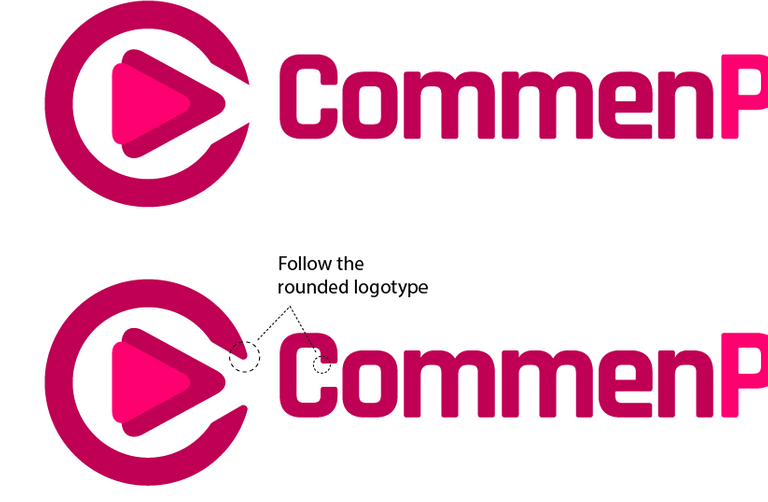
Or alternately you can make the letter C more legible and make it a little bit thicker for a cleaner logomark as shown bellow

The triangles in the center need more tweak as you can see it seems unbalanced.

Your contribution has been evaluated according to Utopian policies and guidelines, as well as a predefined set of questions pertaining to the category.
To view those questions and the relevant answers related to your post, click here.
Chat with us on Discord.
[utopian-moderator]Need help? Write a ticket on https://support.utopian.io/.
Thanks for your moderations, Mod.
Thank you for your review, @nilfanif!
So far this week you've reviewed 1 contributions. Keep up the good work!
Hey, @anharismail!
Thanks for contributing on Utopian.
We’re already looking forward to your next contribution!
Get higher incentives and support Utopian.io!
SteemPlus or Steeditor). Simply set @utopian.pay as a 5% (or higher) payout beneficiary on your contribution post (via
Want to chat? Join us on Discord https://discord.gg/h52nFrV.
Vote for Utopian Witness!
Hi @anharismail!
Feel free to join our @steem-ua Discord serverYour post was upvoted by @steem-ua, new Steem dApp, using UserAuthority for algorithmic post curation! Your post is eligible for our upvote, thanks to our collaboration with @utopian-io!