Hi @anharismail, thank you for your contribution.
The edges on letter C should follow the rounded logotype to maintain uniformity.
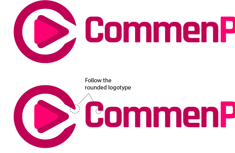
Or alternately you can make the letter C more legible and make it a little bit thicker for a cleaner logomark as shown bellow
The triangles in the center need more tweak as you can see it seems unbalanced.

Your contribution has been evaluated according to Utopian policies and guidelines, as well as a predefined set of questions pertaining to the category.
To view those questions and the relevant answers related to your post, click here.
Chat with us on Discord.
[utopian-moderator]Need help? Write a ticket on https://support.utopian.io/.
Thanks for your moderations, Mod.
Thank you for your review, @nilfanif!
So far this week you've reviewed 1 contributions. Keep up the good work!