Improving the LeoFinance interface (coding details inside)

Image by Gerd Altmann from Pixabay
As you have seen, we recently made some changes to the UI (or User Interface). In addition to adding notifications and improving the look and feel of the mobile interface, many smaller changes were made to allow the site to work better on a wide range of screens. This is called making it "more responsive".
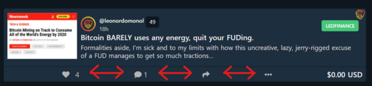
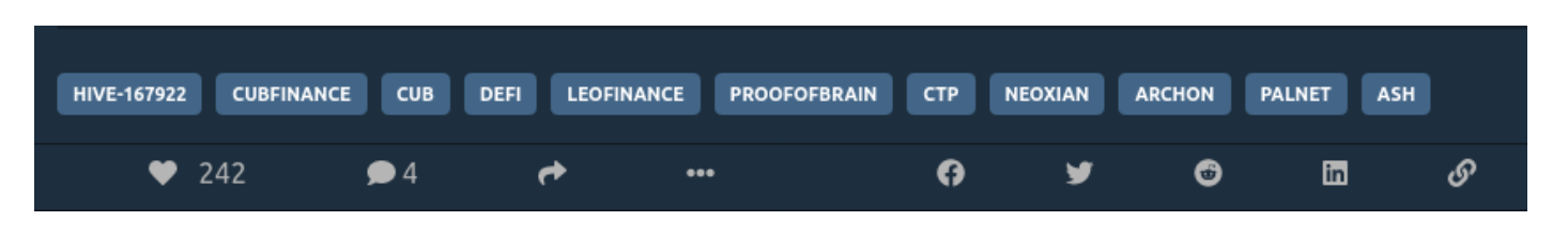
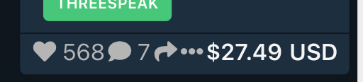
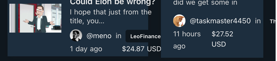
Unfortunately, one unintended side effect that some people didn't like was the change to how items in the footer were laid out. Here are some examples:
We listened—and now it's better!
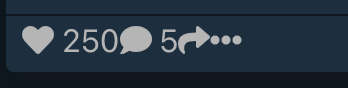
With the newest change from a few minutes ago:
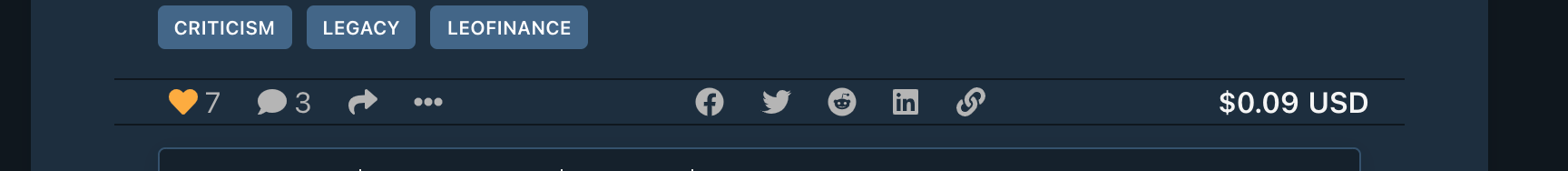
Basically, each of the groups of icons are now grouped together so that they always stay together. And it is done in a way that even if the screen is very small, it still looks reasonably good, although still crowded. For example, here's one particularly crowded screen widget that still stays on one row, even though there's not much space:
Why was the original change done anyway?
I wanted to take a few moments and talk about why the change was made in the first place. A lot of people on the site seem to use the site in a widescreen mode, and so don't notice that when things don't fit well on a smaller screen. However, I like to have other things on the screen at the same time as the browser. Here's an example of the old UI on such a screen:
The icons on the post details page really got bad:

The solution for this is a newer web technology known as "flexbox".
WTF is a flexbox?
This is the best overview of flexbox I've found. I'll let them describe it:
The Flexbox Layout ... aims at providing a more efficient way to lay out, align and distribute space among items in a container, even when their size is unknown and/or dynamic (thus the word “flex”).
For LeoFinance, the front screen adjusts from a 3-column layout for wider screens to a single-column layout for mobile. Within each of these columns, flexbox is used to specify how things are laid out. Although we used flexbox in earlier versions of the UI, the change from a couple weeks ago used more of its capabilities for the footer. Which was a good idea, however we used it poorly.
With flexbox, rather than saying exactly how much space each element should take up, you tell the layout what should it do with extra space. The reason the old layout overflowed into 3 rows was that the space between was fixed (saying exactly how much space to take up between each item). And this resulted in overflowing to the next row rather.
So the first thing I did was to remove all the space around the items. This made them look like this:
and then I told flexbox to take the extra space and put it in between the icons. We do this in CSS as follows:
.content-actions {
  display: flex;
  justify-content: space-around;
}
The result on my screen looked like this:

However as the screen increased, everything would get too spread out

More flexbox to the rescue
The problem I realized is that I was telling the set of icons to take up more space when their containing box grew (this is the default), but what I want is to take up less space when it shrinks. And we do that by adding a line flex:
.content-actions {
  display: flex;
  justify-content: space-around;
  flex: 0 2 160px;
}
That last line means:
- Don't grow when there's more space (
0) - Shrink when there's not enough space (
2) - Ideally, take up (
160px)
You can play around with that on your own: just make your browser bigger and smaller and see how the items in the footer take up more and less space.
A change not yet made
Another concern I saw was that the padding between elements is now not enough. I agree on this and want to give the elements more space, but I'm curious what you think about it. Here's how it looked before:
and now:
I think before the right column was too small, but also that the padding was reduced too much. It's very simple to add some more padding, but I'm curious about your thoughts.
Thank you for the feedback!
We really welcome your thoughts about the UI. Although we would love it if everything was positive, we also know that some changes won't be liked by everyone. The beautiful thing about having our own community is the voice to make a difference, simply by expressing our opinions. We monitor the sentiment coming through the platform (and on Discord), and strive to build the best platform which balances the perspectives of the widest range of people. While we can't make everyone happy, we will strive to improve the experience for as many people as possible.
In the next week or so, there will be more opportunities to express what you think should be next added to the platform. We hope you'll share your opinions and views for the future.
And if people like seeing this level programming detail, I will continue to write more content like this.
And thanks again for the feedback about the interface!
Posted Using LeoFinance Beta
Enjoying the update and interaction with the users. Don't know if getting into the CSS details is very interesting for most people but asking them about their user experience and having screenshot comparisons sure seems fun. :)
For my taste, too cluttered doesn't look too good. More space and more minimal (but still functional) seems better.
Thank you for the feedback. Yeah, I like minimal too.
Posted Using LeoFinance Beta
Ohhh ahhhh....I see....nice, I use mobile browser 98% of the time, I like the ‘now’ look on it... you see that replying to comments of comment section, it was a mess last I checked...
But nice work out here...
Posted Using LeoFinance Beta
Yep, the comments of comments is something that I've been working on. Will have that improved in the next update.
Posted Using LeoFinance Beta
Great update (on the update). Thanks for sharing what is taking place and how you are responding to feedback.
We all want the same thing: for Leofinance.io to be one of the biggest (and best) hubs for financial and crypto info on Web 3.0. To achieve that end, we all have a role to play.
Thanks for stepping up and doing your part. We look forward to more updates.
Posted Using LeoFinance Beta
Thanks, exactly my thoughts. Always a pleasure reading your posts, and I hope that I can make it the best way to read them.
Posted Using LeoFinance Beta
Well, I never saw it wrong, in fact I've always thought it looked great regardless of whether the buttons look annoyed or in love, either way they look great.
Posted Using LeoFinance Beta
I've promised and app review and have not been able to keep my word due to lack of time, but I'm going to do it shortly as mobile has some issues.
Till then, thank you very much for listening to the community and updating the app to what we need. Your work is highly appreciated.
Posted Using LeoFinance Beta
I look forward to reading it.
And thank you for the words of appreciation. Really nice to hear those at the same time as receiving but reports.
Posted Using LeoFinance Beta
I forgot to add, I'd love to see posts like this and I bet I'm not the only one. It makes it easier to understand a lot of things and helps communicate with you guys! So just keep posting :)
Posted Using LeoFinance Beta
And I enjoy interacting with people too :)
Posted Using LeoFinance Beta
At least I understand why there was so much spacing.
I think the current look is good and it matches what I expected from the previous UI.
Posted Using LeoFinance Beta
Glad that you appreciated the explanation and how it looks now.
Posted Using LeoFinance Beta
Your post was promoted by @amr008
Congratulations @shawnlauzon! You have completed the following achievement on the Hive blockchain and have been rewarded with new badge(s) :
Your next target is to reach 600 upvotes.
Your next target is to reach 1500 upvotes.
Your next target is to reach 400 comments.
You can view your badges on your board and compare yourself to others in the Ranking
If you no longer want to receive notifications, reply to this comment with the word
STOPCheck out the last post from @hivebuzz:
Support the HiveBuzz project. Vote for our proposal!
Here's my improvement suggestion, I hope it helps.
https://leofinance.io/@erikah/leofinance-mobile-and-desktop-improvement-suggestions
Posted Using LeoFinance Beta
Congratulations @shawnlauzon! You received a personal badge!
Wait until the end of Power Up Day to find out the size of your Power-Bee.
May the Hive Power be with you!
You can view your badges on your board and compare yourself to others in the Ranking
Check out the last post from @hivebuzz:
Support the HiveBuzz project. Vote for our proposal!
Congratulations @shawnlauzon!
You raised your level and are now a Minnow!
Check out the last post from @hivebuzz:
Support the HiveBuzz project. Vote for our proposal!
Congratulations @shawnlauzon! You received a personal badge!
Participate in the next Power Up Day and try to power-up more HIVE to get a bigger Power-Bee.
May the Hive Power be with you!
You can view your badges on your board and compare yourself to others in the Ranking
Check out the last post from @hivebuzz:
Support the HiveBuzz project. Vote for our proposal!
Thanks for the detailed response! I'll answer each one:
Totally agree. I really want to swipe backwards on my phone and that doesn't work. Unfortunately there's technical reasons for that and so it's more than a simple UI change. But I've been working on changing the underlying code and hope to have that in a few weeks.
I agree on that too. Unlike the mobile UI which seemed pretty clear how each article should be formatted, I wasn't sure what the best desktop experience should be. I made a conscious decision not to put more time into the desktop UI. I would love to run a UI contest and have the community submit their designs which we could implement. Would love to see something that is wholly LEO.
Thanks, that's a good point too. Unfortunately it seems to be very different on different screens and I haven't yet spent the time to really dive into it. But it's on the list!
I'm actually happy to hear this, it means everything else is looking really good! :)
Thank you :)
Posted Using LeoFinance Beta
Thanks again! No it's not an issue with the discord icon, but that is a good guess. Investigating that showed me some other issues with placing of the reply editor, so hopefully I've resolved those as well.
Posted Using LeoFinance Beta