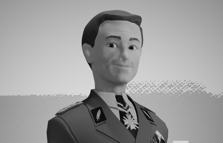
In a list containing the best villains ever written, I think this man deserves a spot somewhere high in that list. The more physical and flashy superpowers like flight, energy beam, super speed and all that are fun, but I love it the most when a character's power is his/her knowledge alone and they use it well that they become formidable.
But that's about fictional characters in general, I'm aware that Inglourious Basterds is set in 1940s France, not in space in 2019 with a lot of spaceships and some purple guy looking to complete his pretty stones collection.


“I love rumors! Facts can be so misleading, where rumors, true or false, are often revealing.”
-Col. Hans Landa
Anyway, this is another part of the WIP scene that I'm working on. This time I'm going to give you a little peek on how I made this stylized version of Christoph Waltz as Col. Hans Landa in the movie Inglourious Basterds.
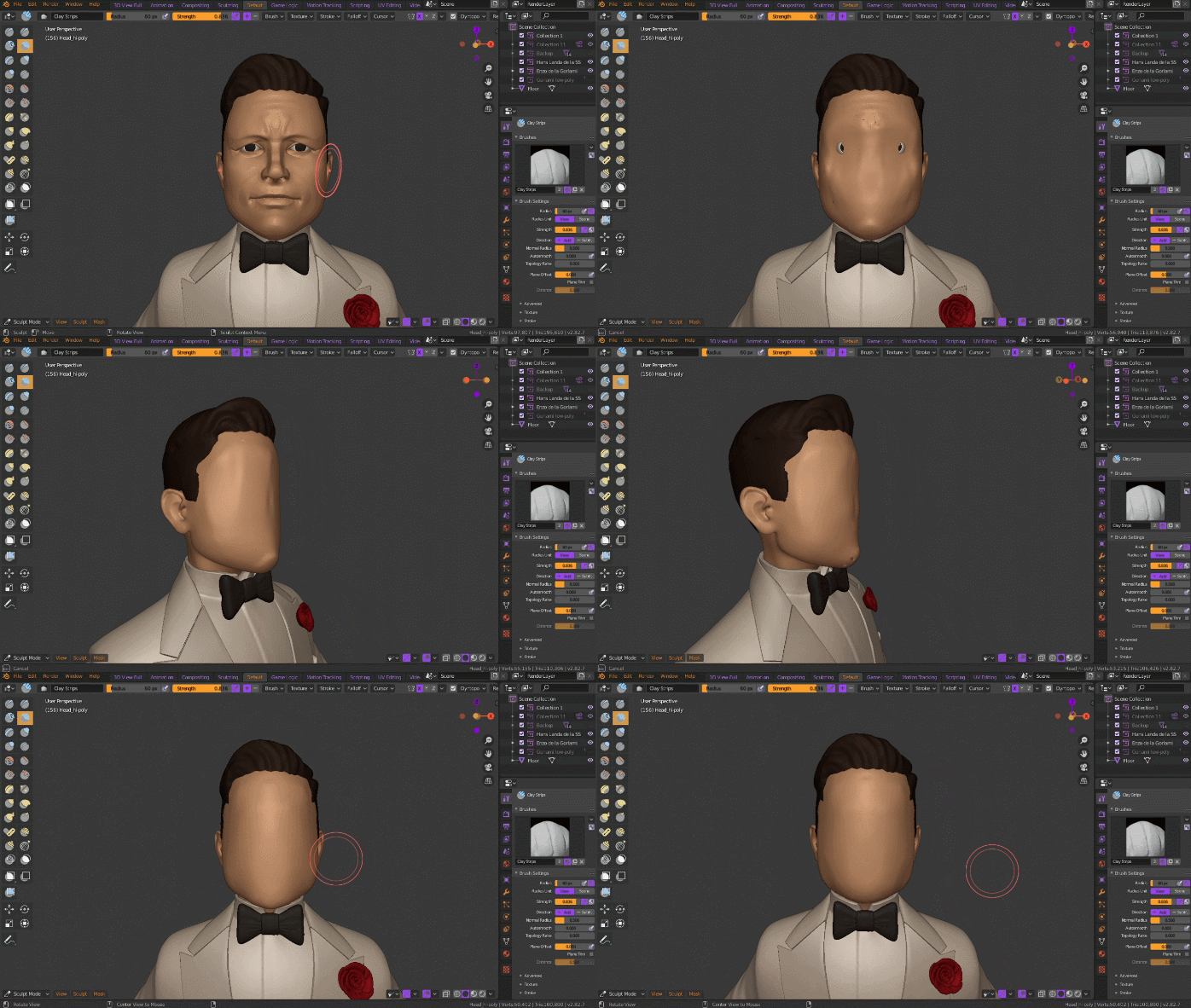
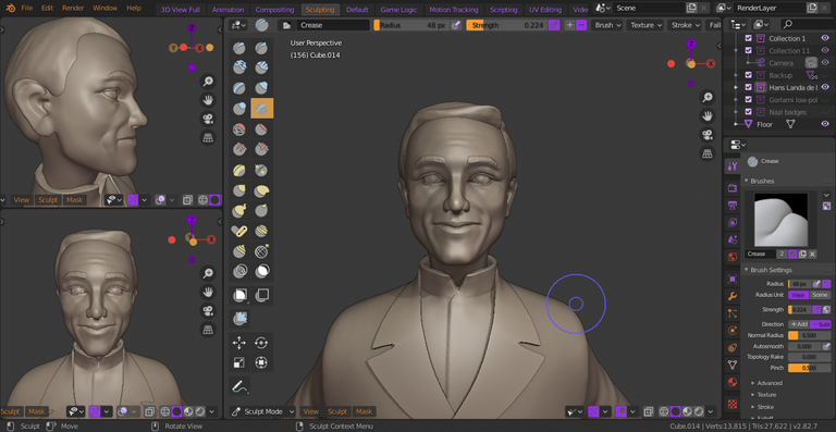
I gathered a couple of references from the movie itself, just like last time. However, instead of starting from scratch, I 'recycled' Aldo's hi-poly face and started to sculpt Hans Landa's from there. Gotta work as efficient as possible, right?
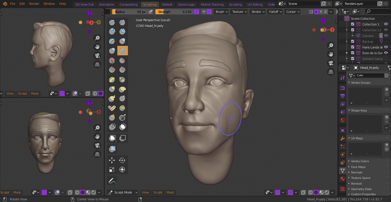
I think it was a better decision rather than keep getting things wrong after spending some time re-adjusting the shape of the face and the facial features around, because I found it better to 'refresh' the look to determine the facial features' shapes, positions, sizes, etc.
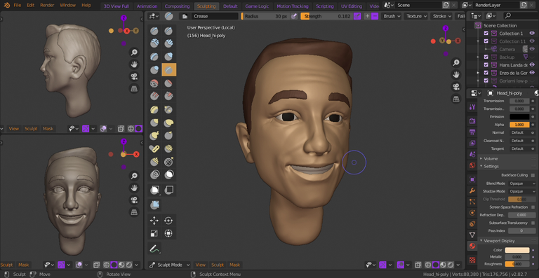
Since this is going to be a one-time render, I decided to try to create him in an already smiling expression rather than making him smile by setting up shapekeys later. Or by telling him a joke or something. But his face turned out kinda crappy and I decided to just hide the teeth.
I'm trying to keep it non-3D artist-friendly to read but sometimes there are some 3D terms that have to be written, such as shapekeys, which is the method to change his facial expression. Or at least that's the easiest way to put it.
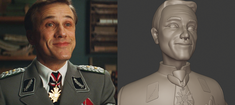
The feature that I tried to get right the most is the shape of his smile, while keeping everything far enough from being realistic. Like the eyes for example, if I make them smaller everything look a lot less stylized, but still keeping them from being so anime-big. That, and his square chin.
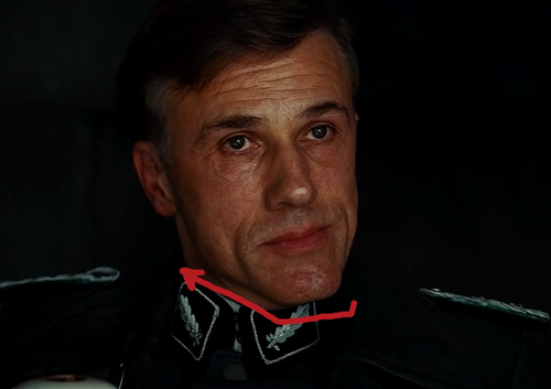
I can say that I learnt a little about reading facial features from doing this project.
If I'm being honest, Cristoph Waltz's strong, boxy chin looks like it is stylized, and reminds me a lot of the Crimson Chin from Fairly Odd Parents.
Forget what I said about learning to 'read' facial features... I think I'll take that back.

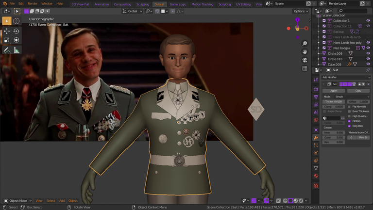
Modelling those little badges are easy as some of them were quite simple box-modelling, but still took some time. I also ended up Googling up some of the badges and read about them to get them right.
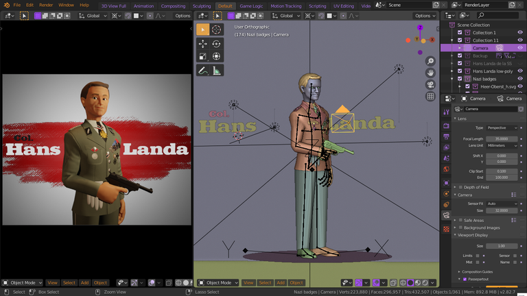
I think I could have done better with this one, especially on the texturing part, which made it look like the textured low-poly model looks less like the actor than the high-poly sculpture. Maybe I will fix a couple of things, but not gonna go back to square one or two. I'll keep some of the mistakes in my artworks as lessons.

Now I'm still doing some fixes on the final scene, on Aldo's model, and trying to come up with a good idea of how to make the final scene looks interesting. What this 'scene' I keep talking about? Well, I guess you know which scene if you've watched the movie before.
I'll put the link of the resources downloaded to complete the appearance of this model down below. Thank you for visiting, and don't forget to...
You can always wait for the cream, but never wait for Fegelein.


Links:
The Imperial Eagle, Standartenführer patches, Golden Party Badge, Blood Order medal, Bandit-warfare Badge, belt buckle.



Character Portrait | 3D Print-Ready Model
He could have looked "less cheerful" and "more ironic", @rainite... But even so, your work is very good.
I thought as much 😅 I only realized that when I was almost finished with him. He didn't look that bad in the sculpt, if I may say so myself, but the coloured low-poly version turned out looking like that lol.
I thought you'd used sculpt mode before, was wondering when I dropped that screenie in artbees if you just don't usually look at the wireframe XD
If you don't spot the mistakes or can't be bothered fixing things for a quickie there's nothing wrong with acknowledging them for the next piece and moving along otherwise you'll be stuck forever :D
This turned out all right at any rate, kind of like something we might expect to see in a phone game maybe :)
I always use sculpt mode. I've watched someone box-model a Tim Burton-styled character before and it was a real pain to watch.
And I agree with that, of course I'll spend as long as it needed to finish a project, but still I'd rather move on than going back too far when I spot a mistake. #NoRagrets
Thank you, Ry. But please don't tease me about game-dev, I really want to start doing that! XD
I know that reference :-), and on the note of cream, I'm not the only one immature enough to start giggling when he said "Wait for the cream.", right? Anyone else? In all, this is pretty fantastic, and a celebration for one of my favourite actors ever. His facial features are pretty amazing as usual, and I especially love the attention that you've put on his uniform, with all the medals and decorations placed just beautifully. Mmm... I'm just about to give a chef's kiss, and a round of applause for this!
Oooo thank you, Zack! ^^ I personally spot some mistakes in the final render, but I'm glad that it's not completely ruined.
Maaaaybe you're the only one. I don't know. XD
When I watched the "wait for the cream" scene I actually found him more menacing. Like, he has this scary, strict personality which he hides with those wits and smiles and friendly manner.
I still can't get my childish notions of cream out of my head XD. Though you are right, Waltz's character can have this wittiness and charm about him on the outside, but you can feel deep inside that he'll kill you just as easily!
I think that's why I've enjoyed him so much as an actor. I dare say the best performance that I remember him in was Alita. What a great movie that was.
👋 Hi @rainite, I was flipping through the blockchain and stumbled on your work! You've been upvoted by Sketchbook / a community for design and creativity. Looking forward to crossing paths again soon.
✅ Join the Sketchbook Community
(Been waiting to do this) Blessed be thee, for thy art, me likey!
///no
But ahh your 3D stuff is always so cool!
Thank you, Thilah! For the compliment and the quote from the (amateur) art bible XD especially the latter.
Zbrush?
Nope. Blender.
I like the dynamism you use! And your colorful palette!
I'm not so good with colour (yet), but thanks, Oscurity. ^^